


Organizations often have to take important decisions that can either make or break their success. Making the right decisions at the right time matters. However, taking the right decisions is neither easy nor straightforward. You may have to measure relevant metrics, sift through enormous Parents of data, and make predictions and accurate projections to gain the insights that help in decision-making. Sometimes, it is possible to be overwhelmed by the sheer amount of data that you may have to filter everything down to a few relevant parameters and visualize them, sort them in order and see how they compare, to get clear insights that drive decisions. So, there is a need for powerful statistical tools for decision-making. Pareto chart is one such tool.
Pareto Principle and the 80-20 Rule
Pareto principle was developed by an Italian economist named Vilfredo Pareto. According to the Pareto principle, around 20% of causes lead to approximately 80% of the effects. Similarly, 20% of the total work done leads to 80% of a project’s outcome. In short, if you can identify the crucial 20% causatives of problems or the crucial 20% of reasons behind a project’s success, then you can address 80% of the problems and have control over 80% of your success potential. He calls it the 80-20 rule. The Pareto chart is a tool that follows this principle to identify problems and success factors accurately, so that you can focus on the right priorities.
What is a Pareto Chart?
A Pareto chart is a statistical tool used to compare proportions efficiently. It graphically displays the relative proportions of occurrence of different values. In short, it shows how many different items are there in a given category and sorts them in terms of occurrences in descending order. Pareto charts can be used to identify and prioritize problems or opportunities. They can help you focus on the most important issues and ensure that resources are allocated accordingly.
For instance, if you want to see how many leads each of your products attracts from a campaign, then you could use a Pareto chart to visualize it and find out. Doing this allows you to stack up the products by the number of leads each attracts in incremental order. By doing this, you can find out which products you need to prioritize, which products you need to market better, etc.
Structure of a Pareto Chart
Pareto chart consists of an X-axis that represents the various items compared in the chart, and a Y-axis that represents the proportion of occurrence for each item.
In a Pareto chart,
- The items in the X-axis that are compared should be devoid of any overlapping; they should be within their respective categories. They should be mutually exclusive and exhaustive.
- Items on the X-axis should be in descending order from left to right, to make it easier to identify the items that are responsible for the majority of occurrences.
- The Y axis should depict the percentage of occurrence for each item.
- The Pareto chart looks like a bar graph with items in descending order.
- It also visualizes the cumulative percentage line, thus effectively making it a combination of bar chart and line graph.
When Should you Use a Pareto Chart?
You can use a Pareto chart in quality control and project management to:
- Analyze data
- Conduct a cause and effect analysis
- Visualize the problems and outcomes
- Identify the most critical factors that need to be addressed
- Identify the relative importance of various factors that come into play in a project/operation/activity
- Prioritize them based on the severity of their impact on the business
Steps Involved in Creating a Pareto Chart
Following are the steps involved in creating a Pareto chart.
- You must start by creating a list of problems for comparison.
- You have to choose a corresponding measure of comparison. These values could range from the number of product defects per batch, to frequency of customer complaints, or how much resources it takes to manufacture a product, or how long it takes to resolve customer complaints, etc.
- Choose a timeframe to collect the data.
- Once you have identified the different values, you have to calculate the proportions for each value. In the cases mentioned earlier, it would be
- A total number of defects per batch for every type of product
- How often has every product received customer complaints
- The total amount of resources spent to produce a single unit of every type of product that is compared
- Total time taken to resolve a complaint for every type of product compared
- Identify the percentage of every item by dividing the value by the grand total number of values and multiplying by 100.
- Arrange the compared items in descending order of percentage – by listing the items in the X axis from highest value to the lowest, and mark the Y axis yet with percentage values of each.
- Draw the bars for every item.
- The height of each bar represents the proportion for each value.
- Calculate the cumulative percentage by adding the percentages of an item with the ones preceding in the list.
- Trace the cumulative percentage, starting from the highest bar in the chart. This line graph is a representation of the cumulative proportion.
Pareto Chart Example
Pareto chart in quality control helps to identify the issues and prioritize them based on their impact. For instance, you can identify 20% of the type of product complaints that cause 80% of customer dissatisfaction and address this 20% to address 80% of customer dissatisfaction.
- We can start by listing out the types of product complaints in a table, sorted in descending order, starting with the complaint that is received more frequently on top.
- Then we can identify the percentage of each type of complaint received by the product, by dividing the number of every type of complaint by the total number of complaints, and then multiplying it by 100.
- Finally, we can calculate the cumulative percentage by adding the percentages of every item with the percentages of the ones preceding them in the list.
When you complete the table, it will look like this.
| Type of complaint | Number of complaints | Percentage | Cumulative percentage |
| Manufacturing Defects | 39 | 48.75% | 48.75% |
| Quality issues | 28 | 35% | 83.75% |
| Lacking features | 7 | 8.75% | 92.5% |
| Shipping related problems | 4 | 5% | 97.5% |
| Design flaws | 2 | 2.5% | 100% |
| Total | 80 | 100% |
Using these, you can create a Pareto chart.
Project management and measuring quality are essential aspects of running a successful organization. Profit.co’s OKR management platform comes preloaded with over 400 KPIs and metrics that can help you measure your progress and meet your business’s short- and long-term goals. To learn more about how Profit.co can help your team, schedule a free demo with our OKR experts today!
Pareto Analysis
Pareto analysis involves applying the 80-20 rule to identify the 20% of causes for the 80% of problems, list them out based on the severity of the impact on the business operations, profit, efficiency, customer experience, etc., visualize them using a Pareto chart, create a rating for each of them, prioritize the statistically most important problems and address them for the benefit and betterment of the business/organization. Pareto analysis can be done by:
- Finding out the problems.
- Listing down the major causes for those problems.
- Visualizing their impact using a Pareto Chart.
- Sorting them according to their importance and impact.
- Scoring the problems and prioritizing the top most crucial problems that need to be solved.
- Categorizing the problems based on their nature – such as customer experience.
- Making a comprehensive plan of action to address the problems with the highest priority.
- Allocating adequate resources accordingly.
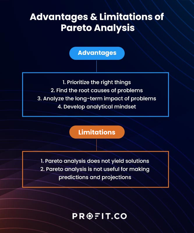
Pareto Analysis – Advantages
- Prioritize the right things
When you have multiple problems to tackle and overcome, you cannot focus on everything simultaneously. It is extremely crucial to prioritize the things that have the most impact on your operations and the organization. Having the wrong priorities can have serious repercussions. Pareto Analysis helps to identify the issues that need immediate attention and prioritize them, so that those problems are resolved before you could divert your attention toward relatively minor problems.
- Find the root causes of problems
When you have problems, addressing the causes rather than the symptoms essential to solving those issues and moving forward. If you do not manage to find the root cause of problems, you will be clutching at straws without finding a permanent solution for the problem. The problem will be recurrent and will demand your precious attention and resources. In order to determine the root causes of problems, you have to dig into the data and analyze them over a period of time. By helping you list your problems, fathom their impact and visualize the data, Pareto analysis helps you find out the root causes of problems and address them immediately.
- Analyze the long-term impact of problems
Pareto analysis helps to understand the impact of problems caused over a long period of time. It helps to measure the cumulative impact of problems, thus enabling organizations to identify and address the most prominent problems that cause the most impact on the organization.
- Develop an analytical mindset
When you seek to leverage data, visualize it, and derive inferences to refine your insights, you gain a fool-proof method to identify the problems with great accuracy and find solutions for problems that need your immediate attention. When you continue doing it over a long period of time, you will manage to sharpen your analytical skills and adopt a data-driven approach in everything to achieve consistently good results in addressing problems.
Quality means doing it right when no one is looking.

Pareto Analysis – Limitations
- Pareto analysis does not yield solutions
Pareto analysis focuses on identifying the problems and ranking them based on their impact on business. So, you can identify the problems that you have to address, but it does not give you any insights on how to overcome those problems. You have to find ways to tackle them yourself using other methods.
- Pareto analysis is not useful for making predictions and projections
Making projections is one of the most important aspects of data analytics. Accurate predictions play a great role in taking the right decisions. However the abilities of the Pareto Analysis are limited to ranking the problems and prioritizing them based on past data from over a period of time. It cannot provide you with accurate projections to plan for the future.
Frequently asked questions
- What is a Pareto chart used for?
Pareto chart is used in project management and quality control for identifying and prioritizing problems and opportunities.
- What is the 80-20 rule Pareto chart?
According to Pareto principle, around 20% of causes lead to approximately 80% of the effects. Similarly, 20% of the total work done leads to 80% of a project’s outcome. So, a Pareto chart aims at identifying the most crucial causes of problems and positive outcomes.
- What is Pareto chart with example?
A Pareto chart is a tool that is used to efficiently compare proportions. It graphically displays the relative proportions of occurrence of different values. For example, you can calculate the total number of customer complaints related to every product in a particular period of time, sort them in descending order depending on their percentage values, visualize as a bar chart, identify the products with most number of complaints, prioritize them to fix the issues in those particular products, and allocate resources accordingly.
Final Thoughts
Project management is essential and challenging for leaders and managers. The project team continuously improves until the project is complete. To properly manage your projects and your company, you need to pair your chosen project management methodology with agile OKR software. Profit.co’s OKR management tool combines OKRs, strategy, tasks, performance, and employee engagement on one central platform. You can get started on Profit.co completely free today!