


Project management is the art and science of planning, executing, and controlling projects to achieve specific goals and deliver customer value. However, managing projects can be challenging, especially when dealing with uncertainty, complexity, and change.
Before we begin, let’s pause and address these questions!
- How can you measure your project progress and performance?
- How can you ensure your project is on track and aligned with your customer’s expectations?
- How can you adapt to changing requirements and feedback?
No need to stress if you’re unsure about these questions. We’ve got your back! The burndown chart is a powerful tool that can provide the desired answers.
In this guide, we’ll introduce you to the burndown chart, guide you on crafting one, and highlight its advantages in project management.
What is a Burndown Chart?
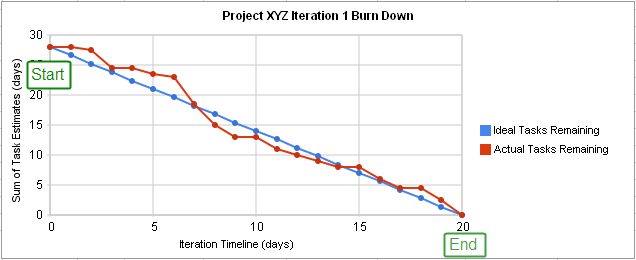
A burndown chart is a graphical representation of the amount of work remaining versus the time available for a project. It can help you visualize your project status, identify potential risks and issues, and make informed decisions to improve your project outcomes.
A burndown chart has two lines: the ideal and actual lines.
The ideal line shows how much work should be done each day to complete the project on time. The actual line shows how much work is really done each day. The goal is to make the actual line follow the ideal line as closely as possible.
If the actual line is below the ideal line, it means you are ahead of schedule and have less work left than expected. If the actual line is above the ideal line, it means you are behind schedule and have more work left than expected.
Mankind invented a system to cope with the fact that we are so intrinsically lousy at manipulating numbers. It’s called the graph.

Types of Burndown Charts
Sprint burndown chart
This type of chart shows the progress of a team for a specific sprint, which is a short and fixed period of time (usually one to four weeks) in agile development methodologies like Scrum.
A sprint burndown chart displays the number of tasks, story points, or hours left to complete the sprint backlog on the vertical axis, and the days of the sprint on the horizontal axis.
The chart also shows an ideal line that represents the expected rate of work completion and an actual line that shows the actual work done by the team.
Ideal for: Scrum teams monitoring short-term goals.
Release burndown chart
This type of chart tracks the progress of a project over a longer period, often an entire release cycle.
A release burndown chart shows the number of features, user stories, or story points left to deliver the product on the vertical axis, and the sprints or milestones on the horizontal axis.
The chart also shows a projected line that indicates the estimated completion date based on the current velocity and scope, and an actual line that shows the actual work done by the team.
Ideal for: Product owners or project managers tracking feature delivery at a higher level.
Product burndown chart
This type of chart shows the remaining work for the entire product or product backlog, which is a list of all the features and requirements that need to be implemented in the product.
A product burndown chart shows the number of product backlog items or story points on the vertical axis and the number of sprints or releases on the horizontal axis.
The chart also shows a trend line that indicates how fast the product backlog is decreasing over time and an actual line that shows how much work has been done by the team.
Ideal for: Long-term planning and progress across the product lifecycle.
Understanding the Mechanics of Burndown Charts
A burndown chart is a useful tool for tracking the progress of a project or a sprint. It shows how much work is left to do and how much time is available to do it. You may have the question of how to create an agile burndown chart on your own; for this you need to understand the core mechanics. So, to understand the mechanics of a burndown chart, you need to know the following components:
X-axis
The X-axis represents the time dimension. It can show the days, weeks, or months of the project or sprint. The X-axis starts from the beginning of the project or sprint and ends at the expected completion date.
Y-axis
The Y-axis represents the work dimension. It can show the number of tasks, story points, or hours of work that need to be done. The Y-axis starts from the total amount of work and ends at zero, indicating that all work is done.
Ideal line
The ideal line is a straight line that connects the starting point and the ending point of the chart. It shows the expected rate of work completion, assuming that the work is done evenly and without any obstacles.
Actual line
The actual line is a curved line that shows the actual amount of work remaining at each point in time. It reflects the progress and performance of the team. The actual line can be above, below, or on the ideal line, depending on whether the team is behind, ahead, or on schedule.
To read a burndown chart, you need to compare the actual line with the ideal line and see how they diverge or converge over time. You can also calculate the team’s velocity, which is the amount of work done per unit of time, by dividing the work completed by the time elapsed. A burndown chart can help you monitor and adjust your plan, identify and resolve issues, and communicate your status and expectations to your stakeholders.
Here is a burndown chart example that demonstrates the expected rate of work completion and the actual amount of work remaining.
Elevate your project management skills with Profit.co
Comparing Burndown and Burnup Charts
Both charts are graphical representations used in agile methodologies to track and visualize the progress of work over time. While they have similarities, their differences lie in how they present the information. Here’s a tabular comparison of Burndown and Burnup charts
Comparison of Burndown and Burnup Charts
| Feature | Burndown Chart | Burnup Chart |
|---|---|---|
| Purpose | Shows work remaining over time | You risk running out of runway if you burn through cash too fast without a sustainable plan. |
| Visual Representation | The line starts high and trends down | The line starts low and trends up |
| Ideal Trend | Steady downward slope | Steady upward slope |
| Main Usage | Monitor work left in a sprint or release | Monitor progress and total scope |
| Main Usage | Monitor work left in a sprint or release | Monitor progress and total scope |
| Scope Changes | It can be confusing | Easier to visualize as it has two lines: one for completed work and one for total scope |
| Complexity | Simpler in concept | A bit more complex due to the additional line |
| Interpretation | When the line hits the bottom, the work is done | When the completed work line meets the total scope line, the work is done |
| Advantage | Immediate understanding of how much work is left | Gives insight into both progress and scope changes |
| Disadvantage | Not great for visualizing scope changes | It might be a little harder for beginners to understand |
| Used by | Scrum teams during sprints | Product and project managers to understand the overall progress |
Choosing between them often depends on the project’s needs, the team’s familiarity with the charts, and the kind of information stakeholders want to see.
The Benefits of Using a Burndown Chart
A burndown chart agile methodology is used for tracking the progress of a project or a sprint. It shows how much work is left to do and how much time is available to do it. Some of the benefits of using a burndown chart are:
- It shows a direct comparison between the work needed to be done and the effort required to complete it.
- It keeps teams on the same page about the project status and helps them communicate effectively with stakeholders.
- It helps teams identify and resolve issues, risks, and impediments that may affect the project delivery.
- It motivates teams to perform consistently and improve their velocity and quality.
- It helps teams plan and prioritize their work, manage their scope and resources, and adjust their expectations.
Leveraging Profit.co for Enhanced Burndown Chart Usage
Agile methodologies have permeated nearly every corner of the business and project management landscapes. At the heart of agile lies the Burndown Chart, which provides teams with a visual representation of work left to do versus time. Integrating this with Profit.co’s task management capabilities can supercharge your project tracking and forecasting. Let’s dive deep into leveraging these two powerful tools together.
Profit.co is a comprehensive platform that offers tools for OKR (Objectives and Key Results) management, task management, and performance reviews. Its task management component enables teams to create, assign, track, and complete tasks in an organized manner.
1. Granular task view
With Profit.co, teams aren’t limited to viewing just the “big picture”. They can drill down to specific tasks, see who’s responsible, and even identify if certain tasks are taking longer than expected. This kind of insight is invaluable for project managers who need to reallocate resources or adjust timelines.
2. Integration with other metrics
One of Profit.co’s standout feature is its ability to integrate the burndown chart with other key performance indicators (KPIs). This means teams can view their progress through OKRs in the context of larger organizational goals, ensuring that every task aligns with the company’s broader objectives.
3. Real-time updates
In today’s fast-paced business environment, having outdated data can be detrimental. Profit.co offers real-time updates, ensuring that teams always have the most current view of their task progress. This not only helps in identifying potential issues early on but also in making quick, informed decisions.
4. Collaborative features
Profit.co’s platform provides a workspace, designed exclusively for collaboration. Team members can comment on specific tasks, link OKRs, tag colleagues, label tasks, set priorities and deadlines, monitor progress, and even integrate with popular communication tools. This kind of seamless collaboration ensures everyone is on the same page, reducing the potential for misunderstandings or missed tasks. Also, logically group them under a particular Objective or key result, so that the departments and teams can make sure that the tasks are completed on time contributing to the overall progress of the key result.
The integration of Profit.co’s task management with the burndown chart brings forward a dynamic tool that provides an enhanced visualization of project status and fosters a proactive work environment. Embrace this combination to stay on top of your projects and ensure timely delivery.
Conclusion
A burndown chart stands as an indispensable instrument for managing projects with a definitive scope and deadline. It gives clarity on your progression, pinpointing potential hazards, and guiding necessary recalibrations to your strategy. Crafting one necessitates outlining your scope, setting the duration, tracing your ideal and actual trajectories, and maintaining consistent updates. The complete power of a burndown chart lies in its frequent review, leveraging it as a tool for communication, strategic planning, feedback, and team motivation, and instituting any required remedial measures.


