

The Balanced Scorecard page now includes a dashboard view built from configurable widgets, sitting above the detailed list. It gives you an at-a-glance read on overall scorecard performance before you scroll into the full breakdown.
Table of Contents
- What is the Scorecard Dashboard?
- Why Does the Scorecard Dashboard Matter?
- How Does the Scorecard Dashboard Work?
- What Happens When You Use the Scorecard Dashboard?
- What Are the Best Practices for the Scorecard Dashboard?
- Related Articles
- What Are Some Frequently Asked Questions About the Scorecard Dashboard?
What is the Scorecard Dashboard?
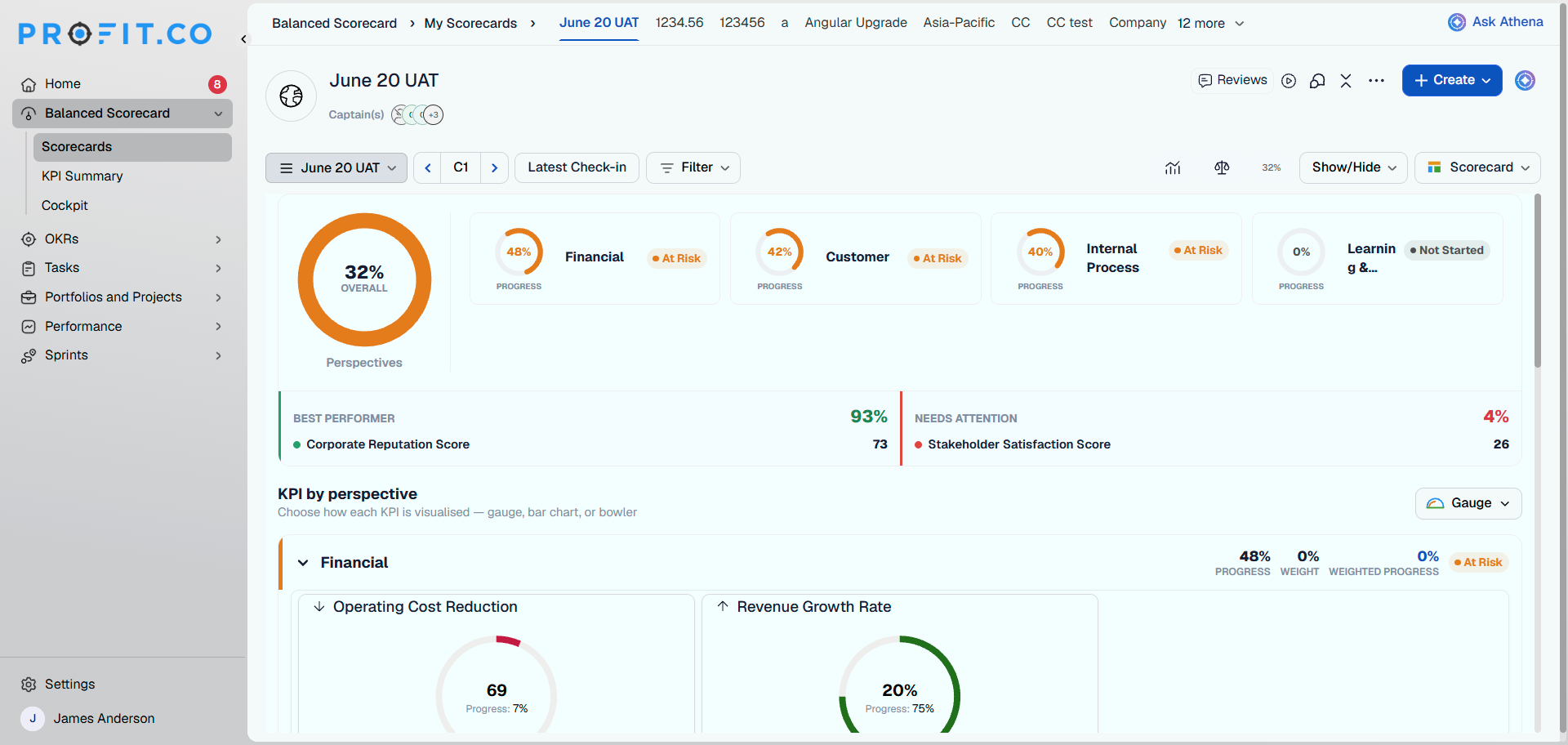
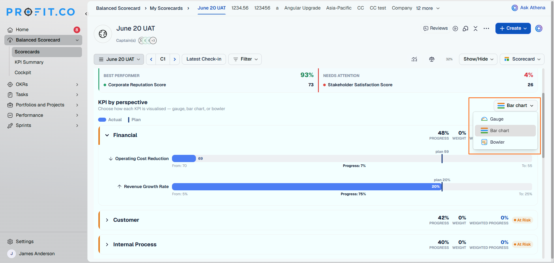
The Scorecard dashboard is a summary layer on the Balanced Scorecard page, built from two widgets: an Overall progress gauge that summarizes every Perspective in the scorecard, and a KPI by Perspective widget with a visualization dropdown you can switch between Gauge, Bar Chart, and Bowler.
This dashboard doesn't replace the existing detailed list. The list still appears below the widgets, unchanged, so the summary and the full breakdown live on the same page.
Why Does the Scorecard Dashboard Matter?
Previously, gauging a scorecard's overall health meant scanning every Perspective row individually, since no aggregate view existed. The Overall progress gauge now surfaces that status the moment the page opens, with no scrolling required.
Reviewers can also switch the KPI by Perspective widget between Gauge, Bar Chart, and Bowler, since the same performance data reads more clearly as a bar chart for some reviewers and a bowler chart for others. Both the summary and the detailed list stay on one page, so nobody has to open a separate view to reconcile the two.
How Does the Scorecard Dashboard Work?
Step 1: Open a Scorecard
- Navigate to Balanced Scorecard → Scorecards.
- Open the scorecard you want to review.
- Choose the Dashboard option.
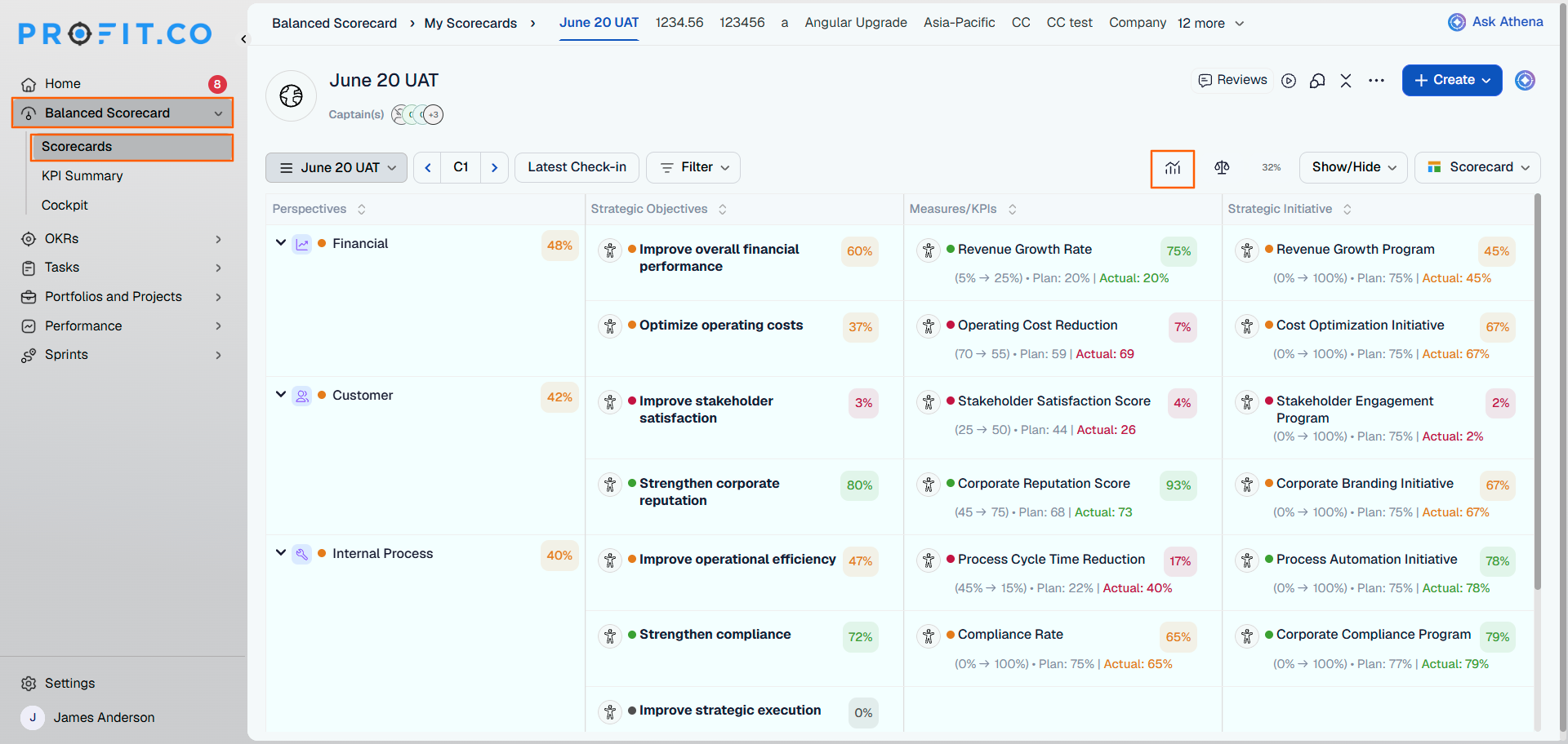
Step 2: Check the Overall Progress Gauge
- Look at the gauge at the top of the page.
- Read the summarized progress across every Perspective in the scorecard.
Step 3: Switch the KPI by Perspective Visualization
- Find the KPI by Perspective widget.
- Open the visualization dropdown.
- Select Gauge, Bar Chart, or Bowler.
Note
The KPI by Perspective widget opens in Gauge view by default until you change it.
Step 4: Scroll to the Detailed List
- Scroll down past the dashboard widgets to reach the detailed list view.
What Happens When You Use the Scorecard Dashboard?
| Scenario | What Happens |
|---|---|
| You open a scorecard for the first time after this update. | Profit.co displays the Overall progress gauge and the KPI by Perspective widget, set to Gauge, above the existing detailed list. |
| You switch the KPI by Perspective visualization to Bar Chart or Bowler. | Profit.co updates only your own view; other users viewing the same scorecard keep seeing their own selected or default visualization. |
| You switch the visualization type. | Profit.co changes only how the KPI data is displayed; it does not change any underlying progress, target, or KPI values. |
| You scroll past the dashboard widgets. | Profit.co shows the detailed list view exactly as it appeared before this update, with no changes to its layout or data. |
What Are the Best Practices for the Scorecard Dashboard?
- Check the Overall progress gauge first before opening any Perspective row, since it already reflects the aggregate status you'd otherwise have to calculate manually.
- Pick Bar Chart or Bowler when you need to compare KPI performance across Perspectives at a glance. Gauge suits reading one aggregate number at a time.
- Remember your visualization choice is personal to your own view, so don't expect a Bar Chart selection to show up when a colleague opens the same scorecard.
- Use the dashboard for the summary and the detailed list beneath it for root-cause investigation, since the list still holds the full underlying data unchanged.
Related Articles
What Are Some Frequently Asked Questions About the Scorecard Dashboard?
No. It sits above the list, which still appears below the widgets exactly as before.
It summarizes all Perspectives in the scorecard as a single aggregate gauge, not any one Perspective on its own.
No. The visualization dropdown is available to anyone who can open the scorecard, since switching it only changes your own display.
Execute your strategy with confidence
Connect OKRs, tasks, and teams in one place with Profit.co
