
Release Highlights
A quick-glance summary of all features shipped in this release. Click any feature to jump to the full detail below.
| STRATEGY (Strategy Roadmaps, Balanced Scorecard, OKR Management, Hoshin Kanri) | ||
|---|---|---|
| S.No | Feature Name | Key Benefit |
| 1. | Custom order in OKR list view | Manual order is now saved permanently and returns exactly as you left it, even after sorting by Name, Period, or Progress. Users can drag to reorder and sort in the same flow without choosing one over the other. |
| 2. | Bowler Chart access for the Standard User role | Standard Users can now see the same Bowler Chart visualization their leads and admins use, and new team members land on the standardized view automatically with no per-user setup needed. |
| 3. | Colour-coded progress for Perspectives in Scorecard List view | Perspective rows in the Scorecard List view now display progress inside a colour-coded badge matching Objectives and Key Results, so at-risk areas are visible without opening each Objective individually. |
| 4. | Health status rollup for nested OKR hierarchies | An at-risk key result several levels down now surfaces on the top-level objective's progress bar, and clicking a coloured segment shows exactly which key results are driving it, with no manual tree-walk needed before a review. |
| 5. | Export as CSV for Following OKRs | Users can export their Following OKRs list as a CSV, choosing All Fields, Current View, or a Custom Selection, and revisit past exports anytime from Export History in the same menu. |
| 6. | Default landing view for OKRs | Admins can set any of the eight OKR views, including Bowler Chart, as the default landing view so the whole team opens the right format every session instead of switching from List each time. |
| 7. | Hierarchy depth selection for OKR Progress Presentations | Users can choose the hierarchy depth (Objectives only, with Key Results, or with Child Objectives) at the point of presenting or downloading, without needing a Super User to change a default under Settings. |
| 8. | Auto-pin OKR views to the sidebar with a set landing page | Admins can pin any OKR entity to the sidebar for all applicable users and set exactly which view it opens to, so the whole team reaches their most-used OKR view in one click from anywhere in the app. |
| 9. | Scorecard dashboard with configurable widgets | The Balanced Scorecard page now includes an at-a-glance dashboard with an overall progress gauge and a KPI-by-Perspective widget switchable between Gauge, Bar Chart, and Bowler views, with no need to leave the scorecard for both summary and detail. |
| 10. | Sub-department inheritance for access and ownership | Adding a parent department to an Objective's Access List now automatically extends the same access to all its sub-departments, replacing the need to add each one individually. |
| 11. | Configurable row actions for the List view | Admins can now control which actions appear on hover and in the More menu for List view rows, enabling faster check-ins on hover or hiding actions the team never uses, with changes applying org-wide immediately. |
| 12. | Filtered count shown as "X of Y" in Balanced Scorecard | When a filter is applied on the Balanced Scorecard, each Perspective's summary counts now display as X of Y, showing how many items match the filter out of the full total, so a filtered view is never mistaken for the full set. |
| 13. | Exact match option for period filters | Selecting any period in the filter now returns only items explicitly assigned to that period: Annual shows only Annual items, 1/2026 shows only 1/2026 items, eliminating unrelated results caused by date-range overlap. |
| PROJECTS (Task Management, Portfolios and Projects, Timesheets, Notes, and Meetings) | ||
|---|---|---|
| S.No | Feature Name | Key Benefit |
| 1. | Approval flow for task completion | Marking a task done can now be sent for the creator's review before it closes, so important work gets checked before it is officially complete, with every request, approval, and rejection logged with who did it and when. |
| 2. | Project and task health based on dependencies | A task's health now reflects the status of everything it depends on, so a project can no longer look on track while blocked work underneath is actually delayed, and the specific blocking task and owner are identified directly. |
| 3. | Alignment view for subtasks in task overview | Subtasks can now be viewed as a connected hierarchy directly from the task overview page by switching to Alignment view, so the full structure of a task's work is visible without navigating to a separate screen. |
| 4. | Alignment view for task dependencies | Tasks now have their own dependency graph, available at workspace, board, or project scope, showing all task connections at once so you can see what is blocking what without opening each task individually. |
| 5. | Manual progress updates now off by default | Project progress is now always calculated automatically from milestone and task completion by default, with manual overrides controlled by a deliberate Super User setting rather than being available to anyone on a project. |
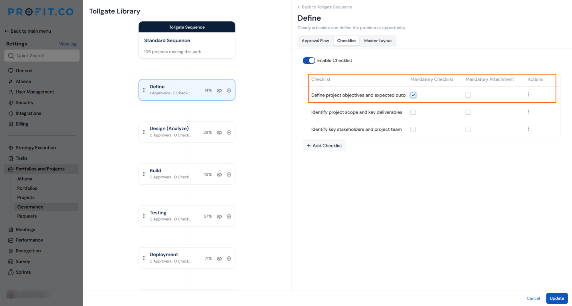
| 6. | Mandatory checklist items on tollgate stages | Admins can now mark specific checklist items as mandatory, blocking stage submission until they are complete, and require file attachments on any item independently, so stages cannot be skipped and proof is captured at the source. |
| 7. | Task descriptions and custom fields in project templates | Descriptions and custom fields defined on tasks and milestones in a project template now carry over automatically to every project created from it, replacing the need to rebuild the same details project by project. |
| 8. | Sub-projects visible in the portfolio hierarchy | Sub-projects now appear nested under their parent project on the portfolio overview, and the project count always matches the Active Projects figure, so the number shown and what is visible on screen finally agree. |
| 9. | Include sub-levels in Portfolio Cockpit widgets | A new per-widget toggle lets admins roll up projects from every sub-portfolio beneath the selected one, so a parent portfolio that organises work through sub-portfolios shows its full picture instead of appearing empty. |
| 10. | Add and move existing portfolios in the hierarchy | An existing portfolio, along with everything nested beneath it, can now be associated as a sub-portfolio or relocated to a different parent in a single action, with every move confirmed up front and logged afterward. |
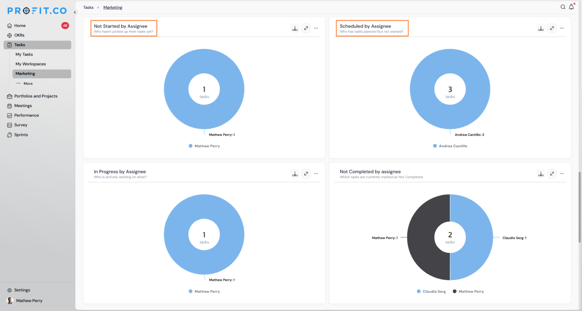
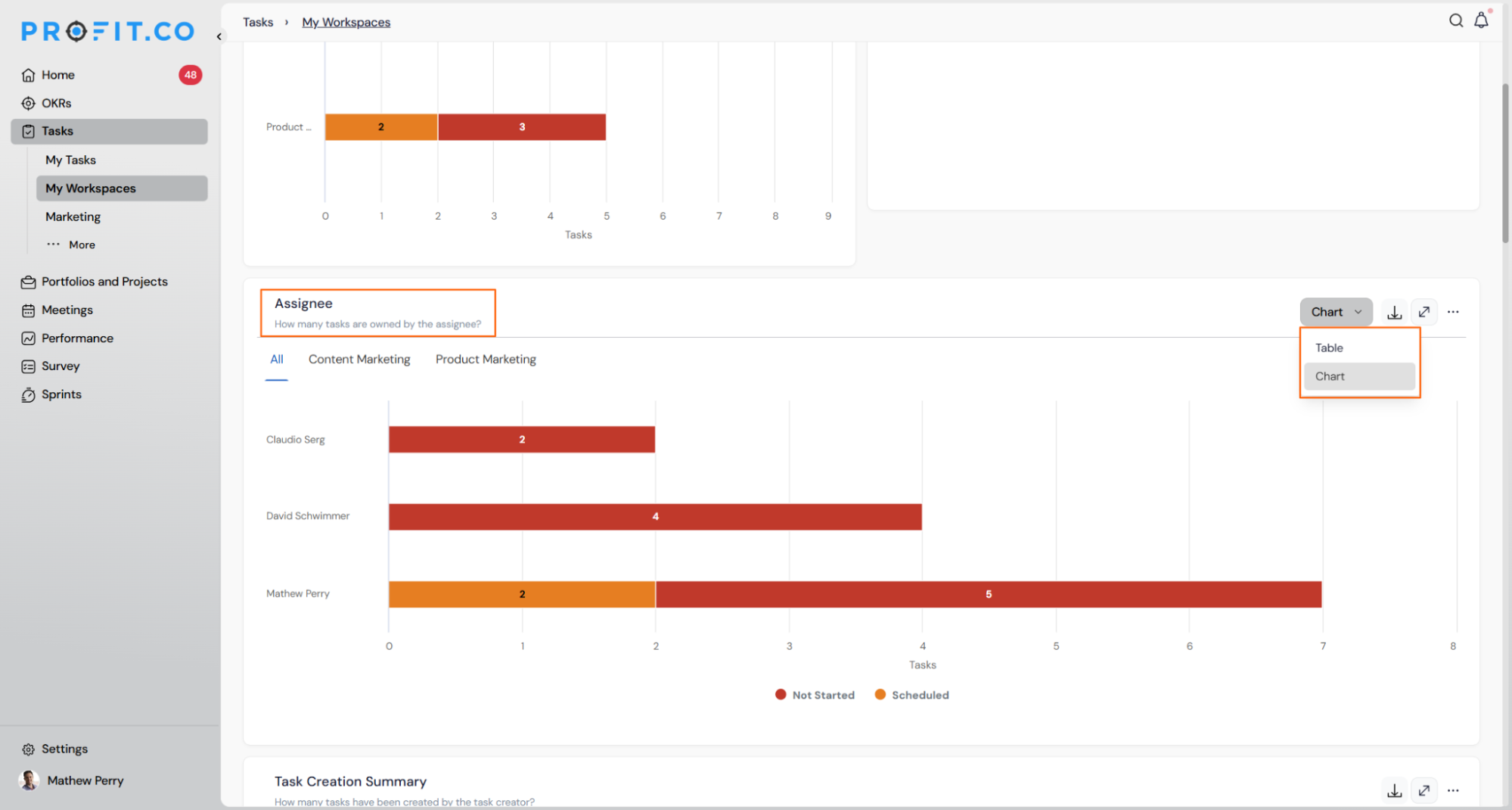
| 11. | Activity dashboard widgets for tasks | Four new dashboard widgets show task distribution by status and by assignee across to-do, in-progress, and completed work, with one click on any chart segment opening the exact tasks behind it, no separate filter needed. |
| Enhancements | ||
| 12. | Consistent alignment on the project overview page | Section headers, KPI rows, milestones, and the Project Information panel follow one consistent left-aligned layout, with no change to fields or behaviour. |
| PERFORMANCE (Performance, Goals, Development Plans, Recognition, Survey) | ||
|---|---|---|
| S.No | Feature Name | Key Benefit |
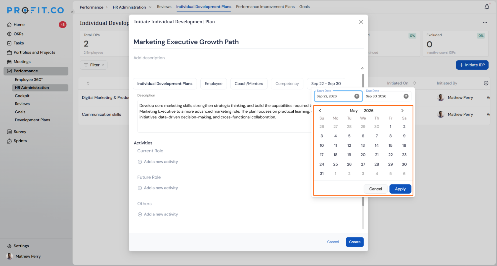
| 1. | Initiate IDPs and PIPs for past periods | Development and improvement plans can now be initiated for a past period, not just the current or a future one, with a clear flag distinguishing backdated plans from those created in real time, keeping audit and reporting records accurate. |
STRATEGY (Strategy Roadmaps, Balanced Scorecard, OKR Management, Hoshin Kanri)
1. Custom order in OKR list view
Overview
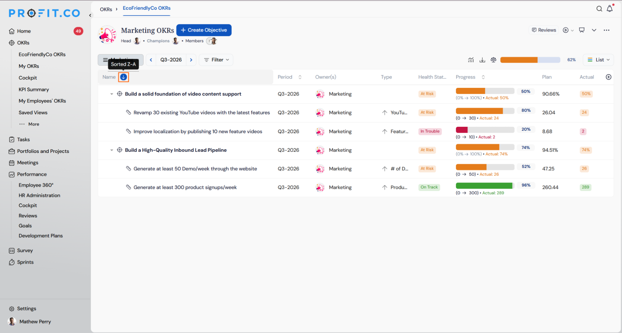
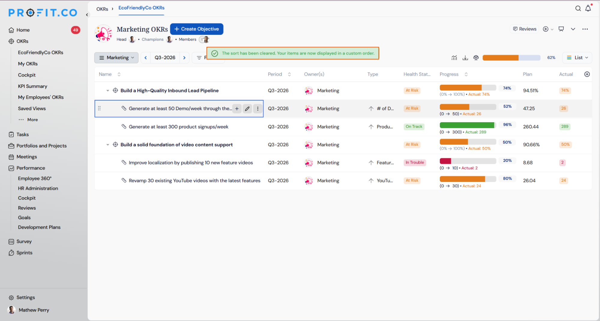
Users can now drag and drop objectives and key results into any order, even while a column sort is applied, and that arrangement is saved as a new Custom order option in the sort control. Previously, applying a sort disabled drag-and-drop entirely, and any manual arrangement was discarded as soon as a sort was applied. This applies across My OKRs, department OKR pages, and Saved Views.
How It Works
- Navigate to any OKR list view (My OKRs, a department's OKRs, or a Saved View)
- Apply a column sort as usual, then drag a row into the position you want
- Confirm the prompt that appears the first time in a session — it names the sort being cleared and notes the order is saved just for you
- Select Don't ask me again to skip this prompt for the rest of the session
- The sort control switches to a new Custom order option, and your arrangement is saved
Why It Matters
- No more lost arrangements: Manual order is now saved permanently and returns exactly as you left it, even after sorting by Name, Period, or Progress.
- Sort and reorder in the same flow: Sort to find the row you need, then drag it into place — no more choosing between sorting and manual ordering.
- Mistake-proof reordering: Every reorder can be undone immediately from the confirmation message, so a misplaced row is never permanent.
2. Bowler Chart access for the Standard User role
Overview
The Bowler Chart view can now be made available to users with the Standard User role and set as their default OKR view. Previously, Bowler Chart was visible only to Super User and Admin roles, so most Standard Users on a team could never open a view their organization had standardized on. This is configured at the account or org-unit level by your Profit.co account team, not a self-service toggle.
How It Works
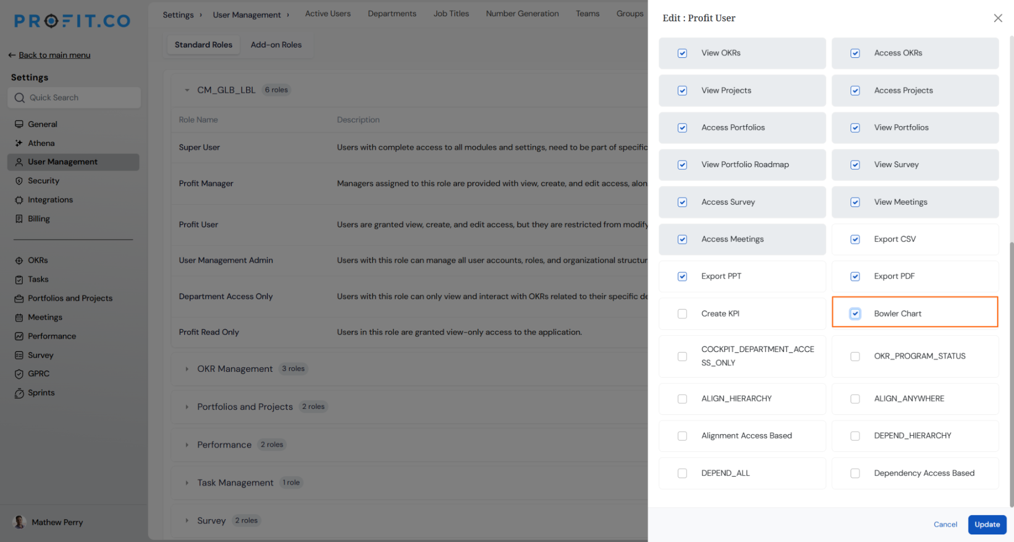
- Navigate to Settings → User Management → Roles from the left panel
- Select the BSC Admin, OKR User, OKR Admin, Profit User, or Profit Manager role
- Bowler Chart now appears as an available permission for these roles, alongside the existing view options
- Once enabled for a role, Bowler Chart appears as a selectable option in the OKR view switcher for users with that role, alongside List, Gantt, Canvas, Alignments, Status Map, Heatmap, and Hierarchy
- Users can still switch to any other view at any time; nothing is removed from the switcher
Why It Matters
- One view for the whole team: Standard Users can now see the same Bowler Chart visualization their leads and admins use, instead of being limited to other views.
- No manual setup per user: New team members land on the standardized view automatically, removing the need to configure it individually for every hire.
- Nothing lost in the switch: Every existing view stays available, so teams that prefer List or Gantt for specific tasks can still reach them in one click.
3. Colour-coded progress for Perspectives in Scorecard List view
Overview
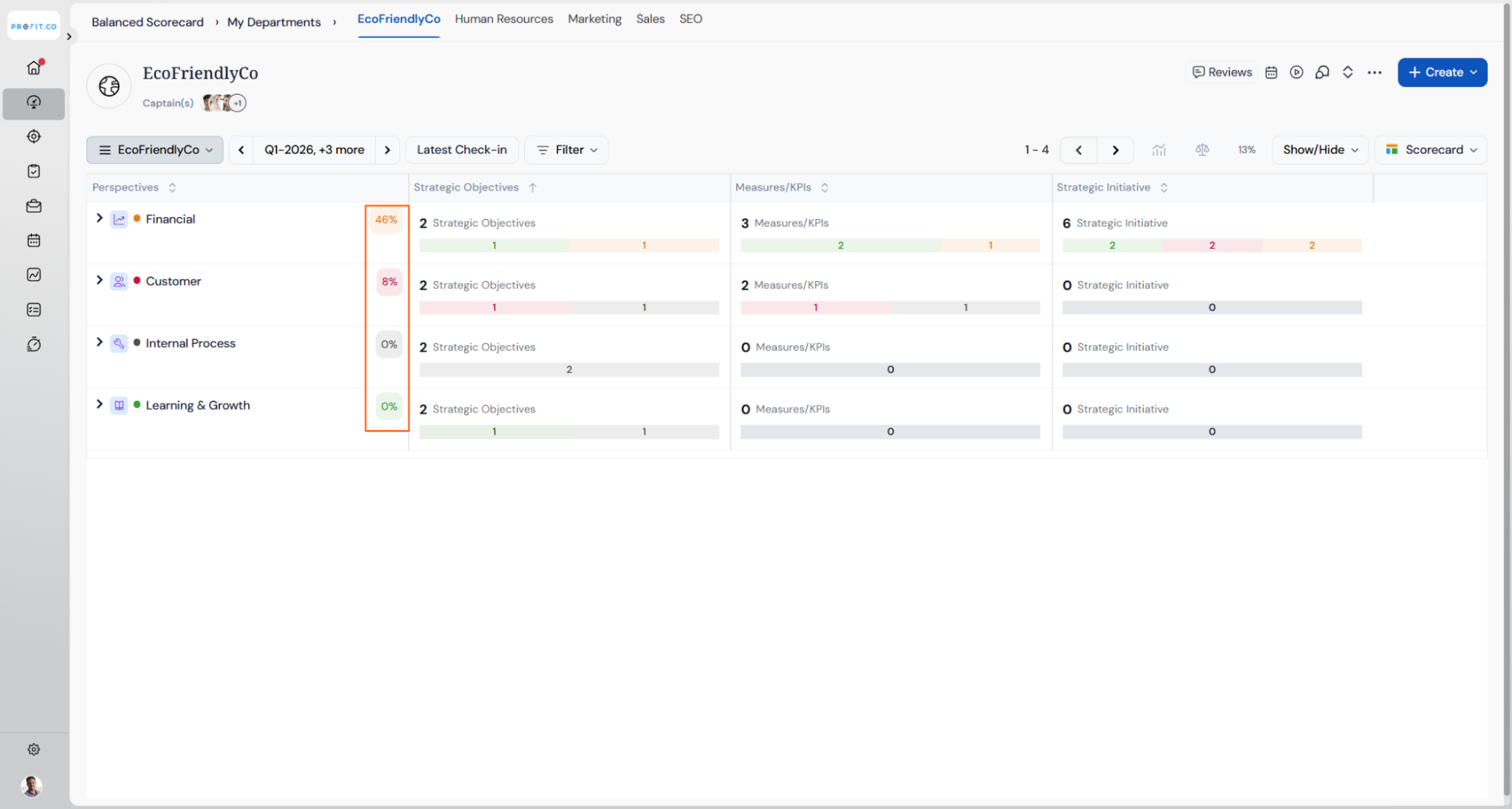
Perspectives in the Scorecard List view now display their progress percentage inside a colour-coded badge, matching the treatment already used for Objectives and Key Results. Previously, Perspective rows showed only plain text for progress, making it harder to scan a scorecard for at-risk areas without opening each Objective individually. Perspectives with no tagged Objectives, or none with logged progress, render in a neutral state rather than a misleading colour.
How It Works
- Navigate to Balanced Scorecard → List View
- Each Perspective row now shows its progress percentage inside a colour badge, matching the Objective and Key Result rows beneath it
- If a Perspective has no tagged Objectives, or none with progress logged yet, it renders in a neutral, uncoloured state instead of a false status colour
- The badge updates automatically whenever the Perspective's average progress changes, the same way Objective and Key Result badges already refresh
- Existing Tag pills on the row are unaffected; the new badge sits alongside them without crowding
- Tree/Hierarchy view is unchanged, since it already showed this colour coding
Why It Matters
- Faster status triage: Spot at-risk Perspectives at a glance without opening every Objective underneath them.
- Consistent visual language: List view now matches Tree view and the existing Objective/Key Result badges, so the same colour always means the same thing.
- No false signals: Perspectives with no data render neutrally instead of appearing falsely off-track.
4. Health status rollup for nested OKR hierarchies
Overview
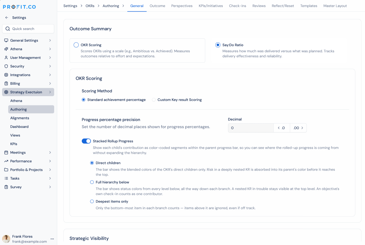
The progress bar on an objective can now show status colors rolled up from every level of its hierarchy, not just its immediate children. A new Health Status Rollup setting lets admins choose between the existing "Immediate children" view and a new "Deepest check-in level" view, which surfaces at-risk key results from deep in a hierarchy directly on the top-level objective's bar. Clicking a colored segment in Deepest mode opens a breakdown of exactly which key results are contributing to it.
How It Works
- Navigate to Settings → OKRs → Planning →Outcome
- Under Outcomes, find the Stacked Rollup Progress setting and choose Direct children (current behavior) or Full hierarchy to roll up colors from every level
- With Full hierarchy selected, you can also enable Show contributing KRs on click to allow drilldown from any colored segment
- Direct children – only immediate KRs.
- Full hierarchy below – all items at every level.
- Deepest items only – only the bottom-most items in each branch.
- With Full hierarchy selected, you can also enable Show contributing KRs on click to allow drilldown from any colored segment
- On the OKR list page, each objective's bar now reflects the selected rollup mode
- Click any colored segment on a bar (in Full hierarchy mode) to see the contributing key results, with their path, actual value, and contribution to that segment
- Click the progress percentage on any objective to open the Progress & Health pop-up, which shows both the progress calculation and how the color split was derived
Why It Matters
- Nested risk is no longer hidden: An at-risk key result several levels down now shows up on the top-level objective's bar, so leaders don't have to manually walk the tree before a review.
- One click to the source: Clicking a red or yellow segment shows exactly which key results are driving it, removing guesswork during status reviews.
- Progress numbers stay unchanged: Switching rollup modes only changes how colors are displayed. The underlying progress percentage is calculated exactly as before.
5. Export as CSV for Following OKRs
Overview
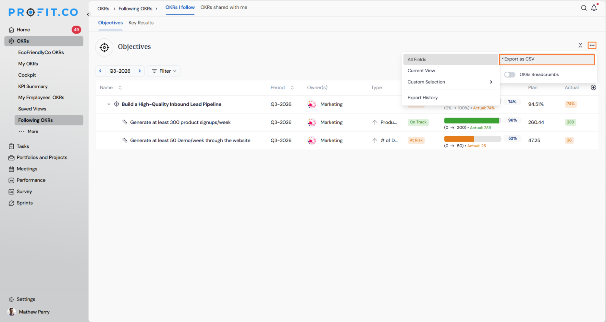
Users can now export their Following OKRs list as a CSV file directly from the Objectives view. This makes it easy to pull OKR data you're tracking into a spreadsheet for offline review or reporting, without needing to open each objective individually.
How It Works
- Navigate to OKRs → Following OKRs → Objectives tab
- Click the … menu in the top-right corner
- Select Export as CSV
- Choose to export All Fields, the Current View, or a Custom Selection of fields
- The exported file downloads with the objectives and key results currently listed on the page
- Past exports can be reviewed anytime from Export History in the same menu
Why It Matters
- Take your data anywhere: Export the OKRs you follow into a spreadsheet for offline analysis or sharing outside Profit.co.
- Control what you export: Choose between all fields, your current view, or a custom set of columns, instead of exporting everything by default.
- Track past exports: Export History keeps a record of previous downloads, so you don't have to guess whether you already pulled the latest data.
6. Default landing view for OKRs
Overview
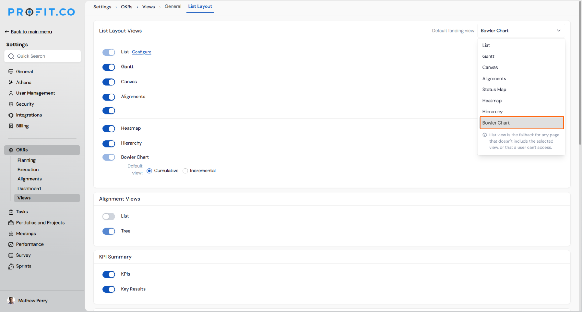
Admins can now set which OKR view format loads by default when users open the OKRs module, instead of always starting on List view. Any of the eight available views, including List, Gantt, Canvas, Alignments, Status Map, Heatmap, Hierarchy, or Bowler Chart, can be set as the default landing view. List view remains the fallback for any page that doesn't include the selected view, or that a user can't access.
How It Works
- Navigate to Settings → OKRs → Views → List Layout
- Use the Default landing view dropdown in the top right to select which view loads first
- Toggle individual views on or off in the list below to control which formats are available to users at all
- Users retain the ability to switch to any other enabled view from within OKRs at any time
Why It Matters
- Match the default to how your team works: Standardize on the view your team already relies on, such as Bowler Chart for Plan/Actual tracking, instead of everyone landing on List every session.
- No repeated manual switching: Removes the need for users to manually switch views every time they open OKRs.
- Nothing lost in the switch: Every enabled view remains one click away, so users can still move between formats as needed.
7. Hierarchy depth selection for OKR Progress Presentations
Overview
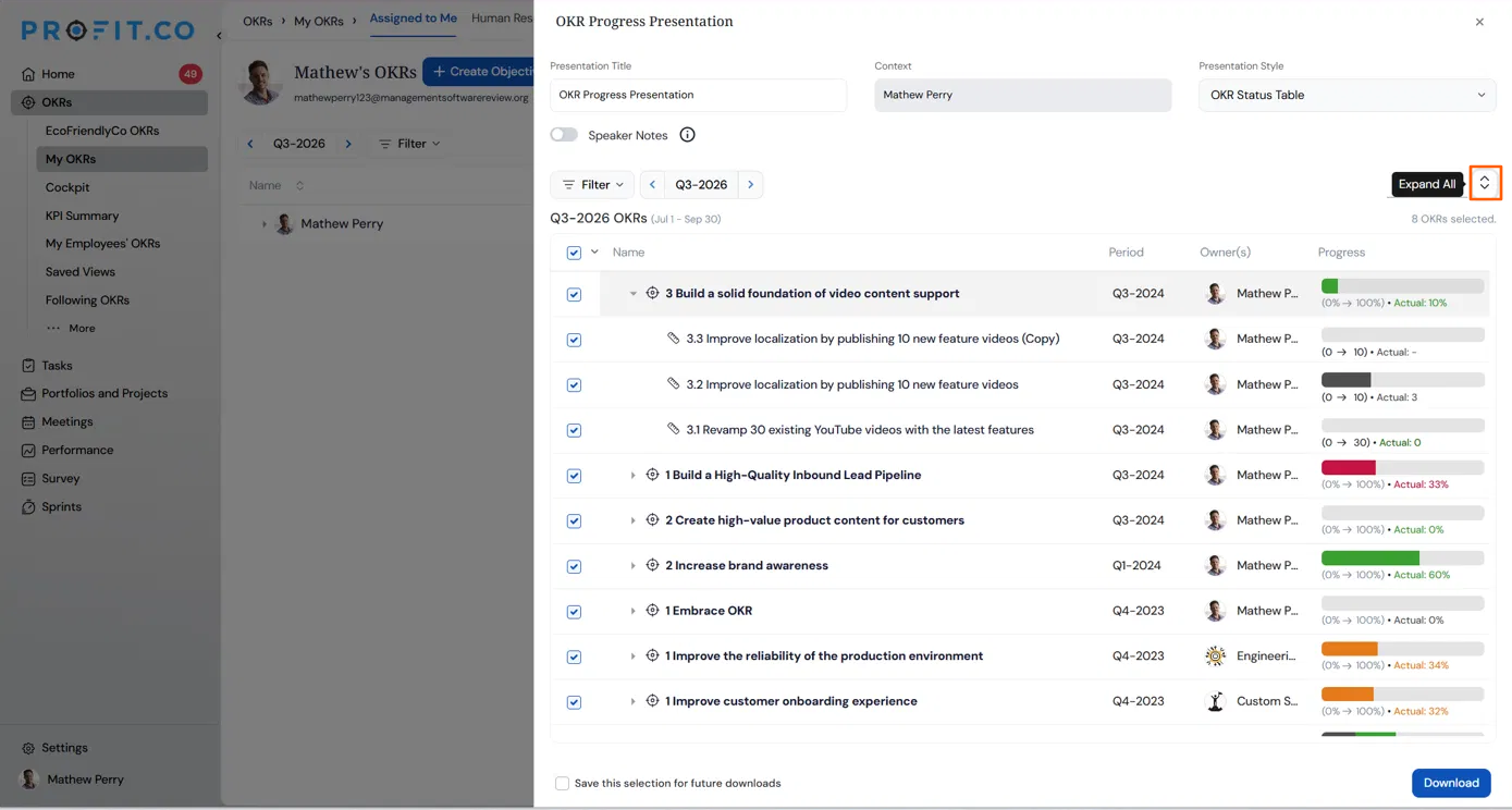
Users can now choose how many levels of the OKR hierarchy to include when generating an OKR Progress Presentation, directly at the point of presenting or downloading. Previously, the hierarchy depth was fixed by a default configuration that only a Super User could change under Settings, so every user was stuck with the same level of detail regardless of their audience.
How It Works
- Navigate to OKRs, select the OKRs you want to include, and open Present or Download
- In the OKR Progress Presentation panel, choose the hierarchy depth for this presentation: Objectives only, Objectives + Key Results, or Objectives + Key Results + Child Objectives
- The selected OKRs in the preview list adjust to show only the chosen levels
- If no depth is selected, the presentation uses the existing Settings-level default configured by a Super User
- Select Download to generate the presentation at the chosen depth
Why It Matters
- Tailor each presentation to its audience: Show just Objectives for a leadership update, or the full Objectives, Key Results, and Child Objectives breakdown for a detailed team review, without changing any settings.
- No Super User dependency: Any user can adjust the hierarchy depth at download time instead of asking a Super User to change the default under Settings.
- Clean layout at every depth: The presentation adjusts to the selected depth so content isn't cut off or cluttered, regardless of how much detail is included.
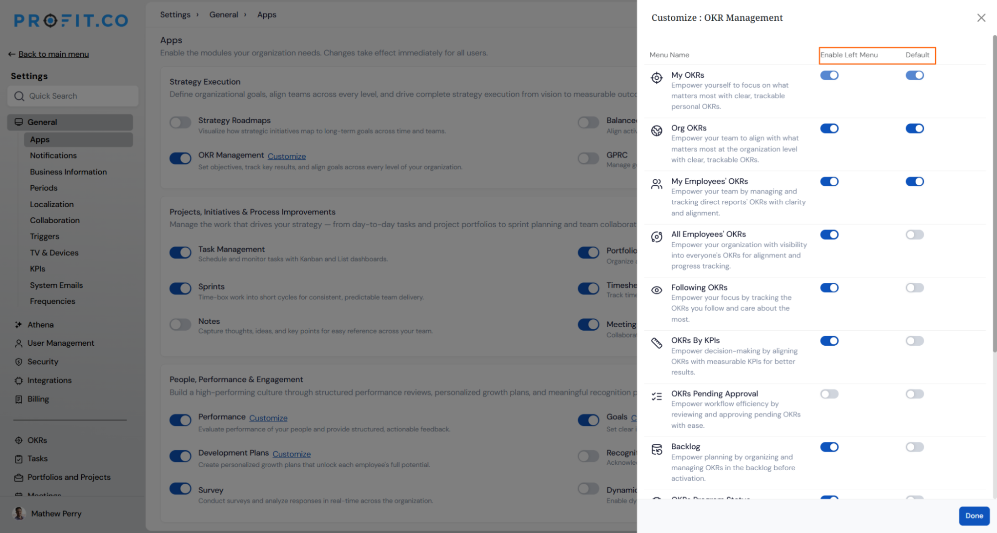
8. Auto-pin OKR views to the sidebar with a set landing page
Overview
Admins can now pin any OKR entity to the sidebar for all applicable users, and set exactly which view it opens to. Previously, users had to manually navigate through the module tree to reach frequently used OKR views, with no persistent shortcut and no consistent destination when clicking into that entity from elsewhere in the app.
How It Works
- Navigate to Settings → General → Apps → OKR Management → Customize
- Find the OKR entity you want to configure and turn on Enable
- Turn on Default (Auto Pinned) to place the entity permanently in the sidebar for every applicable user, with no individual setup needed
- Set the entity's landing page to the specific OKR view it should open to
- Users now see the entity pinned in their sidebar from any module, and clicking it always navigates to the configured view
Why It Matters
- One click from anywhere: Users can jump straight to the OKR view that matters most to them, no matter which module they're currently working in.
- No manual navigation: Removes the need to click through the OKR tree every time a user wants to check a specific view.
- Consistent for the whole team: Once configured, every applicable user sees the same sidebar entry and lands on the same view, with no per-user setup required.
9. Scorecard dashboard with configurable widgets
Overview
The Balanced Scorecard page now includes a dashboard view with configurable widgets, giving an at-a-glance summary of scorecard performance above the detailed list. This includes an overall progress gauge and a KPI-by-perspective widget, where the visualization type can be changed to match how you prefer to review the data.
How It Works
- Navigate to Balanced Scorecard → Scorecards and open a scorecard
- The dashboard at the top shows an Overall progress gauge summarizing all Perspectives
- Under KPI by Perspective, use the visualization dropdown (currently set to Gauge) to switch between Gauge, Bar Chart, or Bowler views
- Scroll down to see the detailed list view, unchanged, below the dashboard widgets
Why It Matters
- Instant overall status: See the scorecard's overall progress without scanning through every Perspective row.
- Choose the visualization that fits you: Switch between gauge, bar chart, or bowler views for KPI data, depending on what's easiest to read for your review.
- Dashboard and detail in one place: No need to leave the scorecard page to get both a summary and the full breakdow
10. Sub-department inheritance for access and ownership
Overview
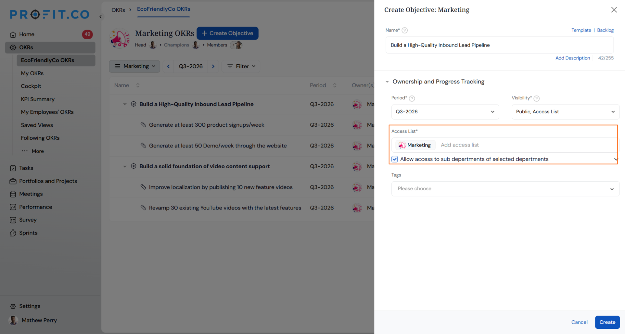
When creating or editing an Objective, adding a parent department to the Access List now automatically extends the same access to all of its sub-departments, instead of requiring each sub-department to be added individually. This is controlled by a new checkbox so it can still be turned off when access should stay limited to the selected department only.
How It Works
- Navigate to OKRs and select Create Objective (or edit an existing one)
- Add a department to the Access List
- The Allow access to sub departments of selected departments checkbox is checked by default, extending access to every sub-department under the ones you've added
- Uncheck it if you want access limited strictly to the departments you've selected
Why It Matters
- No more manual sub-department entry: Adding a parent department covers its full hierarchy automatically, instead of listing every sub-department by hand.
- Consistent visibility across the org: Users in sub-departments get the same access as their parent department without extra setup.
- Still flexible: The behavior can be turned off for cases where access should be scoped narrowly.
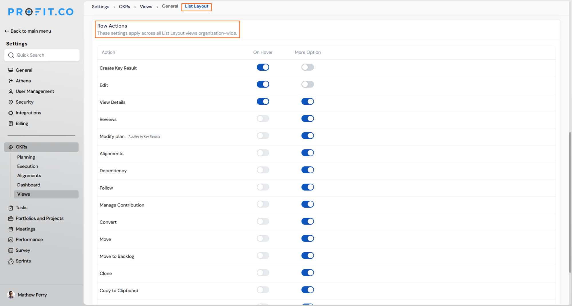
11. Configurable row actions for the List view
Overview
Admins can now control which actions appear on List view rows, both on hover and in the More menu, instead of every account seeing the same fixed set. This makes it possible to enable actions like Check-in directly on hover for faster access, or trim actions an org never uses to keep rows clean. Existing accounts see no change until an admin opens this setting, since the shipped default reproduces today's behavior exactly.
How It Works
- Navigate to Settings → Strategy Execution → Views → List Layout → Row Actions
- For each action (Create, Edit, Check-in, Alignment, Move, Clone, Delete, and others), toggle On Hover and/or More Option on or off
- Turning on On Hover for an action automatically turns on More Option for it too, since hover is a shortcut into the fuller menu
- At least one action must always stay enabled in More Option, so a row is never left with no available actions
- Key result-only actions like Check-in are automatically hidden on objective rows, even if enabled in the matrix
- Changes apply immediately, org-wide, with no refresh or re-login needed
Why It Matters
- Faster check-ins: Turn on Check-in for hover access, so users can check in on a key result directly from the List view without opening it.
- A cleaner view for your org: Hide actions your team never uses instead of scrolling past every action Profit.co has ever shipped.
- Nothing breaks by default: Existing accounts keep their current row behavior automatically until an admin chooses to change it.
12. Filtered count shown as "X of Y" in Balanced Scorecard
Overview
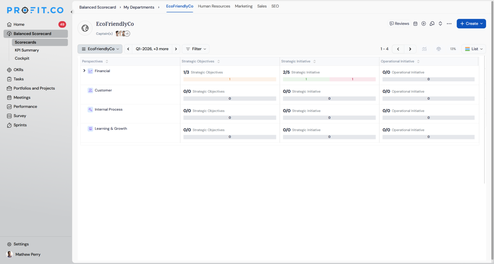
When a filter is applied on the Balanced Scorecard, the summary count for each Perspective now shows both the filtered count and the total count, in "X of Y" format, instead of showing only the filtered number. This makes it clear at a glance how many items match the filter relative to the full set, without needing to clear the filter to check.
How It Works
- Navigate to Balanced Scorecard → Scorecards and open a scorecard
- Apply a filter (for example, filtering to At Risk items)
- Each Perspective's summary counts (Strategic Objectives, Strategic Initiative, Operational Initiative) now display as X of Y, where X is the filtered count and Y is the total count
- Clear the filter to return to viewing full totals as before
Why It Matters
- Context without extra clicks: See how many items match your filter out of the total, without switching back and forth to check.
- Clearer filtered views: Removes the ambiguity of a lone number that could be mistaken for the full count.
- Consistent across Perspectives: Every Perspective row shows the same X of Y format, so scanning a filtered scorecard stays easy.
13. Exact match option for period filters
Overview
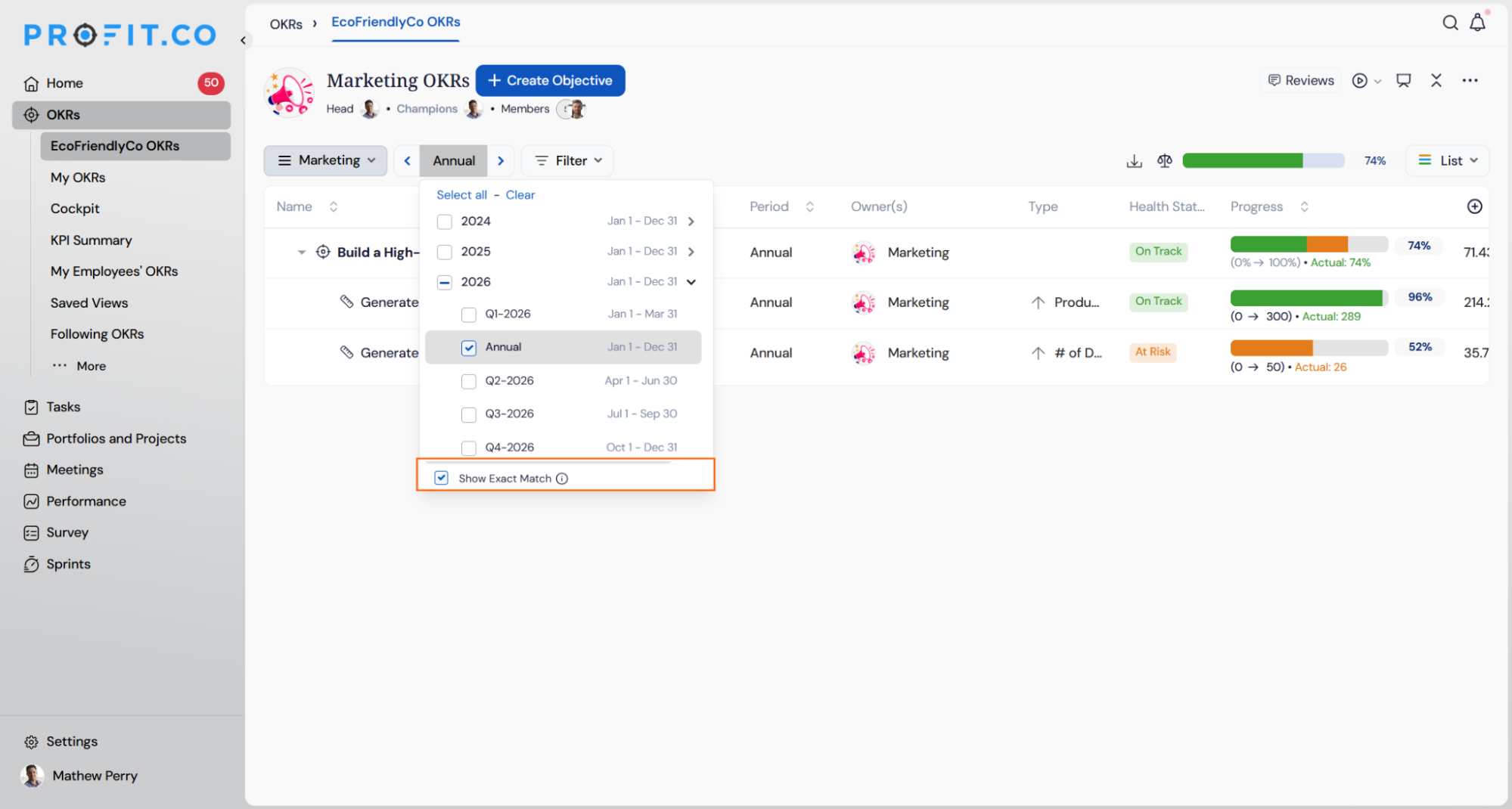
Users can now filter OKRs to show only the objectives and key results assigned to the exact period they select. Previously, selecting an annual period such as 2026 also returned items set to quarters within that year, which made it hard to isolate annual goals. With Show Exact Match turned on, each period selection returns only the items configured for that specific period.
How It Works
- Navigate to OKRs and open any OKR list, such as a department's OKRs.
- Click the period selector next to the view dropdown to open the period list.
- Select one or more periods, such as 2026 or Q3-2026.
- Check Show Exact Match at the bottom of the list.
- When checked, only OKRs assigned to the selected period appear. Selecting 2026 shows annual OKRs only, not items set to Q1-2026 or Q2-2026.
- When unchecked, the filter works as before and includes all OKRs whose period falls within the selected timeframe.
- Custom periods appear as separate entries in the list and follow the same exact-match rule.
Why It Matters
- Clear view of annual goals: Leaders can review year-level objectives on their own, without quarterly items crowding the list.
- Accurate period-specific reviews: Each filter returns only what was planned for that period, so quarterly and annual check-ins reflect the right set of goals.
- Choice between both views: Users can switch between exact-match results and the full rolled-up view with a single checkbox.
PROJECTS (Task Management, Portfolios and Projects, Timesheets, Notes, and Meetings)
1. Approval flow for task completion
Overview
Marking a task as done can now be sent for review instead of closing the task right away. When this is switched on, a task doesn't move to Completed the moment someone marks it done. It waits for the task creator to approve it first. This gives teams a way to check finished work before it's officially closed, instead of relying on someone remembering to check it separately.
How It Works
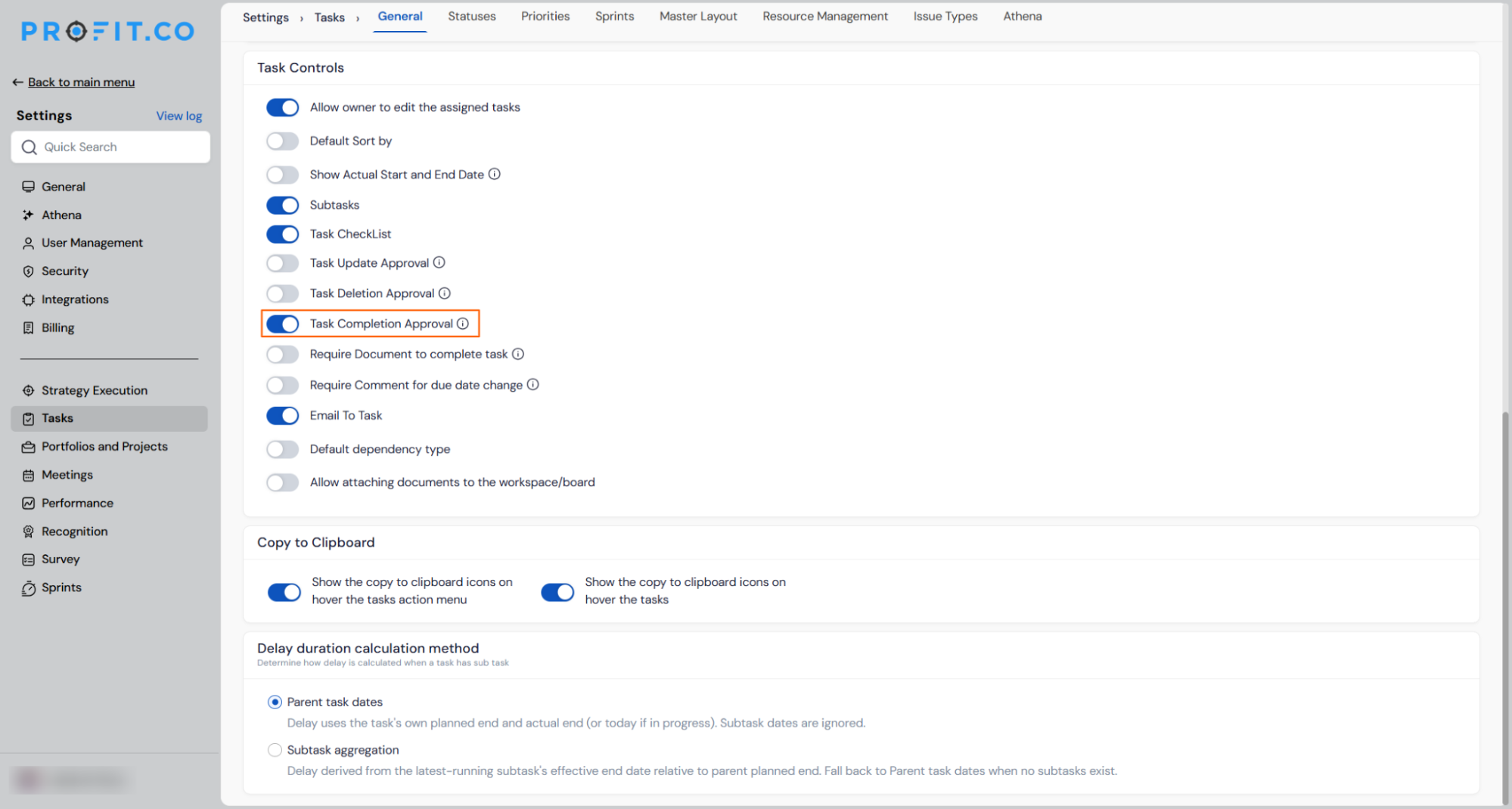
- Go to Settings → Tasks → Task Controls and turn on Task Completion Approval. This sits next to the existing Task Update Approval and Task Deletion Approval settings, and it applies to all tasks and boards.
- When someone marks a task complete (from the task card, the list, or anywhere else), they see a confirmation asking them to send it for approval. Once confirmed, the task shows as "Pending approval sent to [creator's name]" instead of moving to Completed.
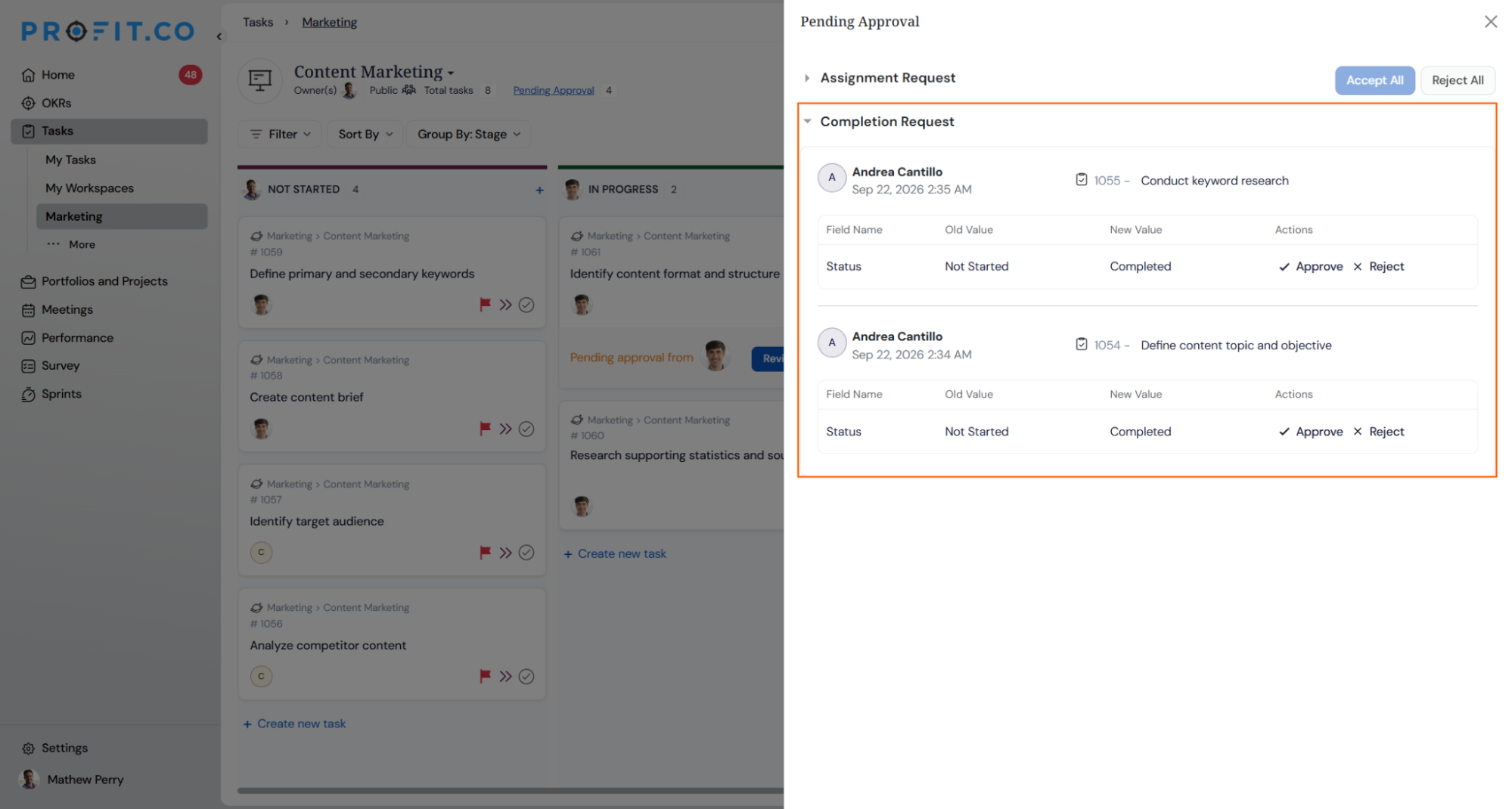
- The task creator sees the request in their Pending Approval list, alongside similar update and deletion requests. They can Approve it, which completes the task, or Reject it, which sends it back with a comment explaining why.
- Creators can also approve or reject several requests at once using Approve All or Reject All.
- Moving a task between other statuses (like Scheduled to In Progress) is unaffected. Approval is only needed to mark something Completed.
- Only people with the right task permissions can send a task for approval or complete one, even if they're the task creator.
- If a task also requires an attached document before it can be completed, that check happens first, before the approval step.
Why It Matters
- Nothing closes without a check: Important tasks get reviewed before they're marked done, instead of relying on informal follow-up.
- A clear record of who approved what: Every request, approval, and rejection is logged with who did it and when.
- One place to manage approvals: Completion requests appear alongside other approval types, so managers can clear everything from a single list.
2. Project and task health based on dependencies
Overview
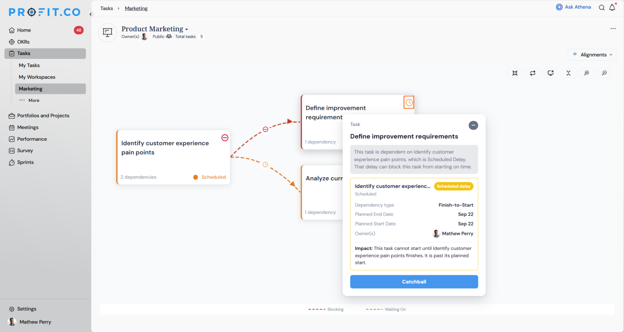
A task's status now takes into account whether it is waiting on something else. Before this, a task could look perfectly healthy even if the work it depended on was badly delayed, so a project could appear on track while parts of it were actually stuck. Now, if a task is being held up by another task, that shows up clearly, with a note explaining exactly which task is causing the delay.
How It Works
- A task's health is never better than the task it depends on. If the task it's waiting on is behind, this task shows as behind too.
- If a task depends on more than one other task, its health is based on the most delayed one, and that specific task is named.
- Some dependencies only care about whether the earlier task started on time. Others care about whether it has finished. Either way, the system checks the right thing automatically.
- Clicking on a flagged task opens a short explanation: what's wrong, which task is causing it, who owns that task, and the relevant dates.
- From there, users can message the person responsible without leaving the page. The message starts with the relevant details already filled in.
- This only affects a task's health status, not its stage (Not Started, In Progress, Completed, etc.), which still works exactly as before.
- Once the blocking task is finished, the delay flag clears and the task returns to a healthy status, even if the blocking task finished late.
Why It Matters
- No more hidden delays: A project can no longer look fine on the surface while work underneath is actually stuck.
- You know exactly who to follow up with: Instead of a vague warning, you see the specific task and person causing the delay.
- Faster resolution: You can reach out to the right person straight from the alert, without switching screens or digging for context.
3. Alignment view for subtasks in task overview
Overview
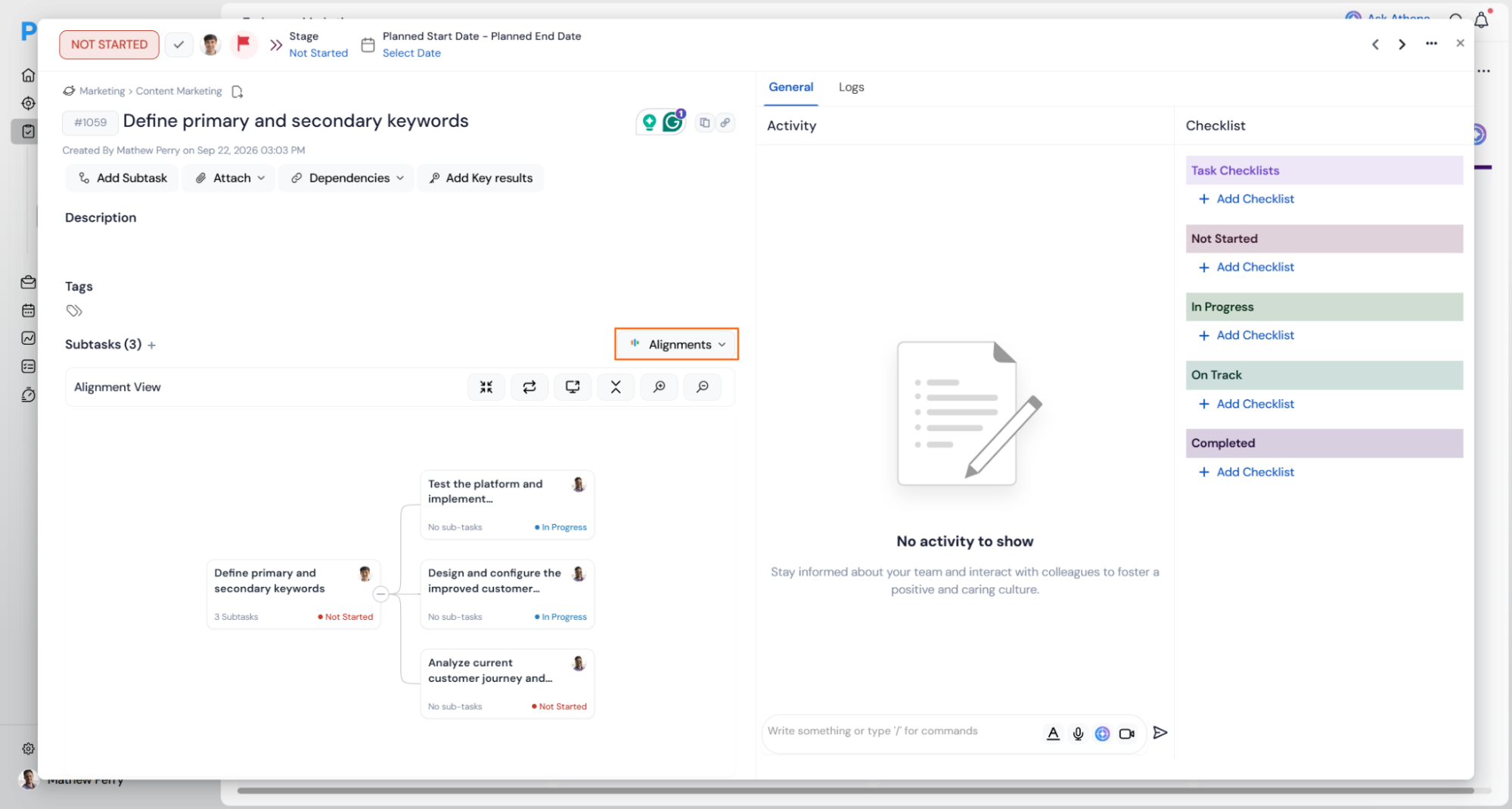
A task's subtasks can now be viewed as a visual hierarchy directly from the task overview page, alongside the existing list view. Previously, subtasks on a task were only shown as a flat list. Now, switching to Alignment view shows the same subtasks as connected cards branching from the parent task, making the structure easier to read at a glance without leaving the task.
How It Works
- Open any task with subtasks and go to its Subtasks section.
- Use the view dropdown, currently showing List, to switch to Alignment.
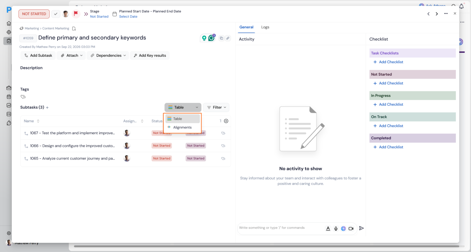
- The parent task appears at the top, with each subtask shown as its own card branching beneath it, along with its status, owner, and its own sub-task count if it has one.
- A Show Parents toggle can be switched on to also display the task's own parent context above it, if relevant.
- A Filter control narrows which subtasks are shown in the view.
- Cards can be expanded to reveal further nested sub-tasks beneath them, using the + control on each card.
- A Full view option opens the alignment view in an expanded layout for a clearer read on tasks with several subtasks.
- Standard pan and zoom controls are available for navigating larger structures.
Why It Matters
- Structure is visible at a glance: A task's subtask breakdown reads as a hierarchy rather than a flat list, making it easier to see how the pieces of work relate to each other.
- No need to leave the task: The alignment view is available directly from task overview, without switching to a separate screen to see the same structure.
4. Alignment view for task dependencies
Overview
Tasks now have their own dependency graph, matching the one that already exists for projects. Before this, seeing how tasks depended on each other meant opening each task one by one and piecing it together manually. Now there's a dedicated view for task-level dependencies that shows all the connections at once, so you can see what's blocking what without digging through individual tasks.
How It Works
- Open the view dropdown (where Kanban, List, Gantt, and Dashboard already are) and select Alignment View. This is the task-level equivalent of the existing project Dependency Map, and is separate from it.
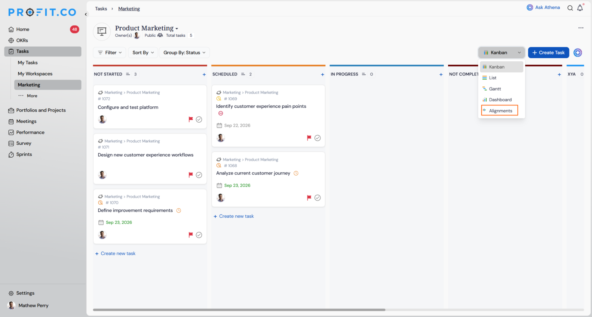
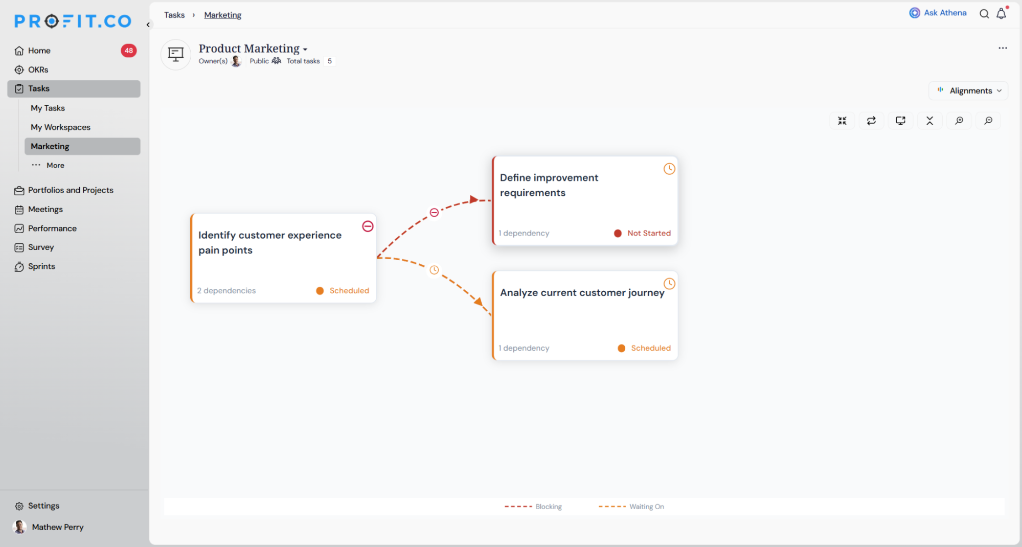
- The task Alignment View is available at three scopes: a whole Workspace, a single Board, or a Project. The view shows which scope you're looking at.
- Tasks appear as cards connected by arrows. A red arrow means one task is blocking another. An orange arrow means a task is Waiting On another.
- Hovering over a task shows its details (dates, progress, owner, status). Hovering over an arrow shows the relationship and both tasks involved.
- Each task has a − control to hide its connections and reduce clutter, and a +N to bring them back. This only changes what you see, not the actual dependency.
- Only tasks that actually have a dependency show up in this view.
Why It Matters
- See task blockers without opening every task: The full picture of what depends on what is visible in one place, at the task level.
- Spot the real bottleneck fast: Clicking a task isolates its chain, making it easy to see which task is actually holding up others.
- Works across boards, not just within one: At workspace scope, task dependencies that cross boards are visible too, which they aren't in any single board view today.
5. Manual progress updates now off by default
Overview
Projects can be set to calculate progress automatically from milestone and task completion, with no manual override. Previously, this override was always available to anyone on an assigned project. Now it sits behind a setting that a super user controls, and it's switched off by default, so progress is calculated automatically unless someone with the right access turns manual overrides back on.
How It Works
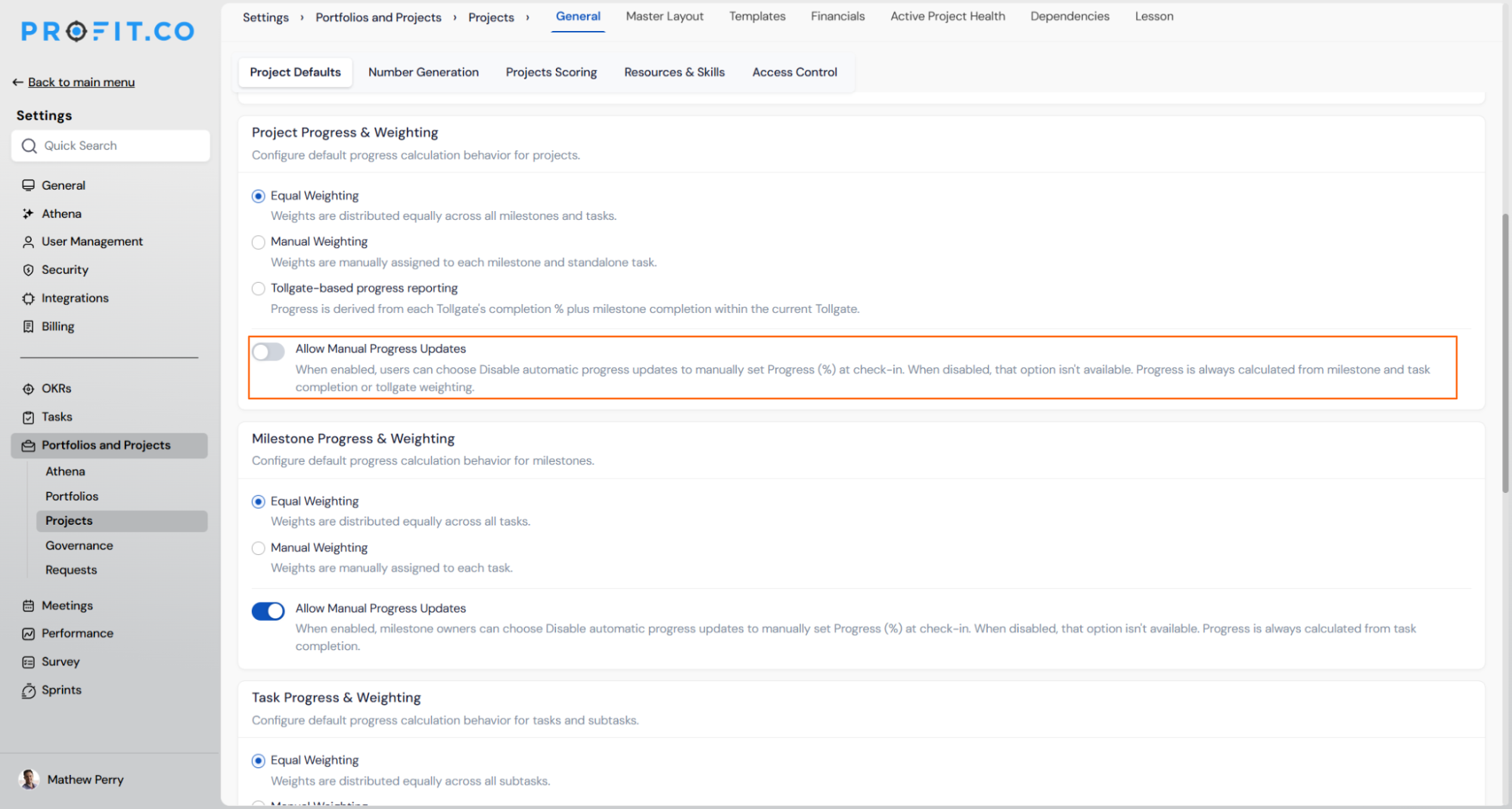
- Go to Settings → Portfolios and Projects → Projects → Progress & Weighting.
- Find the Allow Manual Progress Updates setting. It's off by default.
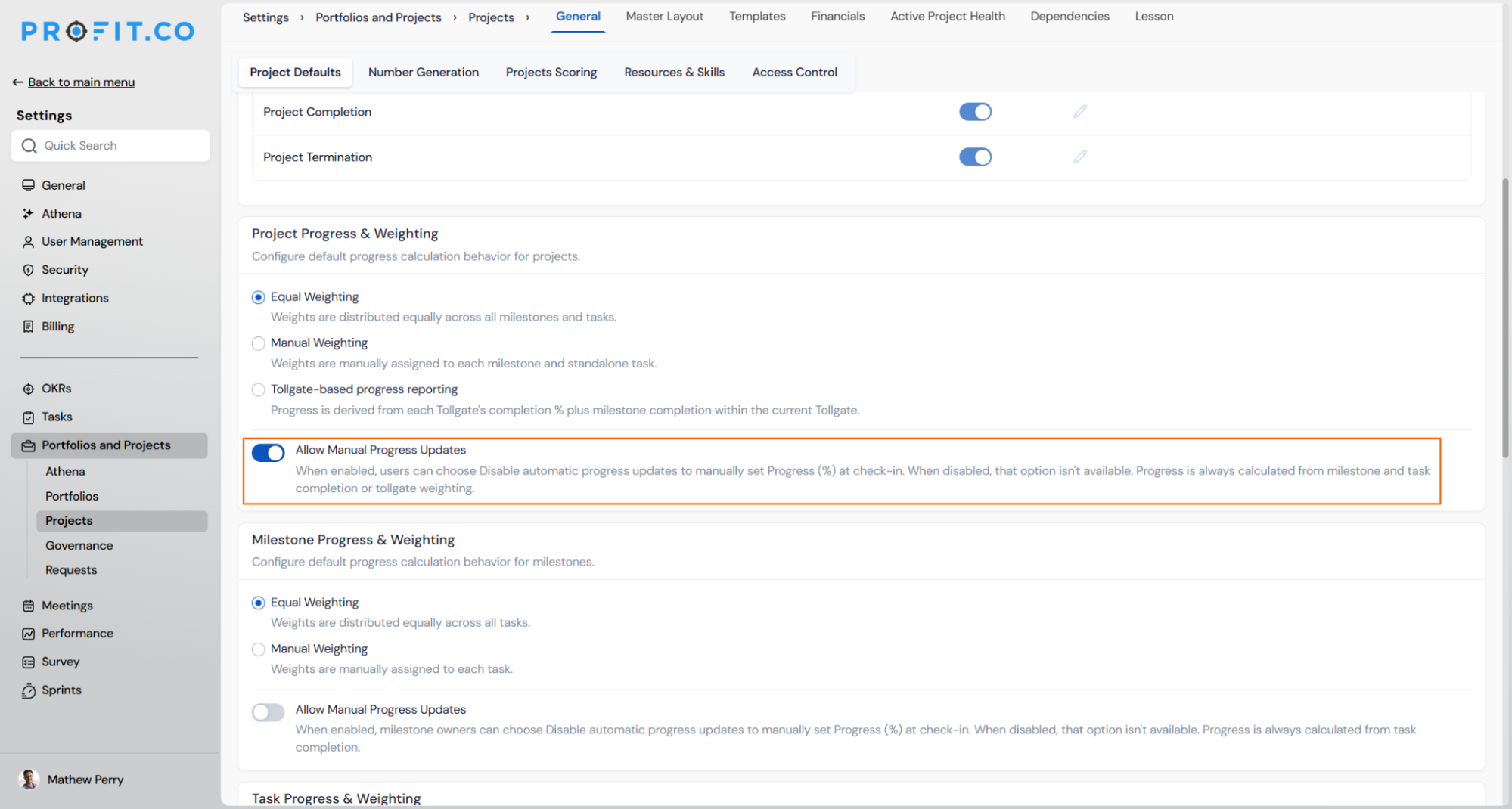
- While it's off, no one on an assigned project can disable automatic progress updates. Progress and stage are always calculated from milestone and task completion (or tollgate weighting, if that's configured).
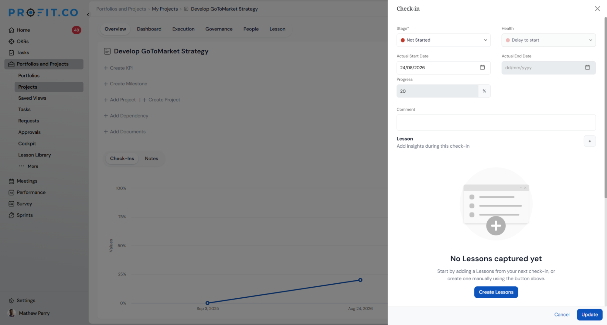
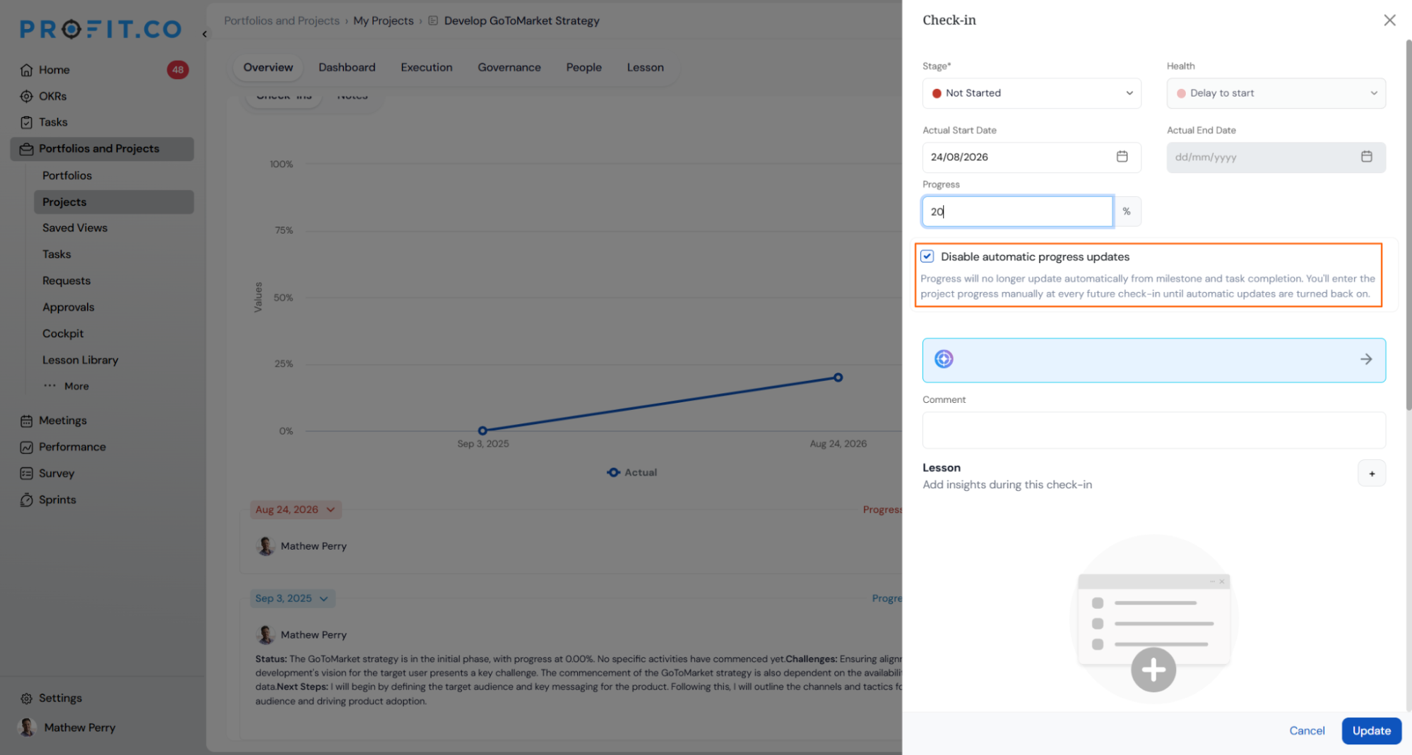
- If a super user switches this setting on, users can then choose to disable automatic updates and set progress manually at check-in, as before.
- Projects that previously had automatic updates disabled will revert to automatic calculation once this change is deployed, unless a super user has switched Allow Manual Progress Updates on.
Why It Matters
- Consistent, trustworthy progress by default: Out of the box, project progress always reflects real milestone and task completion, with no manual figure to second-guess.
- Control stays with admins, not individual users: Whether manual overrides are allowed at all is now a deliberate setting, not something available by default to anyone on a project.
- No disruption for accounts that need manual overrides: Teams that rely on manually set progress can keep that workflow by switching the setting on.
6. Mandatory checklist items on tollgate stages
Overview
Previously, once a checklist was added to a stage, every item had to be completed before the stage could be submitted or sent for approval, with no way to bypass this. A new setting now lets you choose which items are actually required. An item marked mandatory still has to be completed before submission is allowed. If mandatory is unchecked on an item, submission proceeds even if that item is left incomplete. A separate setting can also require a file attachment on any item, independent of whether that item is marked mandatory, so evidence is captured for that item regardless.
How It Works
- Go to Settings → Portfolios and Projects → Projects → Tollgate Library, pick a stage, and open the Checklist tab.
- Turn on Enable Checklist, then add items using Add Checklist Item.
- Each item has two separate checkboxes: Mandatory item (must be completed before the stage can move forward) and Mandatory attachment (must have a file attached). These work independently, so an item can require a file even if it's optional.
- Items can be renamed, duplicated, removed, or reordered using the menu on each row.
- The list shows a running count of how many items there are and how many are required.
- When someone tries to move a project past this stage, they're blocked if any required item is still incomplete, and they're told exactly which ones are outstanding.
- An item that needs a file can't be marked done until a file is actually attached. If that file is later deleted, the item goes back to incomplete.
- Turning the checklist off hides it without deleting anything. Turning it back on brings everything back exactly as it was.
Why It Matters
- Stages can't be skipped: A project can no longer move forward with required steps left undone.
- Proof is captured at the source: Files are attached to the exact item they relate to, so evidence is easy to find later.
- Nothing changes unless you set it up: Existing checklists work exactly as before until someone marks an item as required.
7. Task descriptions and custom fields in project templates
Overview
Project templates can now carry task descriptions and custom fields through to every project created from them, matching what was already possible for milestones. Previously, only milestones supported a description at the template level, and no custom fields could be added to milestones or tasks in a template at all, so both had to be recreated by hand on every new project. Now descriptions can be added to tasks and sub-tasks in the template, and custom fields can be configured for milestones and tasks, with everything carrying over automatically when a project is created.
How It Works
- Open a project template and add a description to any milestone, task, or sub-task, the same way descriptions have always worked on milestones.
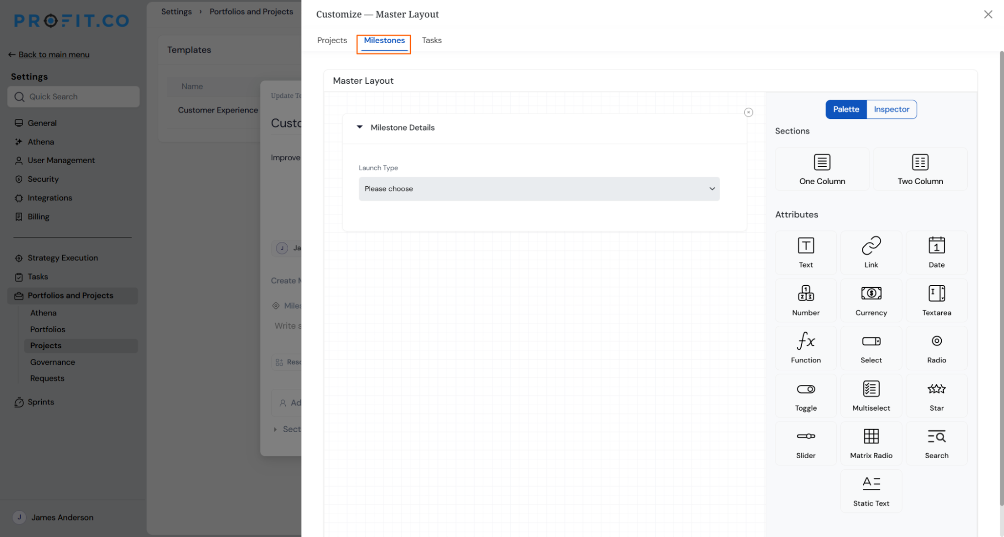
- Select Customize in the template header to open Master Layout.
- Use the Milestone and Task tabs to build custom field sections for each level, choosing from field types such as text, number, date, and select, and organising them into named sections.

- Save the template. Every project created from it arrives with the descriptions and custom fields already in place, at every level they were configured.
- Existing templates are unaffected until descriptions or custom fields are added to them.
Why It Matters
- Projects start complete: Task-level detail and custom fields no longer need to be rebuilt by hand on every project, since they carry over from the template automatically.
- Consistency across the portfolio: Projects created from the same template arrive with the same structure, rather than drifting apart as teams fill gaps differently.
- Less manual set-up: What used to be added project by project is now defined once, in the template.
8. Sub-projects visible in the portfolio hierarchy
Overview
Sub-projects now appear nested under their parent project on the portfolio overview, and the project count shown at the top of the list always matches the Active Projects figure. Previously, sub-projects were counted in that figure but never shown in the list itself, so the number and what was visible on screen didn't agree. Finding a sub-project meant opening each project in turn to check.
How It Works
- Open a portfolio and go to its Overview. The Projects section lists main projects, collapsed by default.
- Any project with sub-projects shows an arrow next to it. Selecting the arrow reveals its sub-projects nested directly beneath it, indented one level in.
- If a sub-project has its own sub-projects, it can be expanded the same way, to any depth.
- Every row, at every level, keeps the same columns as a top-level project: name, timeline, progress, and owner.
- The count shown next to Projects and the Active Projects figure in the Portfolio Information panel always describe the same set, main projects plus every sub-project beneath them.
- An i info icon next to Active Projects shows a tooltip explaining what the figure counts, that it includes this portfolio's projects and their sub-projects, with sub-portfolios counted separately.
- Switching the Project Level filter changes what the list shows but does not change the Active Projects figure.
- Collapsing a project hides everything nested beneath it. Expand and collapse states are remembered for the session.
Why It Matters
- The count and the list finally agree: The number at the top of the Projects section and the Active Projects figure describe the same set of projects, so there's nothing left to reconcile manually.
- Sub-projects are visible without extra clicks: A project's full structure, down to any depth, is visible on the same page instead of requiring a separate visit to each one.
- A familiar way to browse: Expanding and collapsing works the same way it already does elsewhere in the product, so there's nothing new to learn.
9. Include sub-levels in Portfolio Cockpit widgets
Overview
Portfolio Cockpit widgets can now roll up projects from every sub-portfolio beneath the one selected, instead of showing only projects directly attached to it. Previously, selecting a parent-level portfolio could show empty or incomplete widgets even when its sub-portfolios held active work, because widgets only counted direct associations.
How It Works
- Open the filter and select a Portfolio or Sub-portfolio. The filter now renders the complete tree, with every level correctly nested beneath its actual parent, and an expand option available at any depth. Milestones and tasks are not shown in this filter, only portfolios, sub-portfolios, projects, and sub-projects.
- If the selected portfolio has at least one nested sub-portfolio beneath it, an Include Sub-levels toggle appears in the header of each Cockpit widget where it applies. The toggle is off by default.
- Every widget has its own toggle and works independently. Turning it on for one widget does not affect any other, so different widgets can show different scopes at the same time.
- With the toggle off, a widget shows only projects directly attached to the selected portfolio. With it on, the widget includes projects from every sub-portfolio beneath it, at any depth.
- If the toggle is available but off and there is no direct data to show, the widget's empty state includes a prompt suggesting Include Sub-levels.
Why It Matters
- No more misleadingly empty dashboards: A parent portfolio that organises work through sub-portfolios can show its full picture across every Cockpit widget, instead of appearing to have no active work.
- Choose the right view per widget: Each widget can be expanded independently, so consolidating one view doesn't force every other widget into the same scope.
- Every rolled-up number stays traceable: A project pulled in from a sub-portfolio always carries a label showing where it came from, so an aggregated figure is never a black box
10. Add and move existing portfolios in the hierarchy
Overview
An existing portfolio can now be associated as a sub-portfolio of another, or moved to a different parent entirely, without recreating it or moving its projects by hand. Previously, reorganising the portfolio hierarchy meant rebuilding a portfolio from scratch and manually reassigning every project inside it. Now, a portfolio, along with everything nested beneath it, can be relocated in a single action.
How It Works
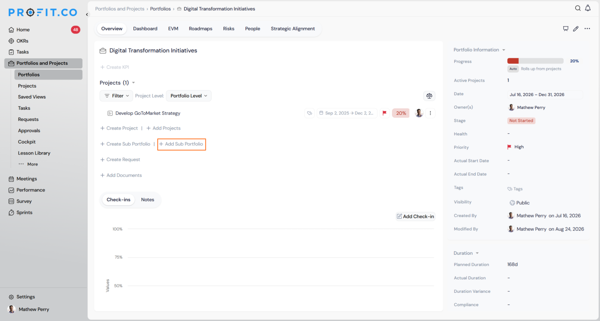
- To associate an existing portfolio as a sub-portfolio, open the parent portfolio's Overview, go to the Sub Portfolios section, and select Add Portfolio. Choose one or more existing portfolios from the picker and confirm. They become sub-portfolios immediately.
- To move a portfolio to a different parent, or make it stand alone, open its More Options menu and select Move Portfolio. Choose a new parent, or select Top Level to make it a standalone main portfolio.
- Either action carries the full structure with it, every sub-portfolio and project nested beneath the one being moved travels along intact. Nothing is left behind or flattened.
- A portfolio can only sit under one parent at a time, so adding or moving it detaches it from wherever it was before.
- These actions are only available to users with the right permissions on both the portfolio being moved and the destination. Users without structural rights can still view the hierarchy but won't see the Add Portfolio or Move Portfolio options.
- Every move is recorded in the Logs tab of the new parent, the moved portfolio, and the old parent.
Why It Matters
- Reorganise without rebuilding: A portfolio and everything inside it can be relocated in one action instead of being recreated from scratch.
- Nothing gets lost or mis-linked: Sub-portfolios and projects travel with the portfolio automatically, removing the risk of manual reassignment errors.
- Changes are safe and traceable: Impossible structures are blocked before they happen, and every move is confirmed up front and logged afterward.
11. Activity dashboard widgets for tasks
Overview
The Tasks dashboard now offers four widgets that show how work is spread across statuses and across team members, without needing to filter and count task rows by hand. One widget shows the overall status breakdown, and three separate widgets show task counts by assignee for to-do, in-progress, and completed work. Selecting any segment on any of these charts opens a filtered list of the exact tasks behind it.
How It Works
- Open a workspace in the Tasks module and switch to the Dashboard view.
- Select Customize to open the widget selector. Four new widgets are available there: Activity Status Distribution, Not started by Assignee, In Progress by Assignee, and Schedule by Assignee.
- Add any combination of the four. Each is added and removed independently, and the selection is remembered the next time the dashboard is opened.
- Activity Status Distribution shows a donut broken down by whatever statuses are actually configured on that board, not a fixed list, so the chart reflects the board's own workflow. The three assignee widgets each show a donut broken down by person, scoped to one status apiece, to-do, in-progress, or completed.
- Selecting a segment on any of the four, for example a specific person's slice of In Progress by Assignee, opens a task list panel showing every task matching that person and status, without leaving the dashboard.
- All four widgets respect whatever filter is already active on the dashboard, and update automatically if that filter changes or is removed.
- Tasks with no assignee appear under an Unassigned segment in the three assignee-based widgets.
Why It Matters
- Workload visible without manual counting: Who is carrying the most open work is visible in one chart, rather than requiring a filtered scan of the task list for each status.
- Bottlenecks surface before they cause delays: A status building up into a backlog is visible immediately, rather than being discovered once it's already caused a delay.
- From chart to task list in one click: Selecting a segment opens the exact tasks behind it directly, with no separate filter or export step.
Enhancements:
12. Consistent alignment on the project overview page
Overview
The project overview page now uses consistent left-alignment across its sections, headers, and fields. Previously, elements throughout the page were aligned inconsistently, which made the layout feel visually uneven. This is a visual clean-up rather than a change in functionality, the information shown and how it's edited stays the same.
How It Works
- Open any project's Overview tab.
- Section headers, KPI rows, sub-project rows, milestones, and the right-hand Project Information panel now follow a consistent left-aligned layout throughout.
- No fields, actions, or navigation paths have moved or changed behaviour, only their visual alignment.
Why It Matters
- A cleaner, more consistent page: Information reads more predictably from section to section, without inconsistent spacing or alignment pulling attention away from the content.
PERFORMANCE (Performance, Goals, Development Plans, Recognition, Survey)
1. Initiate IDPs and PIPs for past periods
Overview
Individual Development Plans and Performance Improvement Plans can now be initiated for a past period, not just the current or a future one. Previously, only the current or an upcoming period could be selected when starting an IDP or PIP, which meant there was no way to create one retroactively when a business need arose after the fact. Initiating for the current or a future period continues to work exactly as before, this is an additional option, not a change to existing behaviour.
How It Works
- When initiating an IDP or PIP, the period selector now includes past periods alongside the current and future ones already available.
- A past period is only selectable if the employee was active during that period. Periods before the employee joined are not offered.
- An IDP or PIP initiated for a past period is clearly marked as such, so it is distinguishable from one created in real time for that period.
- Initiating for a past period does not change any other historical record tied to that period, such as past reviews or attendance.
- Only the roles already able to initiate an IDP or PIP, typically manager or HR admin, can do so for a past period. No new role or permission is introduced.
Why It Matters
- Backdate a plan when the need is identified late: A development or improvement plan can now be created for a period that has already passed, rather than being limited to starting one going forward.
- Backdated plans stay traceable: A clear flag distinguishes a plan created after the fact from one initiated at the time, keeping audit and reporting records accurate.
- No disruption to how this already works: Initiating for the current or a future period is completely unaffected.
