
Release Highlights
A quick-glance summary of all features shipped in this release. Click any feature to jump to the full detail below.
| STRATEGY (Strategy Roadmaps, Balanced Scorecard, OKR Management, Hoshin Kanri) | ||
|---|---|---|
| S.No | Feature Name | Key Benefit |
| 1. | Scheduled date on legacy check-in entries | Every legacy check-in entry now shows a scheduled date chip so reviewers can identify the cycle it belongs to without cross-referencing the KR cadence. |
| 2. | Pending approval visibility on department OKR pages | A badge on the Department OKRs toolbar shows pending approval counts; clicking it opens a panel with full parent hierarchy context. |
| 3. | Dependency graph view on OKR and key result detail pages | A new Dependencies tab shows all upstream, downstream, and linked relationships in a single canvas per Objective or Key Result. |
| 4. | Notes pre-filled into check-in comments | When enabled, notes added to a Key Result since its last check-in are automatically composed into the comment field when the check-in form opens. |
| 5. | Milestone progress bars and sub-rows in the KR progress presentation | The KR Progress Presentation export now supports a visual segmented progress bar per milestone and optional indented sub-rows for each milestone stage. |
| 6. | Stretch Plan in Bowler Chart | Teams can now add an aspirational Stretch Plan target directly in the Bowler Chart; the value is automatically distributed across months. |
| 7. | Progression model selection for key result plans | Five progression models — Linear, Front-loaded, Back-loaded, S-curve, and Stepped — are now available when setting up a Key Result plan. |
| 8. | Control KPI weighting in % weighted roll-up | The % Weighted roll-up now allows weights to be set exclusively on Control KPI children, with standard KR children excluded from the calculation. |
| 9. | Configurable standard fields in master layouts | Standard fields on Objectives, Key Results, Child Objectives, and Check-ins can now be renamed and marked mandatory through the master layout. |
| 10. | Timestamps on check-in entries | Each check-in entry now displays the exact date and time it was submitted, with late submissions clearly flagged. |
| 11. | Per-milestone status tracking for milestone-sequence Key Results | Milestone indicators now reflect individual milestone completion status, with configurable two- or three-state status tracking. |
| Enhancements | ||
| 12. | Scrollable Key Result section in the Bowler Chart | Every Key Result under an Objective is now reachable directly within the Bowler Chart when using Say:Do calculation, with no need to navigate to a separate view. |
| 13. | Full parent context in the OKR presentation view | Breadcrumb in Presentation View now fills the available width so the full parent path is visible during live sessions without hovering. |
| 14. | Stable calendar height during month navigation | Date picker calendar now always displays six rows, keeping navigation arrows fixed so month-to-month clicks require no re-aiming. |
| 15. | Consistent export labelling across the platform | “Download” labels are replaced with “Export” across all modules so users encounter the same terminology platform-wide. |
| 16. | Read-Only user access to Corporate Department in Balanced Scorecard | Read-Only users can now view the Corporate Department in the Balanced Scorecard without requiring a higher-permission role. |
| PROJECTS (Task Management, Portfolios And Projects, Timesheets, Notes And Meetings) | ||
|---|---|---|
| S.No | Feature Name | Key Benefit |
| 1. | Configurable threshold alerts for projects, portfolios, and tasks | Super users can define alert triggers that fire automatically when a project, task, or portfolio attribute crosses a configured threshold, delivering notifications via Action Center, email, or webhook. |
| 2. | Project governance module for CRADI tracking | A dedicated Governance tab inside each project provides structured tracking for all seven RAID categories with auto-generated IDs and immutable activity logs. |
| 3. | Email Notifications for PPM and Task Action Center Events | Email notifications are now available for all Action Center events across the PPM and Task modules, fully configurable per event type by super users. |
| 4. | Heatmap view for portfolio capacity workbench | A colour-coded Heatmap view in the Portfolio Capacity Workbench makes over-allocated and under-utilised resources immediately visible without reading a numeric grid. |
| 5. | Project stage and health widgets by portfolio in the cockpit | Two new Cockpit widgets — Project Stage by Portfolio and Project Health by Portfolio — break down project counts per portfolio with drill-through to individual project lists. |
| 6. | Mandatory tollgate selection on project creation | Super users can mark the Tollgate field as mandatory in the project Master Layout, preventing any project from being created without a stage-gate selected. |
| 7. | Standard date and attribute fields now configurable in Master Layout | Owner, Status, Priority, Tags, and date fields on Portfolios, Projects, Milestones, and Tasks are now configurable via the Inspector panel alongside custom fields. |
| 8. | Tollgate-based project progress calculation | A new Tollgate-based progress reporting mode ties the project progress figure to stage-gate approvals, with a configurable hold-back amount until each Tollgate is signed off. |
| 9. | Stage-specific health status configuration for projects and milestones | Health logic is now configured per built-in lifecycle stage, so planning, execution, and completed projects are each assessed by criteria appropriate to their actual state. |
| 10. | Role-based widget access controls for portfolio and project dashboards | Each role sees only the dashboard widgets relevant to their function, keeping financial and executive data protected. |
| 11. | Planned vs actual progress comparison in the project overview panel | Actual and planned progress now shown side by side on the Overview tab, making the health badge self-explanatory. |
| 12. | Date boundary enforcement across the project hierarchy | Child dates that fall outside their parent’s range are now blocked at entry and flagged with a permanent warning badge. |
| Enhancements | ||
| 13. | Explicit format labels on all PPM export actions | All export labels across Portfolio, Project, Task, and Request areas now state the file format explicitly — Export as CSV or Export as PDF — before the action runs. |
| PERFORMANCE (Performance, Goals, Development Plans, Recognition, Survey) | ||
|---|---|---|
| S.No | Feature Name | Key Benefit |
| 1. | IDP summary cards and filters for HR administration | The HR Administration view for Individual Development Plans now displays six status summary cards and a filter panel to locate plans by employee, department, coach, progress, or status. |
| 2. | Per-reviewer rating controls in review templates | Ratings can now be enabled or disabled independently for each reviewer type and each assessment area — Q&A, Competencies, Goals, OKRs, Tasks, and Overall Rating. |
| 3. | Historical review average in the final overall rating | A custom formula option on the Final Overall Rating averages scores across a configurable number of historical review cycles, with weights auto-adjusted per employee. |
| 4. | Minimum and maximum peer count enforcement in peer assessment | Super users can set minimum and maximum peer nomination counts per employee; the platform blocks stage progression until the minimum is met and caps nominations at the maximum. |
| Enhancements | ||
| 5. | Customisable IDP status labels and colours | HR administrators can rename, recolour, and add contextual descriptions to each IDP status so platform labels match the organisation’s own process language. |
| 6. | Independent rating level configuration per review object type | Rating Controls now loads an independent configuration per object type tab — Competency, Goals, OKRs, and Overall Rating — so each can carry a different rating scale. |
STRATEGY (Strategy Roadmaps, Balanced Scorecard, OKR Management, Hoshin Kanri)
1. Scheduled date on legacy check-in entries
Overview
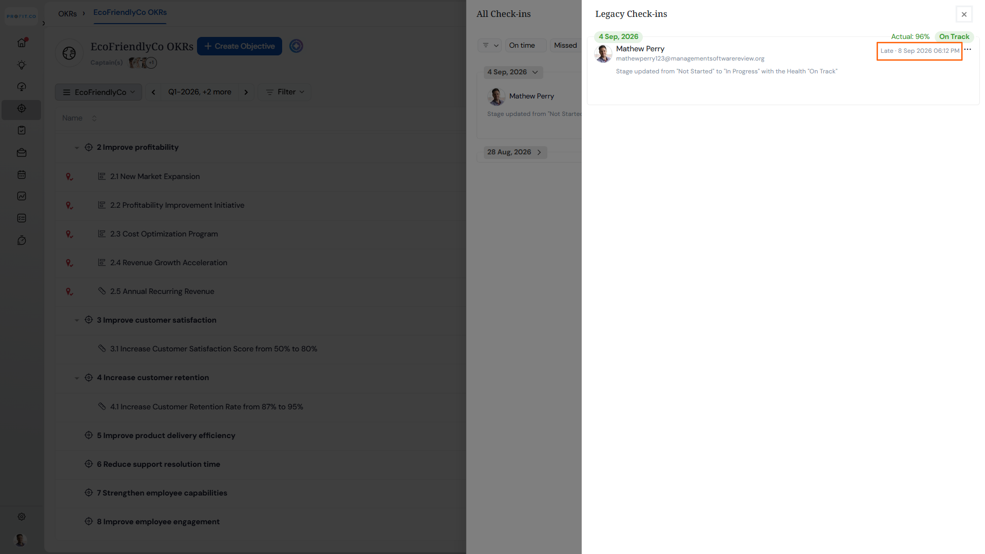
The Legacy Check-ins view shows the full history of past check-in submissions for a Key Result. Previously, each entry displayed who submitted the check-in and when it was posted, but not which check-in cycle it actually belonged to, making it difficult to read entries in isolation during retrospectives or audits. Each legacy entry now displays a scheduled date chip, so reviewers can immediately identify the cycle an entry corresponds to without cross-referencing the KR’s check-in cadence separately.
How It Works
- Navigate to any Key Result, then open the Check-in Activity panel and click Legacy Check-ins
- Each entry now shows a green scheduled date chip at the top-left, indicating the check-in cycle the entry belongs to
- The date renders in the account’s configured date format, matching how dates appear on live check-in surfaces
- Entries from multiple check-ins within the same cycle show the same scheduled date; the “posted on” line continues to distinguish individual submissions
- The chip is read-only; no editing or interaction is attached to it
- Legacy entries that predate the scheduled date field render exactly as before, with no chip and no error indicator
Why It Matters
- Cycle-anchored audit trail: Every legacy entry now identifies its check-in cycle at a glance, so historical records are fully readable in isolation without manual cross-referencing.
- Faster retrospectives: Teams reviewing past periods can match entries to their cycles immediately, reducing the back-and-forth of checking cadence settings to place a check-in in context.
- Consistent historical record: The scheduled date appears in the same format and position as on live check-in surfaces, so the legacy view now meets the same informational standard as real-time entries.
2. Pending approval visibility on department OKR pages
Overview
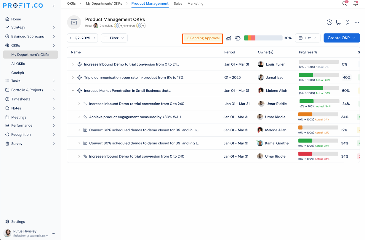
When Objectives or Key Results are submitted for approval, there was previously no signal on the Department OKRs page to indicate items were waiting for review. Approvers had to navigate separately to a dedicated Pending Approval page, which listed items without showing the relationship between a Key Result and its parent Objective. Department OKR pages now display a count of pending items directly in the toolbar, and opening it shows all pending entries in a side panel with their parent hierarchy intact.
How It Works
- Navigate to any Department OKRs page (for example, Product Management OKRs)
- If any Objectives or Key Results in that department are awaiting approval, a badge appears in the toolbar showing the total count
- The badge does not appear when there are no pending items in that department
- Select the badge to open a side panel listing all pending entries, with columns for Name, Period, Owner(s), Progress, Approvers, and Submitted
- Pending Objectives are shown with their child Key Results listed beneath them as context rows
- Pending Key Results whose parent Objective is not itself pending display a breadcrumb above the row showing the Objective they belong to, for example “Under: Increase market share in APAC”
- Selecting any row opens the existing OKR review screen where the approval or rejection can be actioned; no approve or reject controls appear within the panel itself
- The panel is scoped to the department currently in view and reflects only that department’s pending items
Why It Matters
- Approval work surfaces where managers already work: The pending badge appears directly on the Department OKRs page, so approvers no longer need to remember to check a separate page to know items are waiting.
- Hierarchy preserved in the review panel: Pending Key Results are shown with their parent Objective clearly labelled, giving reviewers the context they need to evaluate an item without navigating away to find it.
- No disruption to the existing approval flow: All approve and reject actions continue to happen on the existing OKR review screen; the panel is a discovery and navigation tool only, leaving the established workflow unchanged.
3. Dependency graph view on OKR and key result detail pages
Overview
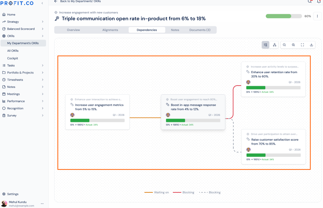
The platform already supports three types of dependency relationships between OKRs and Key Results, including what an item is waiting on, what it is blocking, and what it is linked to. These relationships could only be viewed one at a time through a menu on each row, with no way to see all connections at once. A new Dependencies tab on Objective and Key Result detail pages now shows all relationships in a visual graph, placing the current item at the centre with upstream, downstream, and linked items displayed around it in a format consistent with the existing Alignment view.
How It Works
- Navigate to any Objective or Key Result detail page and select the Dependencies tab, positioned next to the existing Alignments tab
- The canvas places the current OKR or Key Result at the centre; items it is waiting on appear upstream, items it is blocking appear downstream, and linked items are shown connected by a dashed line
- Each related item is displayed as a card showing the owner, OKR or Key Result name, progress bar, percentage, start and target values, actual value, level, and period, matching the card format used in the Alignment view
- When more dependencies exist than fit within the visible canvas, the view scrolls horizontally; cards never overlap
- When an OKR or Key Result has no dependencies, the tab displays a clear empty state rather than a blank canvas
- Canvas controls for fit, zoom, refresh, and fullscreen are available, consistent with the Alignment view toolbar
- The tab is view-only; creating or modifying dependencies continues through the existing row-level menu on the OKR list
Why It Matters
- Complete dependency picture in one view: All relationships an OKR holds, across all three dependency types, are visible together on a single canvas without opening menus or navigating between rows.
- Upstream and downstream risk at a glance: The directional layout makes it immediately clear what is blocking progress on a given item and what would be affected if that item slips, supporting faster decisions during planning and review cycles.
- Familiar format with no learning curve: The dependency graph uses the same card layout and canvas controls as the existing Alignment view, so teams already familiar with that surface can read dependency context without any additional orientation.
4. Notes pre-filled into check-in comments
Overview
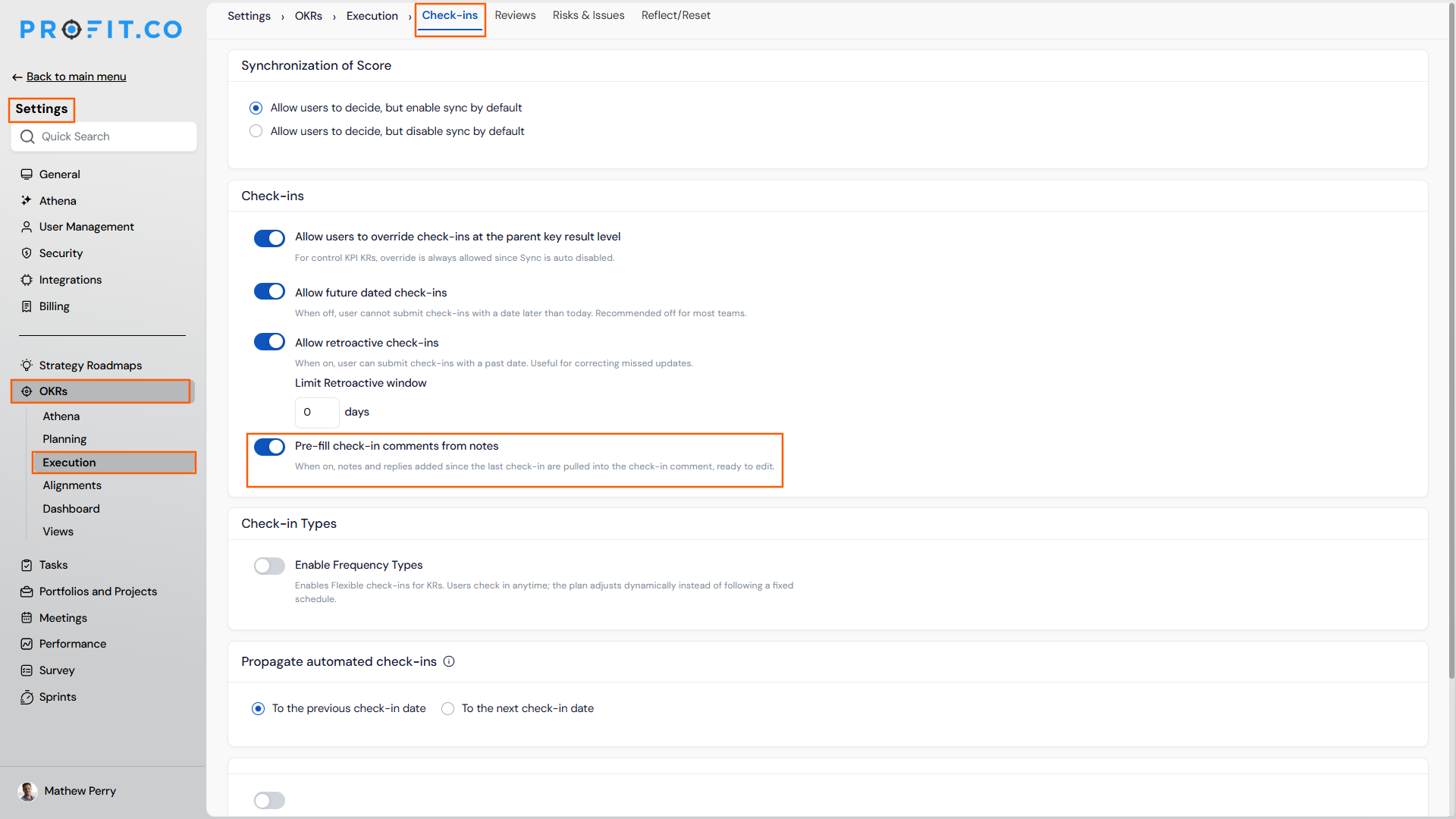
Teams often capture progress updates, observations, and activity notes on a Key Result between formal check-ins, then have to rewrite or copy that content manually when the check-in is due. When the pre-fill setting is enabled, notes added to a Key Result since its last check-in are automatically composed into the comment field when the check-in form is opened, ready to review and edit before submitting. The notes themselves are never altered or removed.
How It Works
- A super user navigates to Settings → OKRs → Execution → Check-ins and enables the Pre-fill check-in comments from notes toggle
- When a user opens the check-in form for a Key Result, the comment field is pre-populated with notes added since the last check-in, grouped by author with each contribution dated
- A pill indicator above the comment field confirms the content has been pre-filled from notes
- The pre-filled content is fully editable; users can delete, reword, or append before submitting, and the check-in stores only the final edited comment
- Private notes and threaded replies are never included in the pre-fill; an exclusion summary shows the count of any items omitted without revealing their content
- On Key Results with multiple owners, notes from all owners are included, grouped under author headings
- When the toggle is off, the check-in form opens with a blank comment field exactly as before; no behaviour changes unless the setting is enabled
Why It Matters
- Progress context carried forward automatically: Updates and observations logged as notes between check-ins are brought into the next check-in comment without manual copying, keeping the formal check-in record grounded in what the team actually tracked.
- Editable before submission: The pre-filled content is a starting point, not a fixed record; users retain full control over what the check-in comment says before confirming.
- Private content always excluded: Notes marked private and threaded replies are never surfaced in the pre-fill, regardless of the setting, so contributors can log candid notes without them appearing in formal check-ins.
5. Milestone progress bars and sub-rows in the KR progress presentation
Overview
The Key Result Progress Presentation export previously showed milestone-tracked Key Results as a single rolled-up percentage with no visual bar, making multi-stage initiatives appear as a low, undifferentiated number in leadership decks. Two new options in the presentation’s customisation panel let teams add a visual progress bar to every Key Result row and optionally expand milestone-tracked Key Results to show each milestone as an indented sub-row. Both options are off by default, leaving all existing exports unchanged.
How It Works
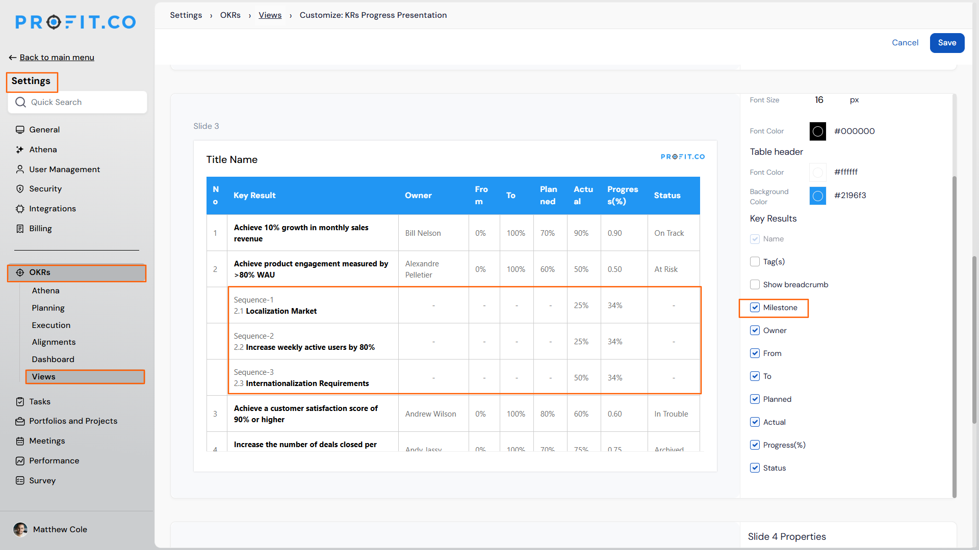
- Navigate to Settings → Strategy Execution → Views → Customize: KRs Progress Presentation
- Check Progress bar to add a visual bar alongside the existing percentage in the Progress column for every Key Result row
- Milestone-tracked Key Results render a segmented bar with one segment per milestone; completed milestones appear filled, in-progress milestones appear in amber, and not-started milestones appear empty
- Standard Key Results render a single continuous bar
- Check Milestones to expand each milestone-tracked Key Result with indented sub-rows beneath it, showing the milestone name and its individual progress bar and percentage; other columns remain blank on sub-rows
- Key Results that are not milestone-tracked are unaffected by the Milestones option
- All existing access rules apply; milestone sub-rows appear only where the parent Key Result is already visible to the viewer
Why It Matters
- Multi-stage progress reads accurately in leadership decks: The segmented bar shows exactly how many milestones are complete, in progress, and not yet started, so a Key Result at 15% overall with two milestones fully done reads as momentum rather than stagnation.
- No disruption to existing exports: Both options ship off by default, meaning every team’s current export output is unchanged until they explicitly opt in through the customisation panel.
- Export and in-app view now match: The same milestone structure visible in the Key Result detail view is now available in the report that leaves the platform and reaches executives, removing the need for verbal narration or pasted screenshots to fill the gap.
6. Stretch Plan in Bowler Chart
Overview
The Bowler Chart now supports a Stretch Plan — an aspirational performance target set above the committed forecast. Users configure it directly within the chart, and the value is automatically distributed across months, giving teams a clear, period-by-period view of both their committed and aspirational benchmarks in one place.
How It Works
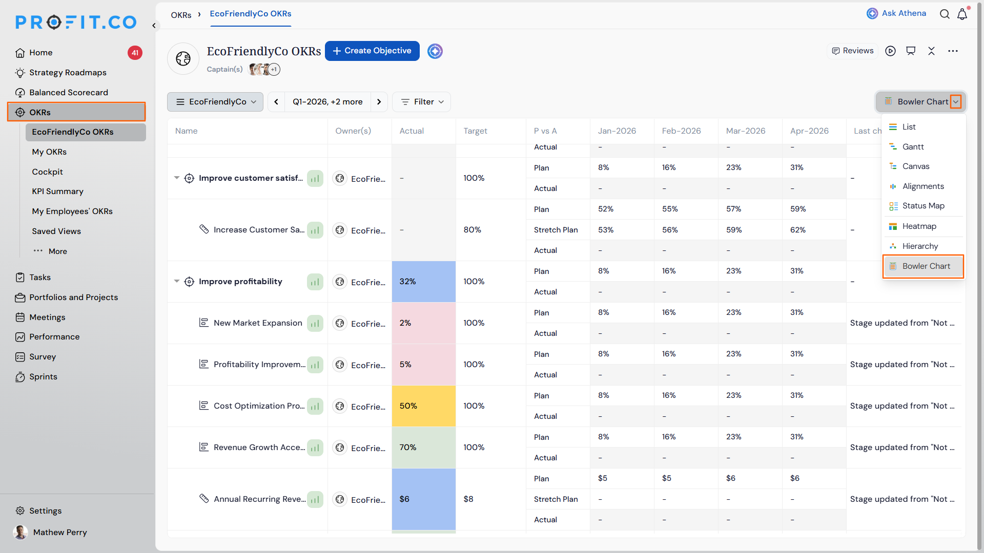
- Navigate to OKRs from the left navigation panel.
- From the Views dropdown, choose the Bowler Chart option.
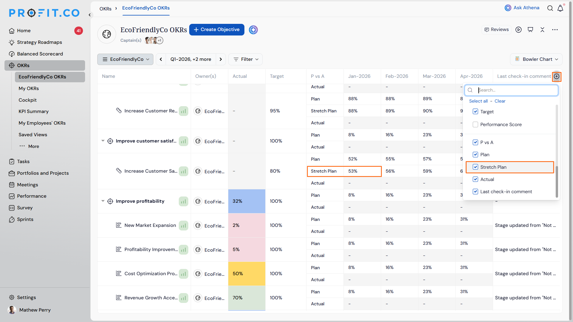
- Click the + icon on the Bowler Chart column header to add the Stretch Plan column
- Click on the required Stretch Plan value. Enter the Stretch Plan value — this should be set higher than the existing committed target or forecast
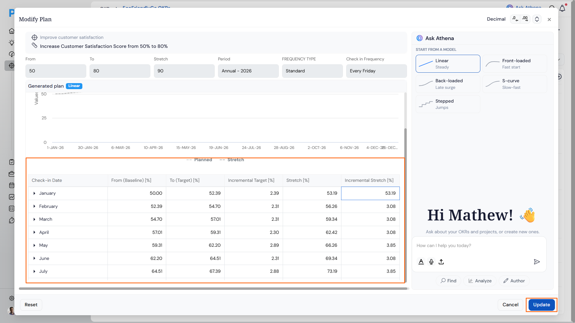
- The value is automatically divided across the months and displayed period-by-period within the Bowler Chart
- The Stretch Plan column appears alongside the existing performance columns — Budget | Budget YTD | Actuals YTD | Forecast | Stretch Plan — and does not affect any existing target, forecast, or actual values
Note: If a Stretch Target was set when creating the Key Result, that value will automatically populate the Stretch Plan in the Bowler Chart and will be divided across months accordingly .
Why It Matters
- Aspirational targets made visible: Teams can track a higher performance goal directly in the Bowler Chart without maintaining a separate sheet or view.
- Automatic monthly distribution: The Stretch Plan value is spread across months automatically, so users get a ready-to-use period-by-period breakdown with no manual calculation needed.
- Clean separation from committed data: The Stretch Plan is stored and displayed independently, leaving all existing target, forecast, and actual figures untouched.
7. Progression model selection for key result plans
Overview
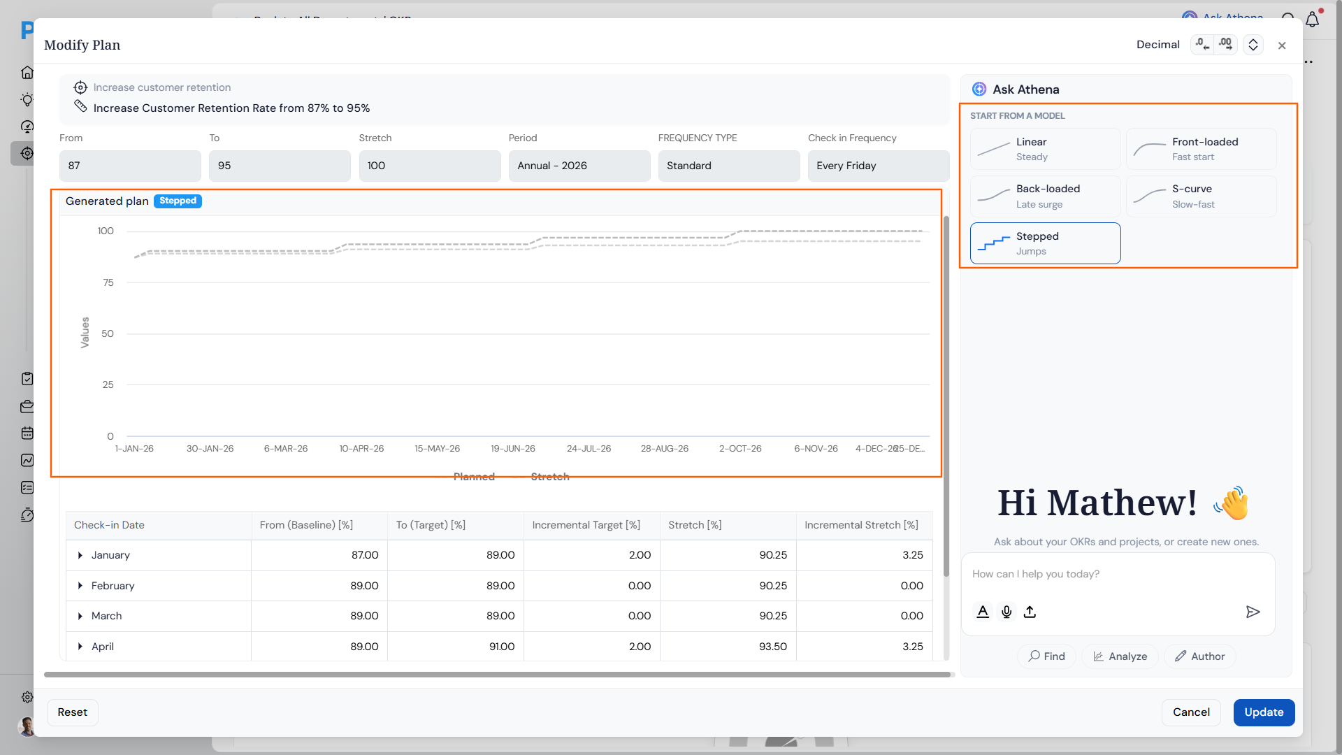
When setting up a plan for a Key Result, users can now choose from five progression models — Linear, Front-loaded, Back-loaded, S-curve, and Stepped — each distributing check-in targets differently based on how work is expected to unfold across the period. A built-in model guide explains how each model is calculated and shows a worked example on the user’s actual KR values, so teams understand what they’re committing to before applying. An integrated Ask Athena panel also lets users adjust the plan through natural language.
How It Works
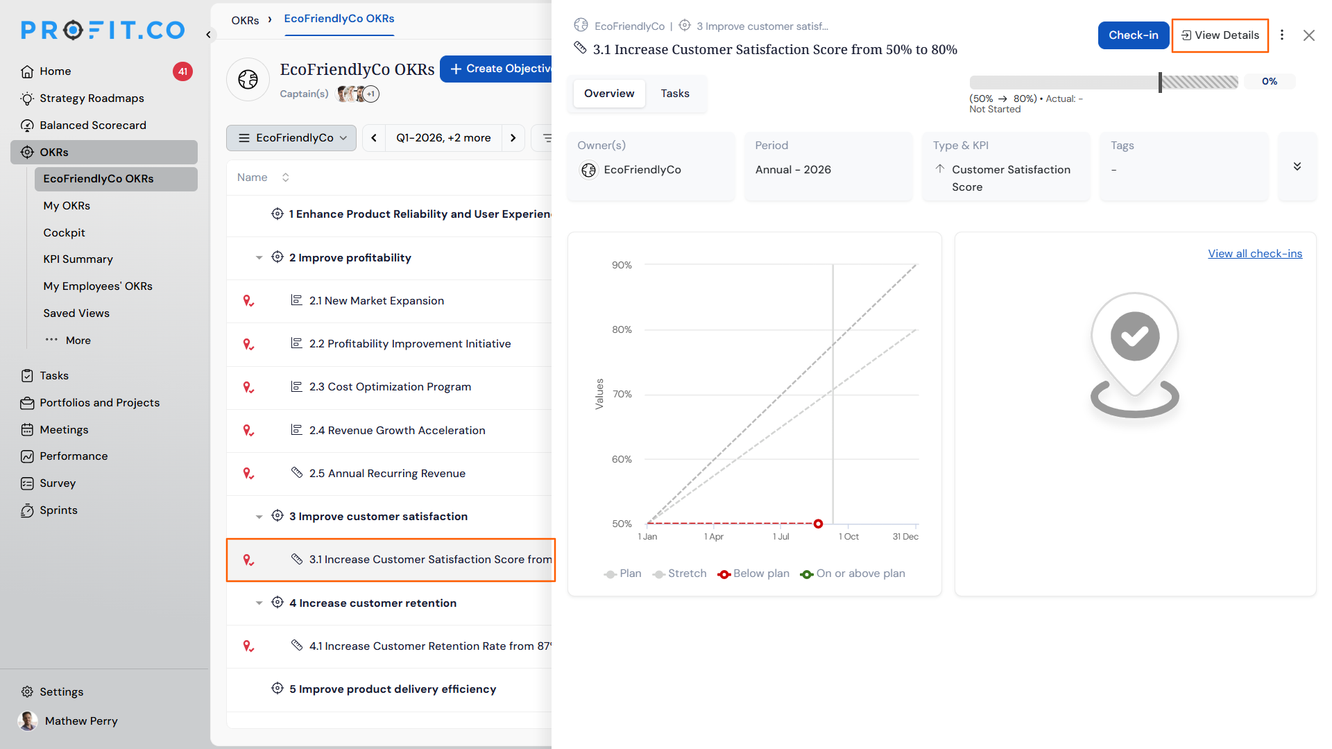
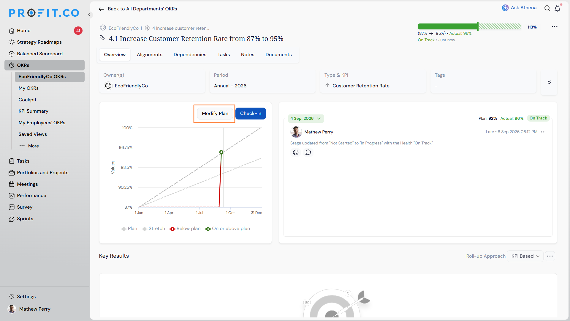
- Navigate to the Key Result and on the View Details page, click on the Modify Plan.
- In the Set up plan panel, modify the plan if needed or select a progression model from the right-side panel — choose from Linear (steady equal increments), Front-loaded (fast start, tapering close), Back-loaded (slow start, accelerating close), S-curve (slow build, steep middle, gentle landing), or Stepped (holds flat, then jumps at fixed intervals)
- The left panel updates live, displaying a chart and a check-in-by-check-in breakdown of Baseline, Target, and Incremental Target values for the selected model
- Alternatively, use the Ask Athena chat in the panel to describe adjustments in natural language (e.g., “back-load into March”) and Athena will apply the change
- Click Update to confirm
| Model | What it means | Simple example | Use when… |
|---|---|---|---|
| Linear | The target increases by the same amount every check-in, from start to finish. | Hiring 12 people over 6 months — 2 hires per month, every month. | Work is steady and predictable with no seasonal spikes. |
| Front-loaded | Most of the target is expected to be hit early. Progress slows as the period goes on. | A product launch — 60% of sign-ups come in the first two weeks, then it tapers off. | The hardest or most impactful work happens at the beginning. |
| Back-loaded | Progress is slow in the early check-ins and picks up sharply toward the end of the period. | Sales deals that close at quarter end — most revenue lands in the final weeks. | There is a long build-up phase before results start showing up. |
| S-curve | Slow start, steep acceleration in the middle, then levels off as the target is approached. | Company-wide software rollout — adoption is slow at first, spikes after training, then plateaus. | Work needs an onboarding or ramp-up phase before it can scale. |
| Stepped | Target holds flat and jumps at fixed intervals. No progress is expected between milestones. | Three software releases in a quarter — target jumps only when each release ships. | Work is delivered in batches, not continuously. |
Why It Matters
- Plan shape matches actual work patterns: Different types of work progress differently — campaigns front-load, pipeline builds back-load, product rollouts follow an S-curve. Choosing the right model means check-in targets reflect real expectations, not just a straight line.
- Transparent model logic: Each model’s drill-down shows the exact formula and a worked example on the user’s own KR data, along with clear guidance on best-fit and caution scenarios — so teams know what they’re committing to before applying.
- Natural language plan adjustments: The embedded Ask Athena panel lets users describe changes conversationally, removing the need to manually recalculate or reconstruct plans from scratch.
8. Control KPI weighting in % weighted roll-up
Overview
The % Weighted roll-up mode for parent Key Results now distinguishes between Control KPI children and standard KR children when assigning weights. Administrators and KR owners can set percentage weights exclusively on Control KPI children, and the parent KR score is calculated as a weighted average of those Control KPIs alone. Standard KR children remain visible in the weight modal but are excluded from both weight assignment and the roll-up calculation.
How It Works
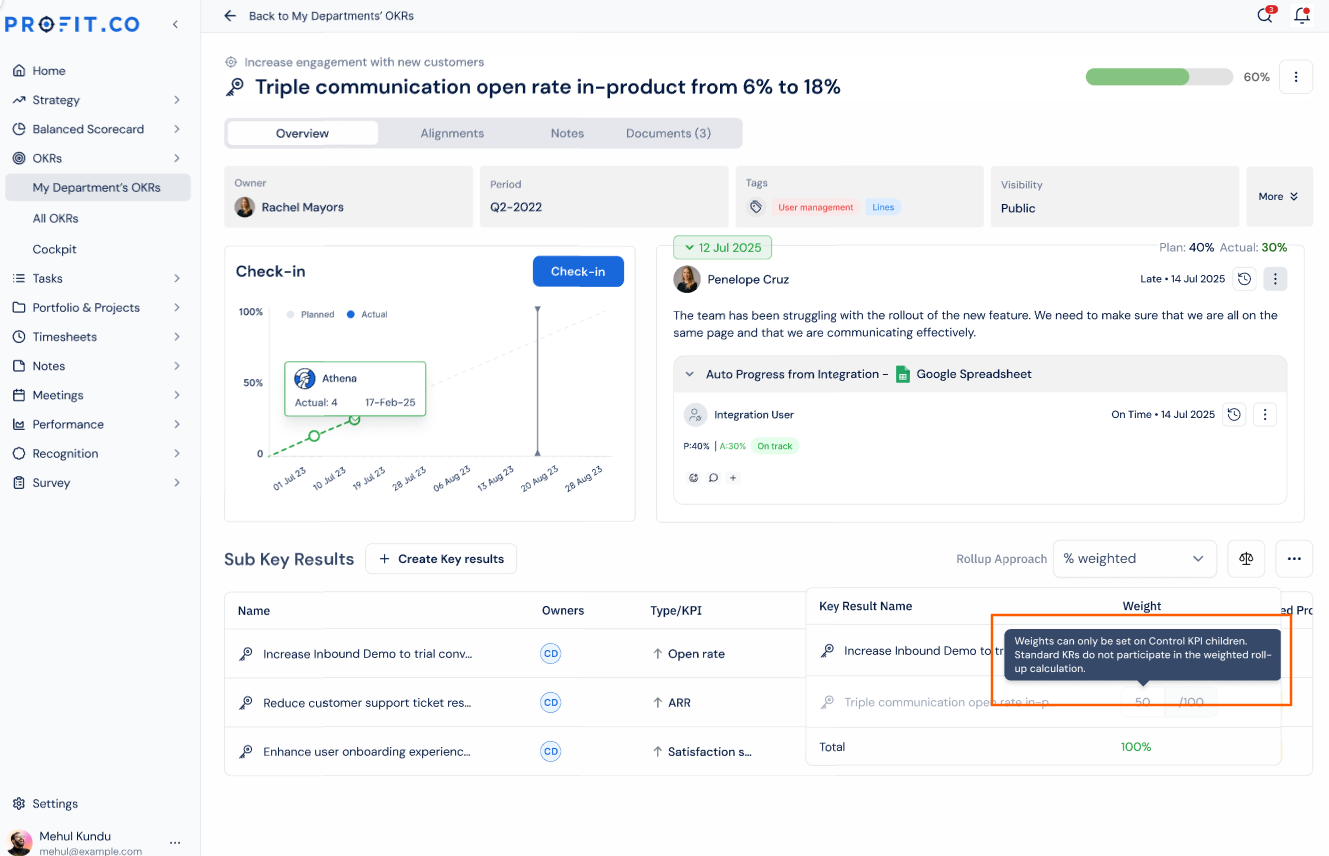
- Open a parent Key Result, click the Roll-up Approach dropdown, and select % Weighted to open the weight-setting modal.
- In the modal, Control KPI child rows display editable weight input fields; standard KR child rows display a locked field showing “—” with the label “Not applicable for this KR type.”
- A tooltip explaining that weights apply to Control KPI children only and that standard KRs do not participate in the weighted calculation.
Note: Note: This behaviour applies regardless of whether the parent KR is itself a standard KR or a Control KPI. If the parent is a Control KPI and its children are a mix of Control KPIs and standard KRs, the same rule holds — weights can only be set on the Control KPI children; standard KR children remain locked and excluded from the calculation.
- Enter integer weight values for each Control KPI child. The Total counter at the bottom of the modal sums Control KPI weights only — standard KR rows are not included.
- The Apply button is enabled only when Control KPI weights sum to exactly 100%. An inline validation message displays the current total if the sum is above or below.
- If all Control KPI weights are left at 0, Apply remains enabled but a warning appears: “No weights assigned. The parent KR score will be 0% until weights are set.”
- Click Apply to save. The parent KR score immediately updates to the weighted average of Control KPI children only.
- If the parent KR has no Control KPI children, all rows in the modal are locked and an empty-state notice appears — Apply is disabled in this configuration.
Why It Matters
- Accurate parent KR scores: The weighted roll-up now reflects the strategic importance assigned to Control KPIs specifically, rather than distributing weight indiscriminately across all child types.
- Clear weight assignment experience: Locked rows with labels and tooltips make it immediately clear which children participate in the weighted calculation and why, reducing configuration errors.
- Safe validation before applying: Inline weight validation prevents misconfigured totals from being saved — the parent score cannot update until Control KPI weights sum to exactly 100%, keeping aggregate scores defensible in reviews and reports.
9. Configurable standard fields in master layouts
Overview
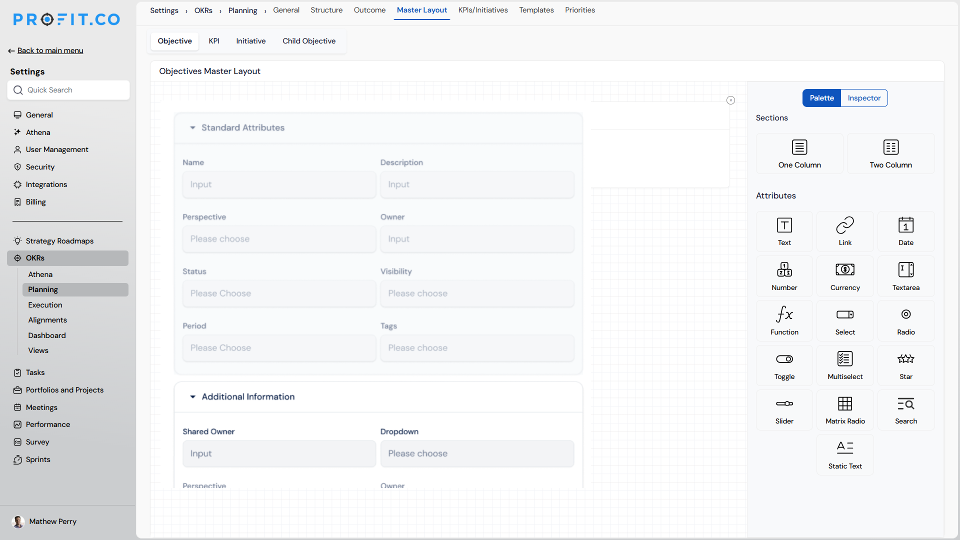
Standard fields on Objectives, Key Results, Child Objectives, and Check-ins can now be configured through the master layout. Administrators and Department Champions can rename any standard field to match their organisation’s terminology and mark it as mandatory to ensure consistent data capture across the team.
How It Works
- Navigate to Settings → OKRs → Planning from the left navigation panel and switch to the Master layout tab. For Check-ins, navigate to Settings → OKRs → Execution from the left panel, switch to Reviews and enable the Check-in Review. Choose the Master Layout option.
- Select the entity to configure — Objectives, Key Results, Child Objectives, or Check-ins
- Locate the standard field to update under the fields list
- Edit the field label to rename it, and toggle the Mandatory setting to make it required for all users
- Save the layout — changes take effect immediately across all users for that entity type
Note: Note: Department Champions can also configure standard fields through the master layout for their respective departments, without requiring administrator access.
Why It Matters
- Terminology that fits your organisation: Standard field labels are no longer fixed — teams can rename them to match internal language without creating custom fields.
- Enforced data completeness: Marking a standard field as mandatory ensures users cannot submit an Objective, Key Result, or Check-in without filling it in, reducing incomplete records.
- Flexible administration: Both Administrators and Department Champions can manage standard field configuration, so layout changes can be handled at the department level without routing everything through a central admin.
10. Timestamps on check-in entries
Overview
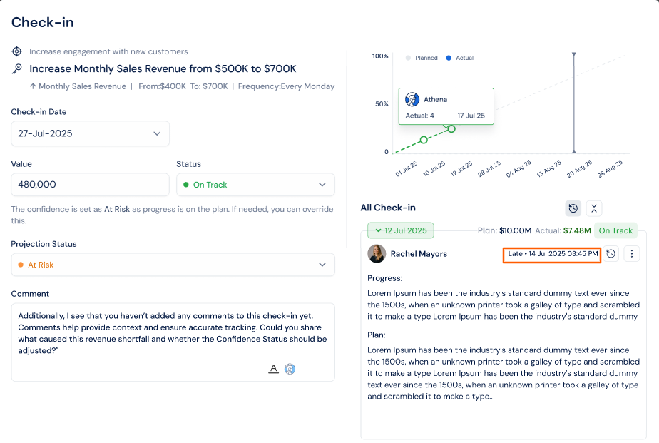
Each check-in entry now displays the exact date and time it was submitted. This gives managers and team members a precise record of when a check-in was logged, making it easier to track submission timing and identify late entries at a glance.
How It Works
- Navigate to a Key Result and open the check-in panel
- Under All Check-ins, each entry now shows the submission timestamp alongside the contributor’s name — displaying the date and time the check-in was recorded
- Entries submitted after the scheduled check-in date are labelled Late, with the exact submission timestamp shown next to it
Why It Matters
- Clear submission record: Teams and managers can see exactly when each check-in was submitted, not just the check-in date it was filed against.
- Late submissions identified instantly: The Late label combined with the timestamp removes any ambiguity about whether a check-in was filed on time.
- Better accountability: A visible submission time creates a lightweight audit trail for check-in discipline without requiring any additional configuration.
11. Per-milestone status tracking for milestone-sequence Key Results
Overview
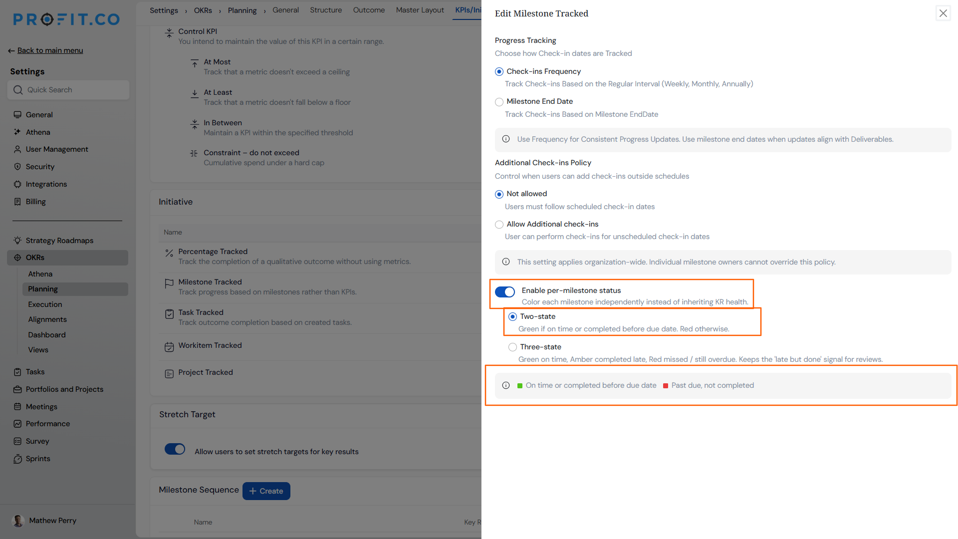
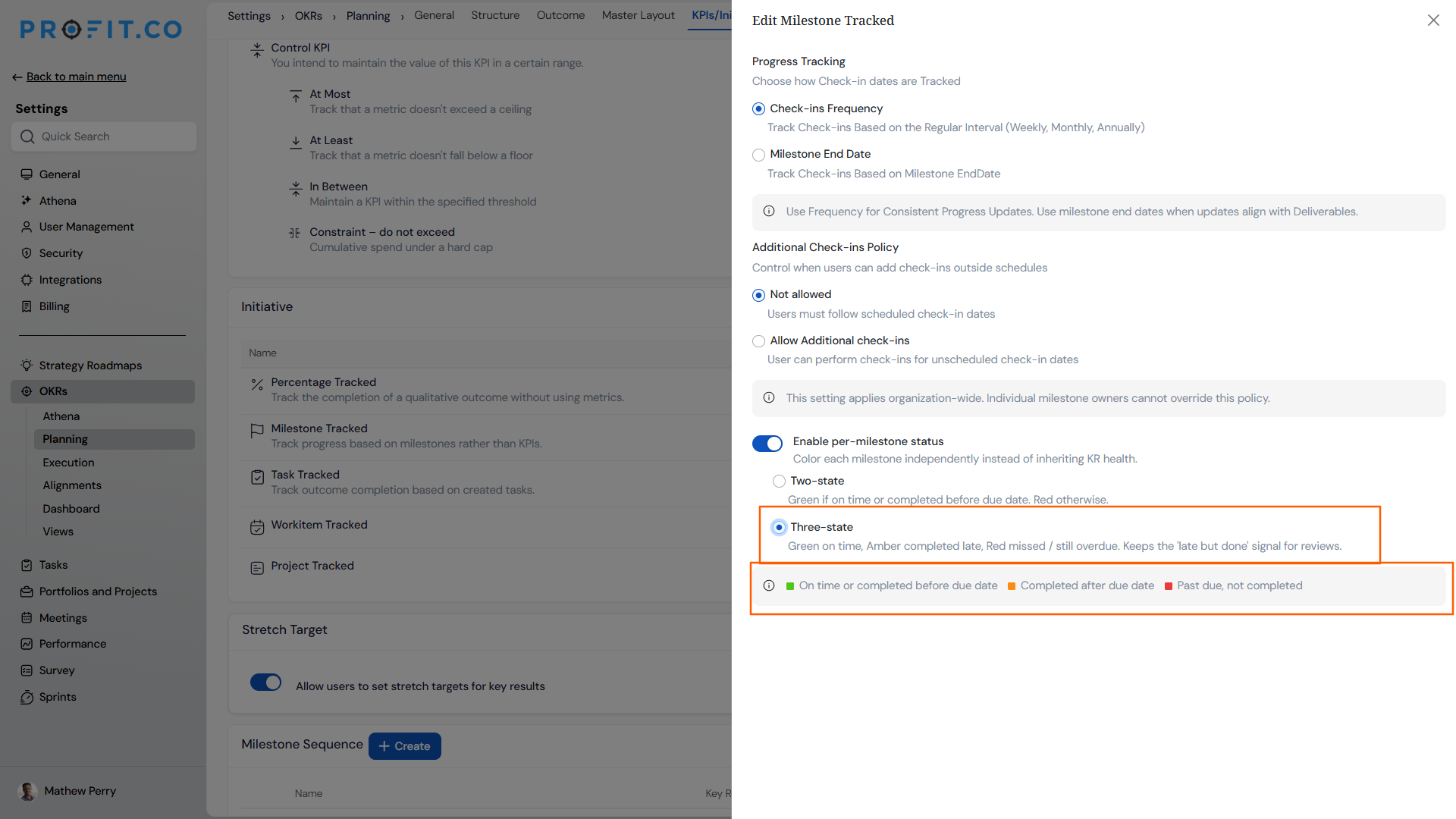
Milestone indicators on milestone-sequence Key Results now reflect each milestone’s own completion outcome rather than the Key Result’s overall health status. Administrators can enable per-milestone status tracking and choose between two status models — a two-state green/red model, or a three-state model that gives grace-period completions their own amber color. Once a milestone window closes, its color is locked and never recomputed on later check-ins, making milestone history a reliable record of actual performance.
How It Works
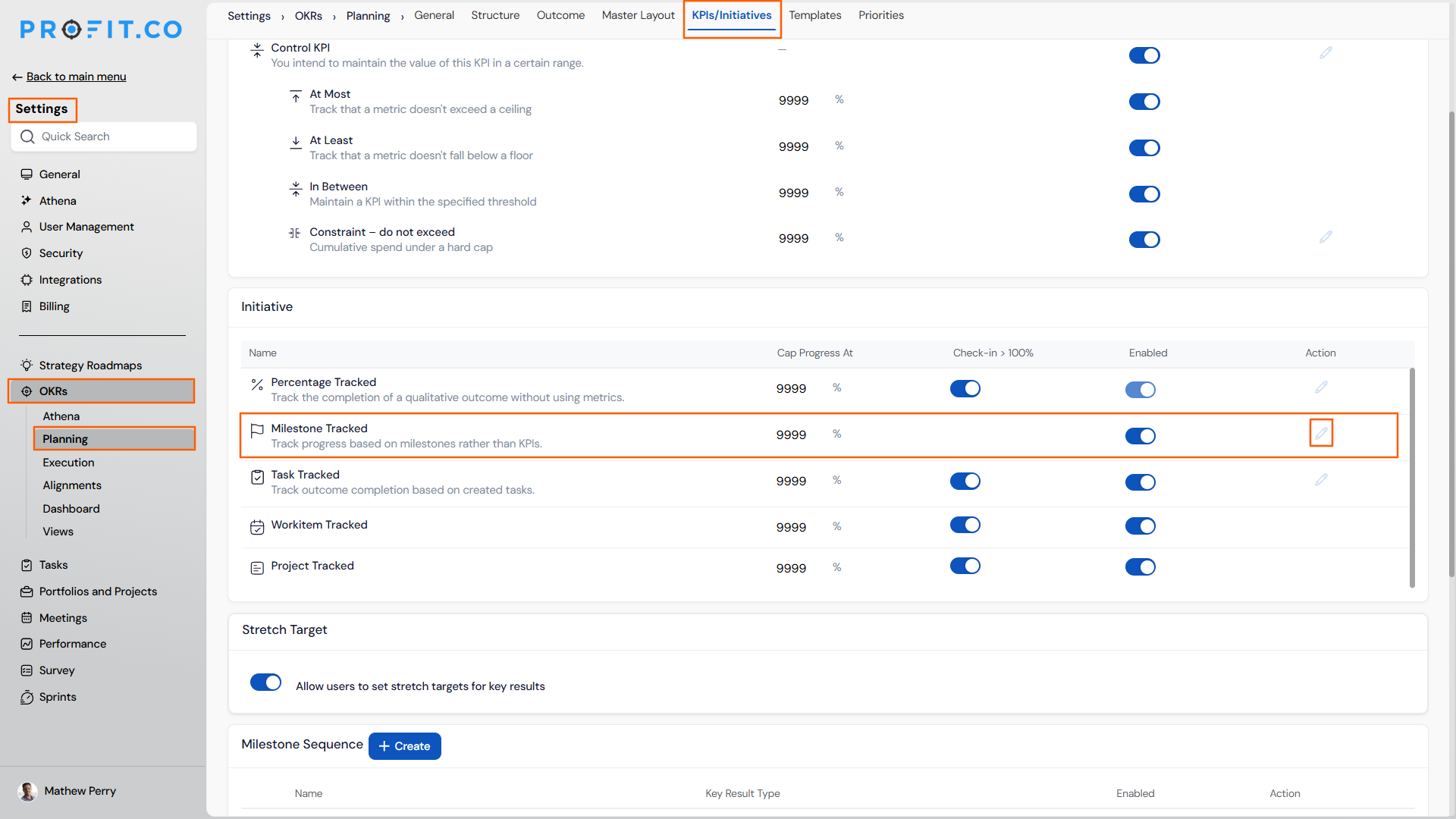
- Navigate to Settings → OKRs → Planning → General\
- Switch to the KPIs/Initiatives tab and edit the Milestone Tracked
- Toggle on Enable per-milestone status — this colors each milestone independently instead of inheriting the Key Result’s overall health
- Select the status model:
- Met or missed — a two-state model using green and red only
- Met, late or missed — a three-state model that adds amber to distinguish grace-period completions
| Color | Met or missed | Met, late or missed |
|---|---|---|
| 🟢Green | On plan, or finished within the grace period | On plan, or finished by the due date |
| 🟠 Amber | — | Finished during the grace period |
| 🔴 Red | Not finished by the end of the grace period | Not finished by the end of the grace period |
- Once configured, milestone colors apply consistently across the check-in panel, List view, Details view, Bowler Chart, and Summary view
- Colors are locked once the milestone window closes and do not change on subsequent check-ins
Why It Matters
- Accurate historical record: Milestone colors now reflect whether each milestone was actually met on time — completed milestones no longer flip to red when later check-in data changes the Key Result’s overall health.
- Grace period visibility: The three-state model gives administrators the option to distinguish milestones completed within the grace period from those completed on time, so review sessions can identify slippage without marking late completions as missed.
- Permanent, trustworthy indicators: Once a milestone window closes, the color is locked and never recomputed — making milestone history a stable reference across every review cycle.
Enhancements:
12. Scrollable Key Result section in the Bowler Chart
Overview
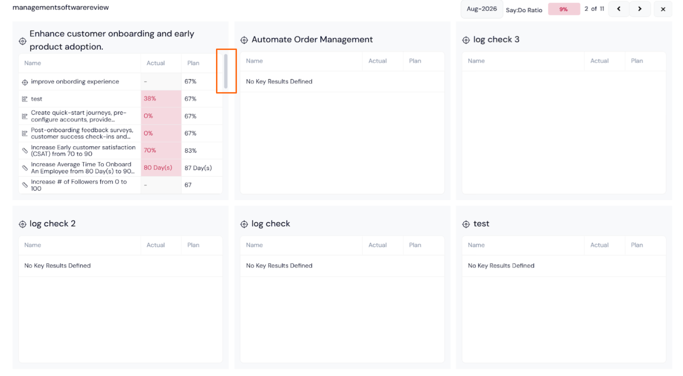
When the Say:Do ratio calculation is selected in the Bowler Chart, the present period’s Key Result section is now scrollable. Previously, when an Objective contained more Key Results than could fit within the visible area, the overflow rows were cut off silently. Users can now scroll within the Key Result section of the present period to see every row without the card expanding or the layout shifting.
How It Works
- Navigate to OKRs → Bowler Chart view
- Select the Say:Do ratio calculation option
- Objective cards in the present period that contain more Key Results than fit in the visible area display a scrollbar and a soft fade at the bottom of the Key Result section, indicating additional rows exist below
- Scroll within the Key Result section to bring hidden rows into view
- The column header stays pinned at the top of the section while scrolling, keeping data readable at any position
- The bottom fade clears once the last Key Result is fully visible, confirming the complete list has been reviewed
- All surrounding cards and the page layout remain undisturbed — scroll is fully contained within the section
Why It Matters
- Complete Key Result visibility: Every Key Result under an Objective is now reachable directly within the Bowler Chart when using Say:Do calculation, with no need to navigate to a separate view.
- No silent data gaps: A visible scrollbar and bottom fade make it clear when more Key Results exist below, so reviewers are never working from a partial snapshot without realising it.
- Stable layout: Card sizes and positions remain unchanged, keeping the Bowler Chart consistent and familiar across review cycles.
13. Full parent context in the OKR presentation view
Overview
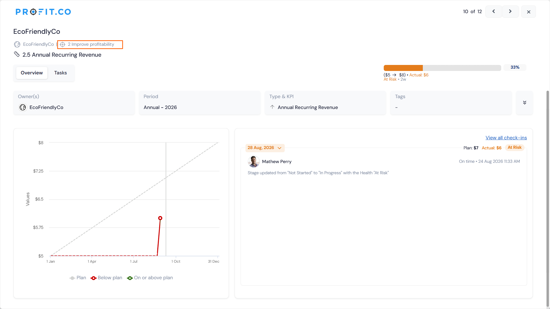
The OKR Presentation View displays each initiative on a dedicated slide, with a breadcrumb at the top showing where the initiative sits in the organisation’s goal hierarchy. Previously, the breadcrumb truncated to an ellipsis at a fixed width, even when plenty of horizontal space remained unused beside it, leaving parent context hidden by default during live sessions. The breadcrumb now expands to fill the available width on screen, showing as much of the parent path as space allows before truncating.
How It Works
- Navigate to OKRs and open any initiative in Presentation View
- The breadcrumb at the top of each slide automatically measures the available horizontal space and fills it with the parent path before applying a trailing ellipsis
- When the full path fits within the available space, it is displayed in full with no ellipsis
- When the path exceeds the available width, the breadcrumb fills to the boundary and ends with a trailing “…”; hovering over the breadcrumb reveals the complete path in the existing tooltip
- The breadcrumb re-measures automatically when the browser window is resized or when navigating between initiative slides, so the display is always accurate to the current viewport
- No configuration is required; the behaviour applies to all Presentation View sessions
Why It Matters
- Parent context visible by default: Reviewers and audiences can read where an initiative sits in the OKR hierarchy at a glance, without needing to hover mid-presentation to reveal the full path.
- Better use of screen real estate: The breadcrumb now uses the space the header already provides, making structured OKR reviews on shared screens cleaner and more informative.
- Consistent experience across window sizes: The breadcrumb adapts to whatever viewport size is in use, so the display remains correct whether presenting in a maximised window or a narrower shared view.
14. Stable calendar height during month navigation
Overview
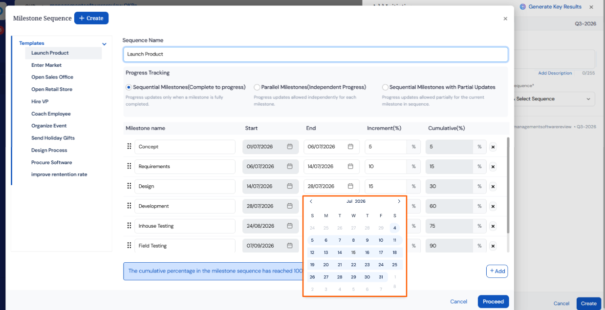
The date picker calendar previously changed height depending on how many week rows a given month required, causing the previous and next month arrows to shift position between clicks. This made rapid date selection across multiple months inconsistent, as users had to re-aim after each navigation. The calendar now always displays six rows regardless of the month, keeping the picker a consistent size and the navigation controls fixed in place.
How It Works
- Open any date field across the platform (for example, in OKRs, milestones, tasks, or review schedules) to launch the date picker
- The calendar always renders six rows of week cells; when a month’s dates require fewer than six rows, the remaining cells are filled with dates from the adjacent month, shown in grey
- The greyed adjacent-month dates are visible for reference only and cannot be selected; clicking them has no effect
- The Previous and Next month arrows stay fixed in position across all months, allowing quick consecutive clicks without re-aiming
- All existing date selection behaviour is unchanged, including selected-date highlights, today markers, and any disabled date rules applied to a specific field
- No configuration is required; the consistent calendar height applies across every date field in the platform automatically.
Why It Matters
- Fixed navigation controls: The previous and next month arrows stay in the same position on every month, so users navigating through multiple months can click quickly without adjusting their aim between each step.
- No accidental adjacent-month selections: Greyed dates from neighbouring months are clearly distinct and non-selectable, preventing unintended clicks that previously could jump the calendar to a different month.
- Platform-wide consistency at once: Because the fix is applied to the single shared date picker component, it takes effect across all modules simultaneously with no per-module work required.
15. Consistent export labelling across the platform
Overview
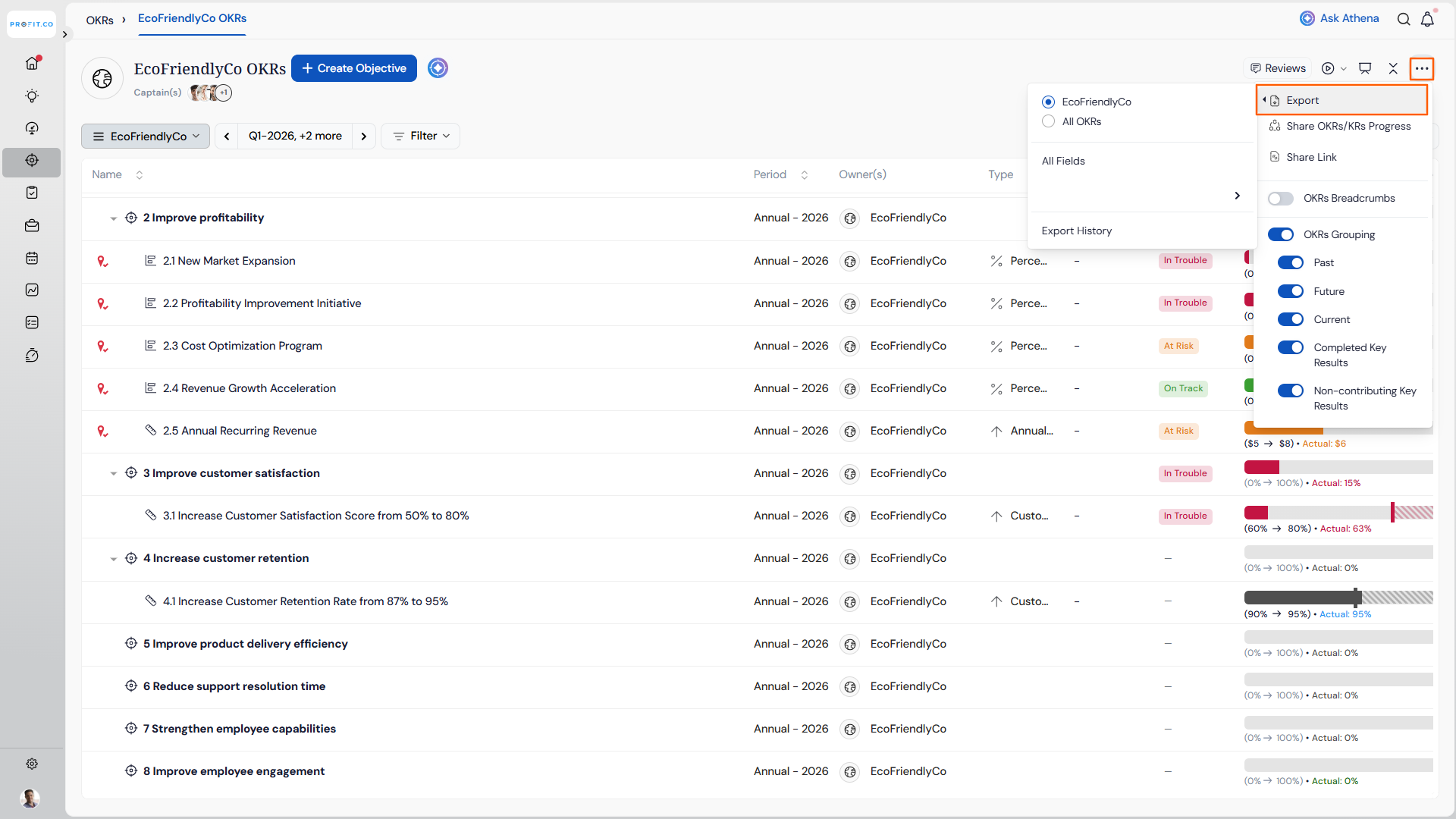
Across several areas of the platform, the option to download data was labelled Download, while the same action in other areas was labelled Export, creating inconsistency in how the same function was named depending on where a user accessed it. The label has been standardized to Export throughout, so users encounter the same terminology regardless of which module or feature they are working in.
How It Works
- Access any feature that supports data export (for example, OKR lists, reports, or project views)
- The option previously labelled Download is now labelled Export in all locations where the rename has been applied
- The underlying action is unchanged; clicking Export produces the same file output as before.
Why It Matters
- Predictable terminology: Users who learn the Export label in one part of the platform can immediately locate the same action elsewhere, without hunting for a differently named control.
- Reduced confusion during training: Teams onboarding new users or building internal guides no longer need to account for two different labels for the same action across modules.
- Cleaner platform experience: Consistent labelling across all export touchpoints brings the platform in line with standard product conventions.
16. Read-Only user access to Corporate Department in Balanced Scorecard
Overview
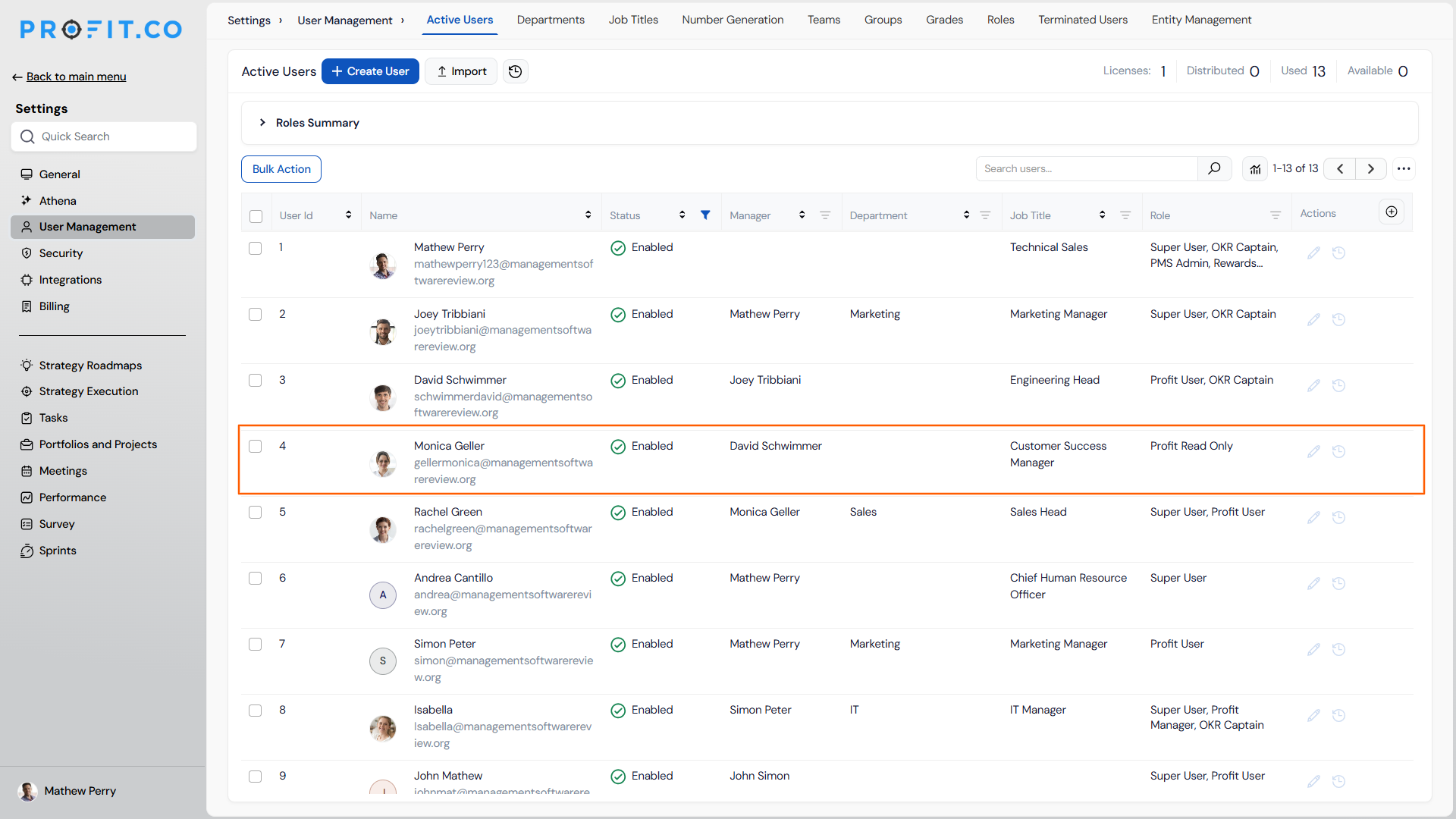
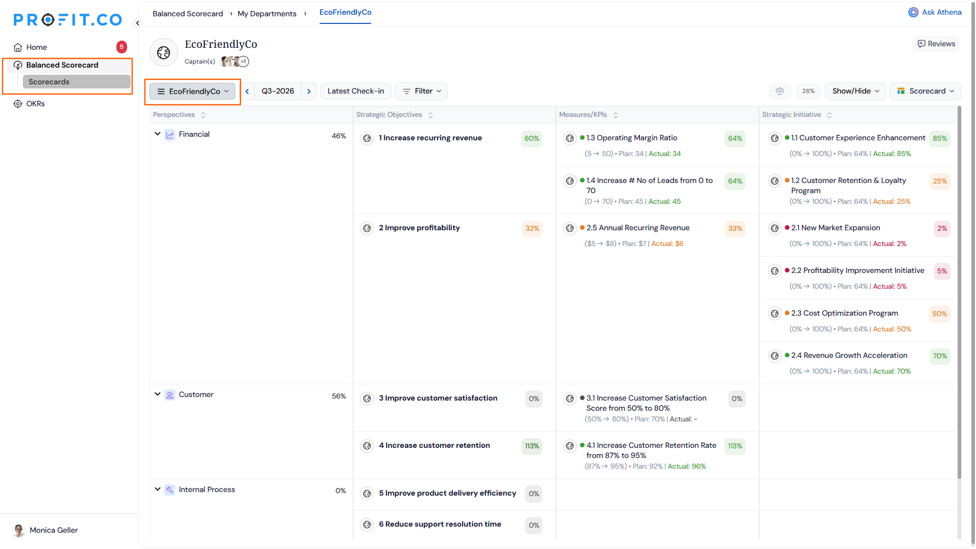
Users with Read-Only access can now view the Corporate Department within the Balanced Scorecard. This ensures that team members in a read-only role have complete visibility across all departments, including corporate-level data, without requiring elevated permissions.
How It Works
- Navigate to the Balanced Scorecard from the left navigation panel and switch to the Corporate Department.
- Users assigned the Read-Only role can now view the Corporate Department alongside other departments visible to them
- No additional configuration is required — access is available automatically for Read-Only users
Why It Matters
- Full BSC visibility for Read-Only users: Read-Only users can now view corporate-level balanced scorecard data without needing a higher-permission role.
- No workarounds needed: Teams no longer need to manually share or export Corporate Department data for Read-Only stakeholders.
- Consistent departmental access: Read-Only users now see a complete and consistent view of the Balanced Scorecard across all departments they are permitted to access.
PROJECTS (Task Management, Portfolios And Projects, Timesheets, Notes And Meetings)
1. Configurable threshold alerts for projects, portfolios, and tasks
Overview
Risk in project portfolios has historically surfaced through periodic status meetings or manual dashboard checks, often after a budget overrun or schedule slip has already compounded. Super users can now set up configurable alert triggers that fire automatically when a project, portfolio, task, or milestone attribute crosses a defined threshold, delivering a visible badge on the dashboard and notifications through the Action Center, email, or a webhook, the moment the condition is met.
How It Works
- Navigate to Settings → General → Triggers and click Create
- Give the trigger a name, then select the update event to monitor: Project Update, Task Update, Portfolio Update, or Milestone Update
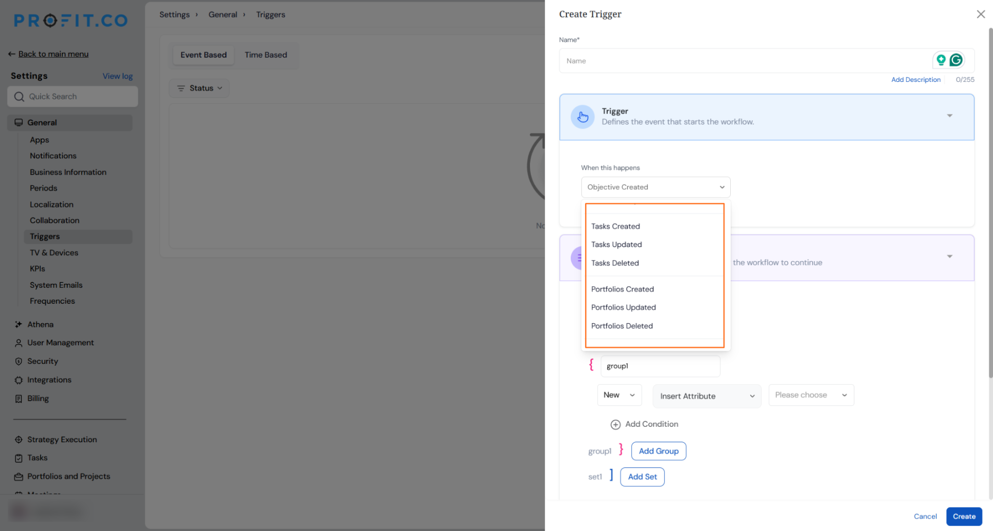
- Build conditions using the Condition panel:
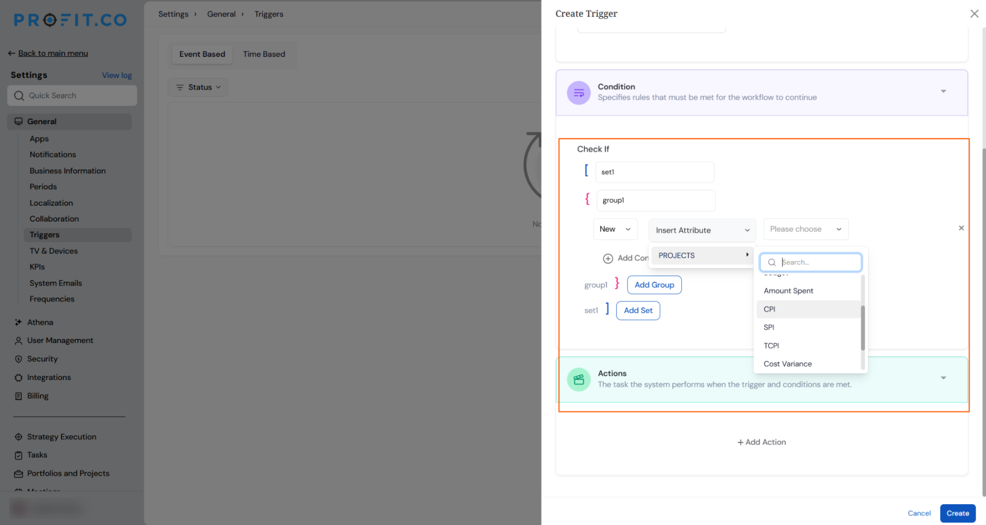
- For Project Update: choose from project-level attributes including Health Status, financial metrics such as Budget Utilization, Amount Spent, and Budget, and EVM metrics including CPI, SPI, TCPI, CV, SV, and VAC; select an operator and set a threshold value
- For Task Update, Portfolio Update, and Milestone Update: choose Health Status as the condition attribute
- Combine multiple conditions within a group using AND logic, and combine groups using AND or OR logic
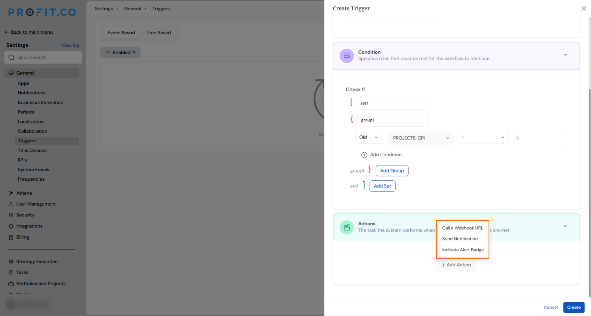
- Click Add Action to define what happens when conditions are met: choose from In-App Notification (Action Center), Email Notification, Indicate Alert Badge (projects only), or Call a Webhook URL
- Save the trigger; it evaluates automatically on every relevant update from that point forward
- Validation prevents saving incomplete or impossible configurations, such as numeric thresholds outside the valid range for EVM metrics
Why It Matters
- Risk surfaces the moment it happens: Threshold conditions are evaluated on every project or task update, so budget overruns and schedule slips generate an alert while corrective action is still practical rather than after the fact.
- Alerts land exactly where teams already work: The dashboard badge, Action Center notification, email, and webhook options mean the right person sees the signal in whichever surface they use, without needing to check a separate report.
- One flexible setup covers every condition: A single trigger can combine multiple attributes with AND and OR logic, covering compound risk scenarios like a project that is simultaneously over budget and behind schedule, without requiring a separate alert for each.
2. Project governance module for CRADI tracking
Overview
Project teams managing risks, issues, decisions, and other governance items have typically relied on external spreadsheets, email threads, and third-party wikis, keeping critical project information outside the platform and leaving no audit trail. A dedicated Governance module is now available inside each project, providing a structured, configurable home for all seven governance categories: Risks, Issues, Project Changes, Actions, Decisions, Assumptions, and Blockers. Each category has its own lifecycle, ownership, and automatic activity log, bringing RAID-compatible governance fully into the project workspace.
How It Works
- Navigate to Settings → Portfolios and Projects → Governance to enable the governance object types relevant to your PMO; each type can be enabled or disabled independently.
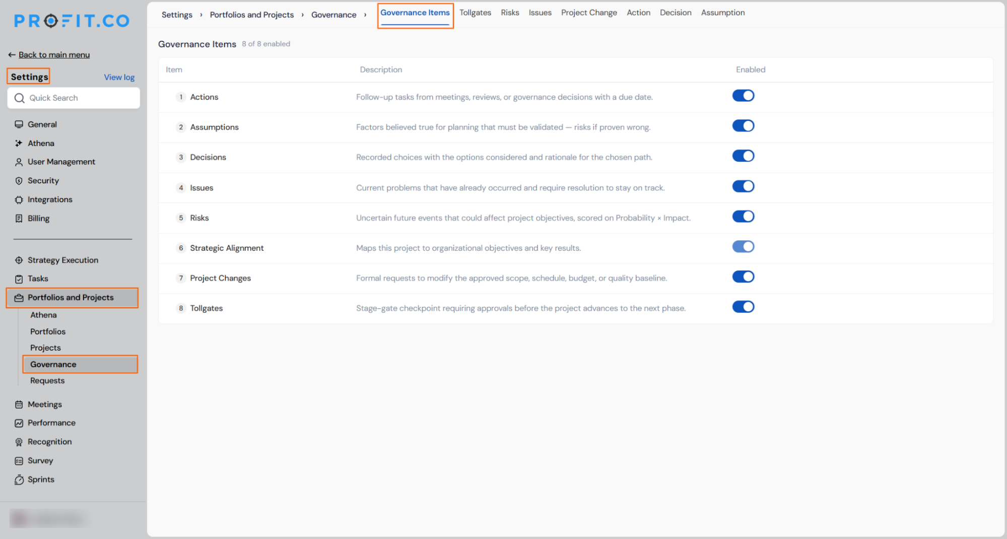
- Risks — uncertain future events that could affect project objectives, scored on a configurable Probability × Impact matrix
- Issues — current problems that have already occurred and require active resolution to keep the project on track
- Project Changes — formal requests to modify the approved scope, schedule, budget, or quality baseline
- Actions — follow-up tasks arising from meetings, reviews, or governance decisions, each with an owner and due date
- Decisions — recorded choices with the options considered and the rationale for the path taken
- Assumptions — factors believed true for planning purposes that must be validated or flagged as invalid
- Blockers — dependencies or constraints actively preventing the team from progressing
- Each enabled type has its own configurable status lifecycle, priority labels, and auto-generated ID prefix
- For Risks, configure the 5×5 probability and impact matrix with colour-coded threshold bands for Low, Medium, High, and Critical levels; Risk Level is calculated automatically from the values entered at check-in
- Inside any project, open the Governance tab to see all enabled item types; use the filter chips at the top to switch between types, and toggle between List view and Kanban view organised by status
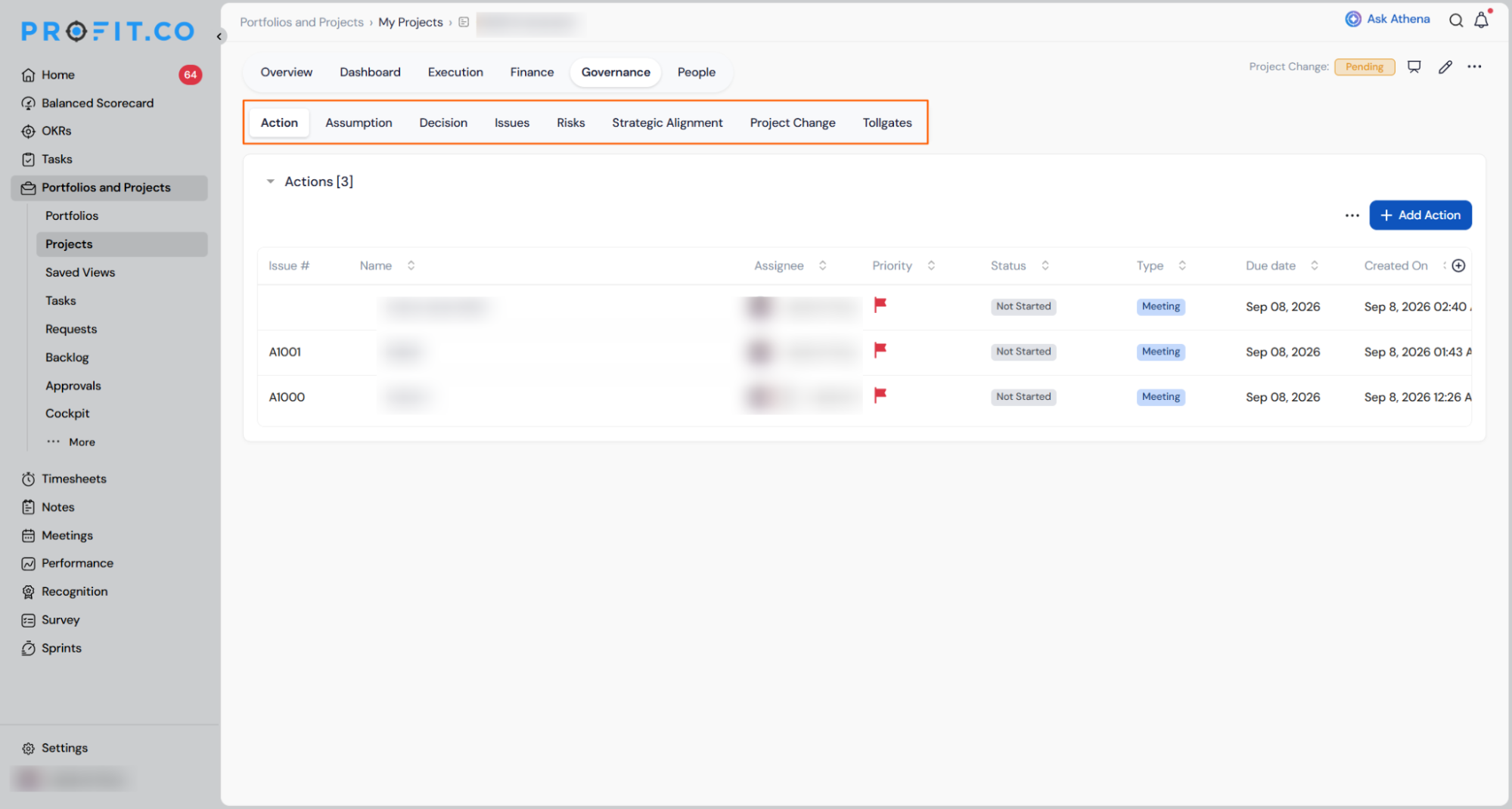
- Click + to create a new governance item; each type has its own required fields validated at submission
- Open any item to access a detail pane with three tabs: Overview (all fields), Associated Tasks (link to or create WBS tasks directly from the governance item), and Activity Log (a complete, immutable record of every change with actor and timestamp)
- Risks that materialise can be escalated directly to Issues with a single action; the system creates a pre-populated Issue, cross-links both items, and records the escalation on both activity logs
- Assumptions can be marked as Validated or Invalid from the detail pane; either action is logged with the acting user and timestamp
Why It Matters
- Governance stays inside the platform: Risks, issues, decisions, and all other RAID items are logged, tracked, and closed directly in Profit.co, removing the dependency on external spreadsheets and the data gaps they create.
- Full audit trail with no manual effort: Every action on every governance item is captured automatically with the actor’s name and a timestamp, giving compliance-sensitive teams a complete, immutable record without additional logging steps.
- Configurable to each PMO’s practice: Super users choose which of the seven governance types to enable, configure the status lifecycle and priorities for each, and set auto-numbering prefixes so the module matches the team’s existing governance framework rather than replacing it.
3. Email Notifications for PPM and Task Action Center Events
Overview
Email notifications are now available for all Action Center events across the PPM and Task modules, covering milestones, portfolios, projects, and tasks. When a relevant event occurs, such as an assignment, a due date change, a deletion, or an approval decision, the right person receives an email automatically. Super users can configure each notification type individually, controlling who receives it and what the message says, directly from the Notifications settings.
How It Works
- Navigate to Settings → General → Notifications → Action Center
- Select the Portfolios and Projects tab or the Tasks tab to view the available notification types for each module
- Notification types are grouped by entity, such as Milestone, Portfolio, and Project, with each group listing its individual events
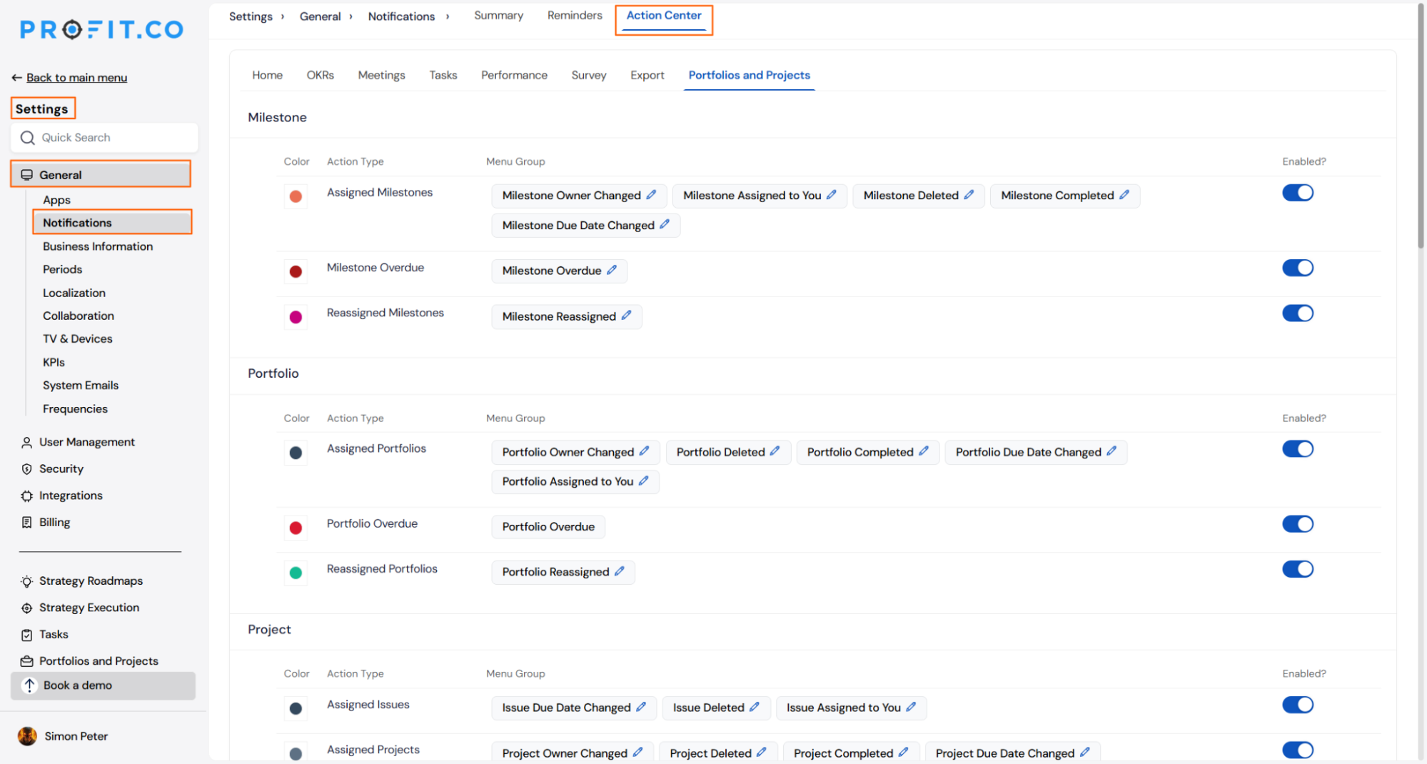
- Use the Enabled toggle on each action type to turn notifications on or off
- Click the edit icon on any event tile to customise the recipient, subject line, and message body for that notification
- Notifications are sent automatically when the triggering event occurs, such as an item being assigned, reassigned, completed, deleted, or moved to overdue
- Approval- related notifications route the request to the approver and send the approval or rejection decision back to the person who submitted it
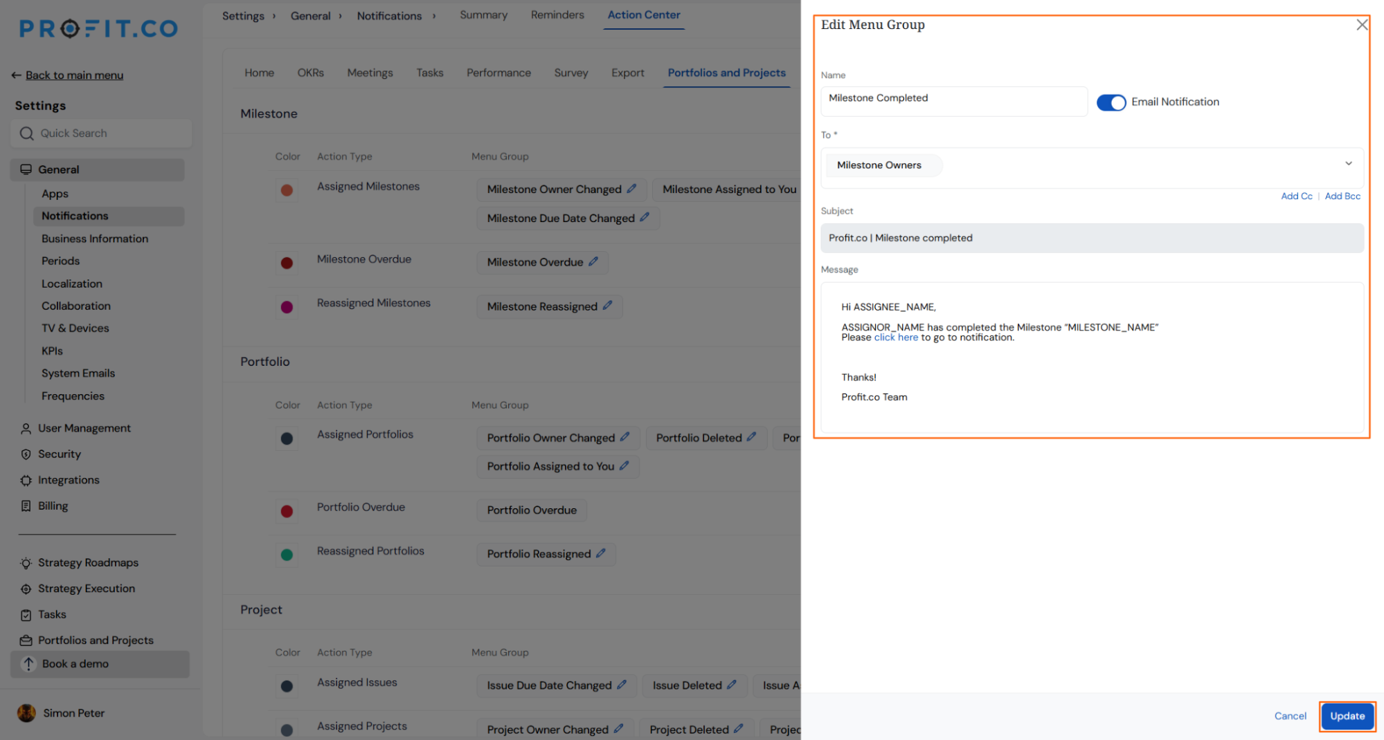
Why It Matters
- Right people are notified automatically: Team members, owners, and approvers receive timely emails for the events that matter to them, without anyone needing to manually follow up.
- Full control for super users: Each notification type can be enabled or disabled independently, and the recipient, subject, and message can be tailored to match how the organisation communicates.
- Approval flows keep moving: Approval requests and decisions are routed automatically to the correct person at each step, reducing delays caused by missed actions.
4. Heatmap view for portfolio capacity workbench
Overview
The Capacity Workbench previously showed resource allocation and utilisation as a dense numeric grid, requiring managers to read every number across every person and period to identify overload or spare capacity. A new Heatmap view sits alongside the existing grid on the Portfolio People tab, using colour-coded cells to show each resource’s utilisation band at a glance. Over-allocated resources are immediately visible and actionable without leaving the view.
How It Works
- Navigate to any Portfolio → People → Capacity Workbench and select Heatmap from the view selector in the filter bar; all active filters and period selections carry across from the Grid view
- Five summary cards at the top show the count of resources in scope broken down by allocation status: People in Scope, Over Allocated, Optimal Allocation, Under Allocated, and No load, along with the average utilisation across all resources
- Each cell in the heatmap represents one resource in one time period and shows three values: used and capacity hours (for example 118 / 160h), the utilisation percentage, and the planned allocation percentage (for example “plan 84%”)
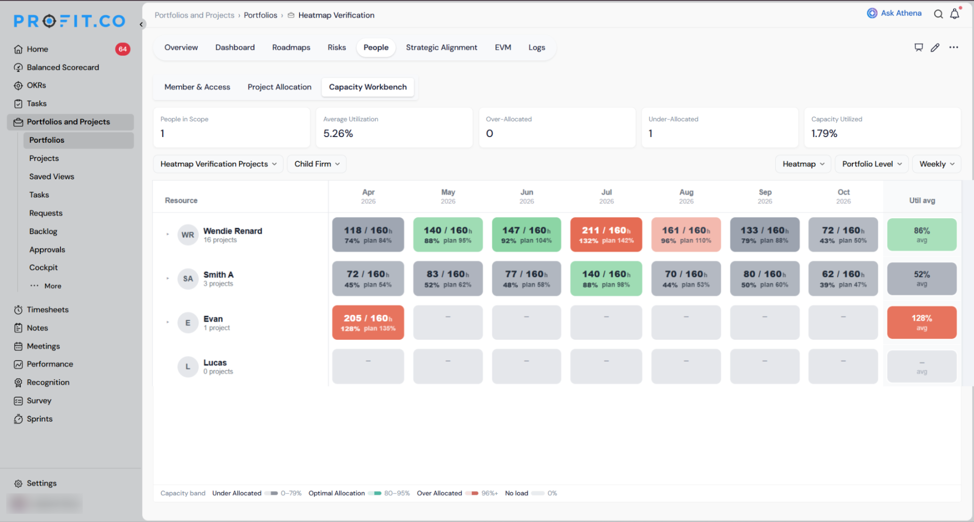
Why It Matters
- Overload and idle capacity visible in a single scan: Colour coding replaces number-by-number reading, so a portfolio manager can identify who is at burnout risk and who has available bandwidth across an entire portfolio without scrolling through rows of figures.
- Planned and actual load visible together: Each cell shows both the planned allocation percentage and the actual utilisation in the same space, making it immediately clear when work is booked but not being delivered.
- Overload is actionable in place: Clicking an over-allocated cell opens the existing rebalancing workflow directly, so a manager can reassign or reschedule tasks without navigating away from the heatmap.
5. Project stage and health widgets by portfolio in the cockpit
Overview
The Portfolio Cockpit’s existing project stage and health widgets roll all projects across every portfolio into a single aggregate count, showing overall programme health but giving no signal about which portfolios carry the most risk. Two new widgets, Project Stage by Portfolio and Project Health by Portfolio, break the same data down by portfolio so executives and PMO owners can see at a glance which portfolios need attention, without opening each one individually.
How It Works
- Navigate to Portfolios and Projects → Cockpit and click Customize to add either or both new widgets to the Cockpit view
- Project Stage by Portfolio displays a table with one row per portfolio and four stage columns: Not Started, Scheduled, In Progress, and Completed; each cell shows the count of projects in that stage for that portfolio
- Project Health by Portfolio displays a table with one row per portfolio and six health columns showing projects that are on time or delayed, split across Not Started, In Progress, and Completed stages
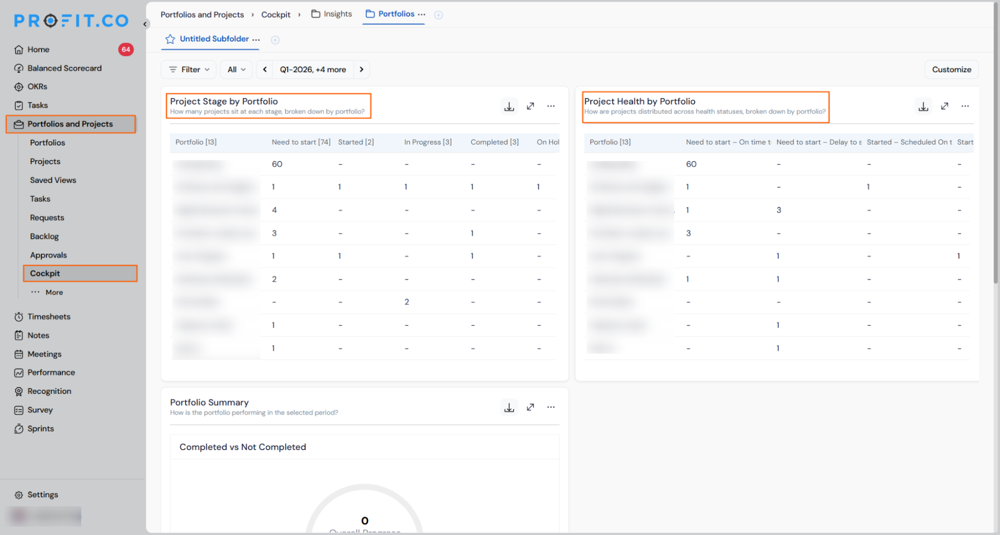
- Click any count to open a drill-down panel listing the exact projects behind it, showing project name, owner, planned start and end dates, stage, and progress
- Use the Portfolio dropdown inside the drill-down panel to switch to the same status for a different portfolio without closing the panel
- Open the ⋯ menu on either widget to: Download as PNG (for dropping into a deck), Include Sub-Portfolios (rolls sub-portfolio projects into the parent portfolio’s counts), or Remove Widget (re-add anytime via Customize)
Why It Matters
- Portfolio-level risk visible before any meeting: Executives can identify which portfolios are behind or in trouble from a single Cockpit view, without opening each portfolio or asking the PMO to compile a manual summary.
- Drill-through without leaving the Cockpit: Clicking any count opens the list of exact projects behind it, so follow-up questions about which projects are affected can be answered in the same surface without navigation.
- Sub-portfolio rollup on demand: The Include Sub-Portfolios option lets PMO owners see consolidated counts for a parent portfolio when sub-portfolio projects need to be included in reporting, with no separate calculation required.
6. Mandatory tollgate selection on project creation
Overview
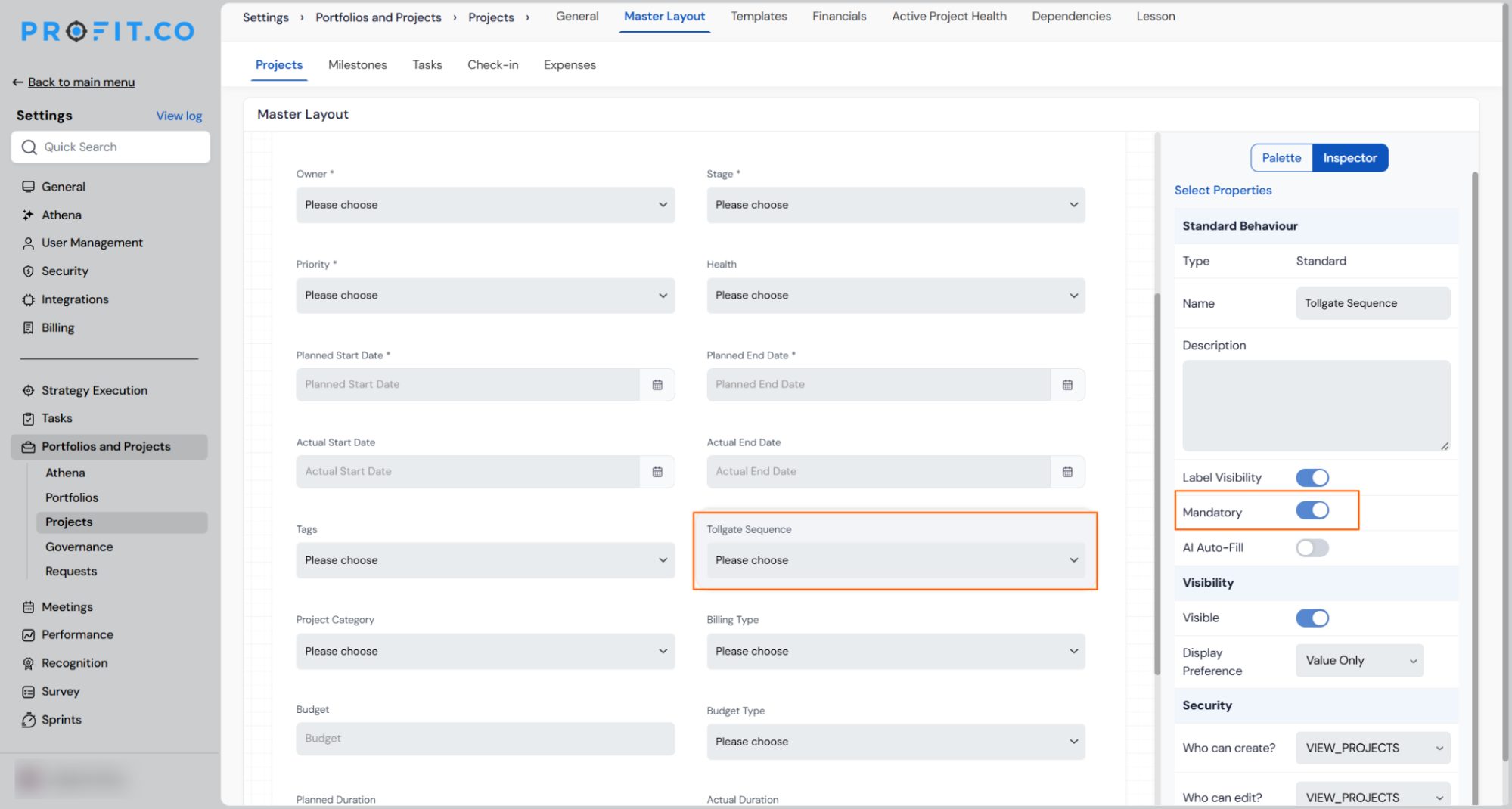
Tollgate selection during project creation was optional, meaning projects could be saved without a defined stage-gate structure. Super users can now mark the Tollgate field as mandatory in the project Master Layout, which prevents any project from being created until a tollgate is selected, regardless of which creation path is used. Existing projects are unaffected.
How It Works
- Navigate to Settings → Portfolios and Projects → Portfolios → Master Layout
- Select the Tollgate field to open its property panel in the Inspector
- Enable the Mandatory toggle; the field is now required on the project creation form
- When a user attempts to create a project without selecting a Tollgate, the system blocks submission and displays a validation message directing them to complete the field
- The mandatory validation applies consistently across all project creation entry points, including creation via a portfolio, via a template, and via the standalone project creation flow
- Existing projects created before this change without a Tollgate selected remain accessible and are not retroactively blocked or altered
- The available Tollgate values are unchanged; this setting enforces selection only and does not modify the configured list of tollgates
Why It Matters
- No projects without a stage-gate structure: Making Tollgate mandatory at the point of creation ensures every project enters the portfolio with a defined governance checkpoint, closing the gap that allows projects to bypass tollgate configuration entirely.
- Consistent enforcement across all creation paths: The validation applies regardless of how a project is created, so the requirement cannot be bypassed by using a template or portfolio-level creation flow instead of the standard form.
- Safe rollout with no impact on existing records: The mandatory setting applies forward only, leaving projects already in the system untouched and avoiding disruption to current portfolio views or reporting.
7. Standard date and attribute fields now configurable in Master Layout
Overview
The Master Layout canvas for Portfolios, Projects, Milestones, and Tasks previously only allowed super users to configure custom fields. The platform’s own standard fields, including Owner, Status, Priority, Tags, Planned Start Date, Planned End Date, Actual Start Date, and Actual End Date, were fixed and could not be made mandatory, hidden, or repositioned through the same Inspector panel. A new Standard Attributes section in Master Layout now exposes all of these fields as fully configurable attributes. Planned Start Date and Planned End Date ship with Mandatory pre-enabled; Actual Start Date and Actual End Date ship with Mandatory off.
How It Works
- Navigate to Settings → Portfolios and Projects → Portfolios / Projects / Milestones / Tasks → Master Layout
- A new Standard Attributes section appears on the canvas alongside any existing custom field sections; it contains Owner, Status, Priority, Tags, Planned Start Date, Planned End Date, Actual Start Date, and Actual End Date
- Select any standard attribute to open its Inspector panel, which exposes the same controls available for custom fields:
- Label Visibility — show or hide the field label
- Mandatory — when enabled, the field must be completed before the record can be saved
- Visibility — control whether the field is visible to users
- Display Preference — choose how the field value is presented
- Security — set who can create, edit, or view the field (for example VIEW_PORTFOLIOS)
- Planned Start Date and Planned End Date have Mandatory enabled by default; disabling these is permitted but should be done deliberately
- Actual Start Date and Actual End Date have Mandatory disabled by default and can be made required if the PMO’s process demands actual date capture at record creation
- Changes take effect immediately across all creation and edit forms for the configured entity type
- Existing records are not retroactively blocked; mandatory validation applies at the point of creation or next save only

Why It Matters
- Planned dates enforced at the point of creation: Super users can require Planned Start and End dates before any project or milestone is saved, preventing incomplete records from entering the portfolio with blank scheduling data.
- One configuration mechanism for all fields: Standard and custom attributes are now governed by the same Inspector panel and the same Mandatory toggle, removing the inconsistency where custom fields were fully configurable but core fields were not.
- Per-entity control without new settings screens: The configuration applies separately to Portfolios, Projects, Milestones, and Tasks through each entity’s own Master Layout, so PMO teams can enforce date capture on projects without affecting task creation forms, or vice versa.
8. Tollgate-based project progress calculation
Overview
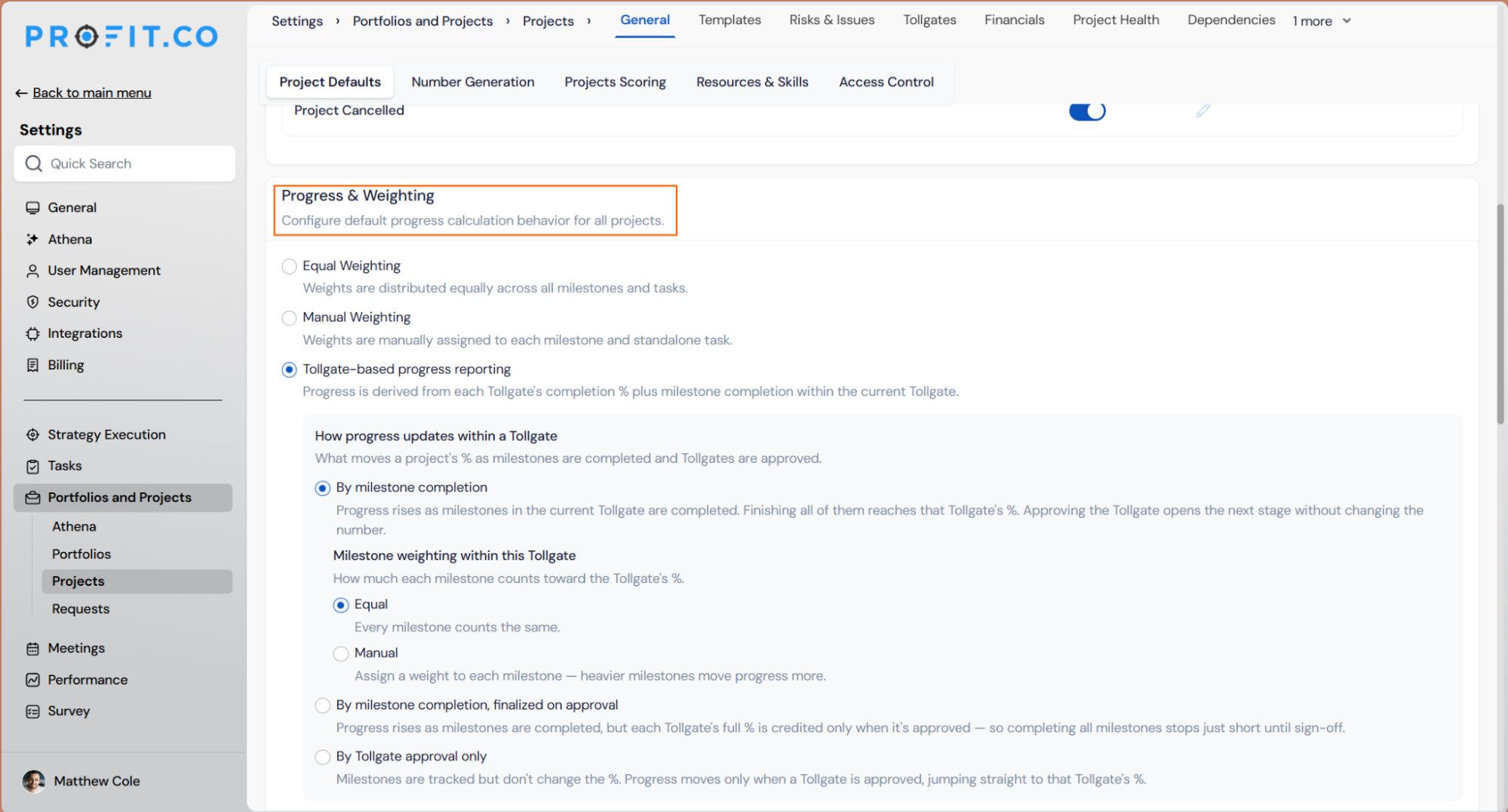
Project progress was previously calculated only from milestone and task completion across the entire project, with no way to tie the progress figure to the stage-gate structure a project follows. A new Tollgate-based progress reporting mode is now available in Project Defaults, giving super users three options for how progress moves through each Tollgate stage. Teams that require formal sign-off before crediting completion can now hold back a configurable percentage point until a Tollgate is approved, keeping the reported figure honest about what has actually been accepted rather than just completed.
How It Works
- Navigate to Settings → Portfolios and Projects → Projects → General → Project Defaults and scroll to Project Progress & Weighting
- Three progress calculation modes are available:
- Equal Weighting — weights distributed equally across all milestones and tasks (existing)
- Manual Weighting — weights manually assigned to each milestone and standalone task (existing)
- Tollgate-based progress reporting — progress is derived from each Tollgate’s completion percentage plus milestone completion within the current Tollgate (new)
- When Tollgate-based progress reporting is selected, a sub-option controls how progress updates within each Tollgate:
- By milestone completion — progress rises as milestones in the current Tollgate are completed; approving the Tollgate opens the next stage without changing the number
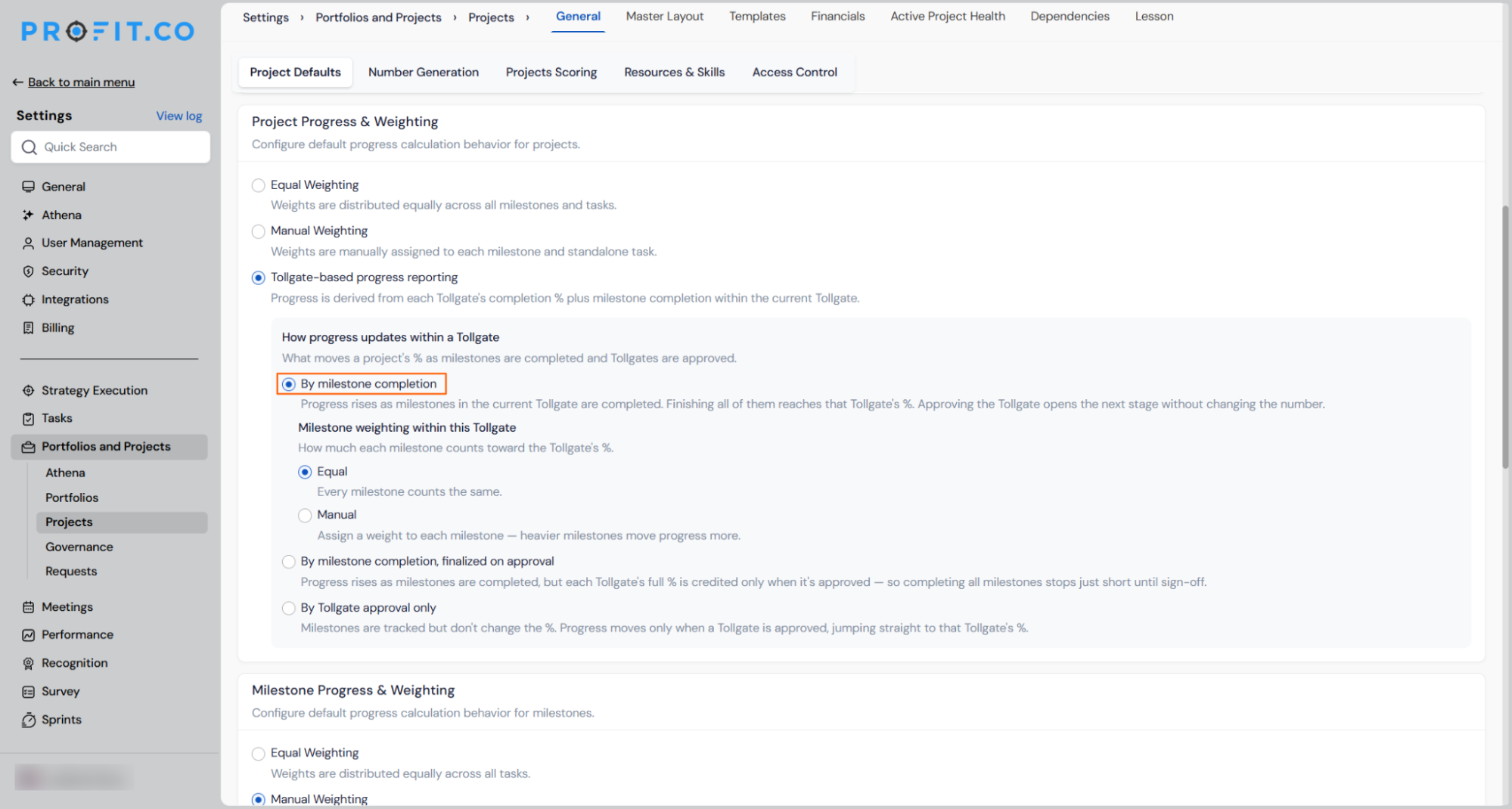
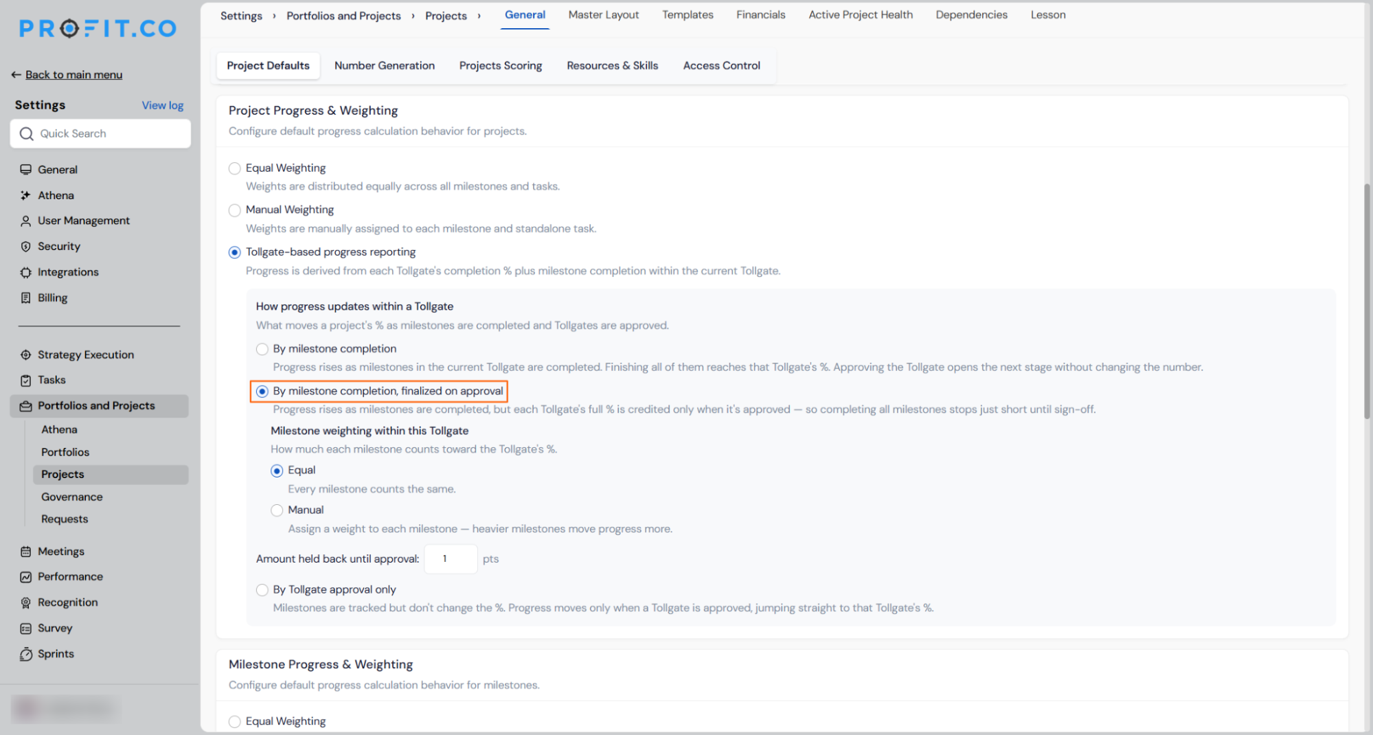
- By milestone completion, finalized on approval — progress rises as milestones are completed but the Tollgate’s full weight is only credited once it is approved; an Amount held back until approval field lets super users set how many points are withheld pending sign-off (for example, if a Tollgate has a weight of 5 and hold-back is set to 1, completion shows as 4 until the Tollgate is approved, then moves to 5)
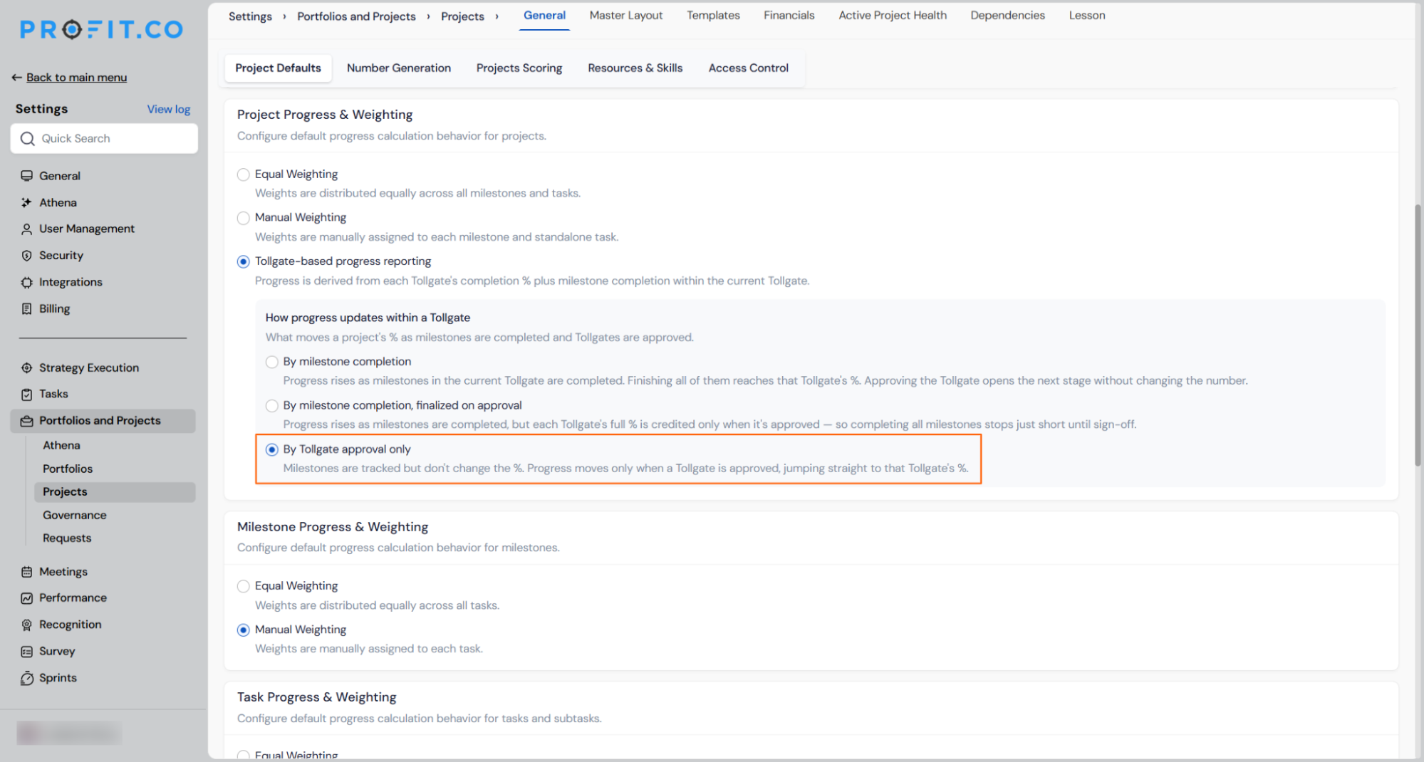
- By Tollgate approval only — milestones are tracked but do not move the progress percentage; the number jumps directly to the Tollgate’s full weight only when the Tollgate is approved
- Milestone weighting within each Tollgate can be set to Equal (every milestone counts the same) or Manual (assign individual weights so heavier milestones move progress more)
- The selected mode applies as the default for all new projects; existing projects retain their current calculation method until updated
Why It Matters
- Progress reflects governance reality: Teams that run formal Tollgate approvals can now report a progress figure that only moves to its full value after sign-off, preventing a project from showing 100% complete while its final stage gate is still pending.
- Hold-back amount is configurable per PMO need: The amount held back until approval can be set to any value within a Tollgate’s weight, giving super users precise control over how much of the completion credit requires sign-off versus active milestone work.
- Three modes cover the full governance spectrum: From fully milestone-driven to fully approval-driven, the three sub-options let each organisation match the progress calculation to the level of governance rigour their stage-gate process demands.
9. Stage-specific health status configuration for projects and milestones
Overview
Project and milestone health was previously calculated using a single method applied uniformly across all lifecycle stages, which meant a project in planning was judged by the same criteria as one actively in execution. Health status configuration is now available per built-in lifecycle stage, with each stage using logic appropriate to where the project actually is. The health calculation cascades up the hierarchy automatically: task health rolls into milestone health, and milestone health rolls into project health, so the project-level badge always reflects the actual state of the work beneath it.
How It Works
- Navigate to Settings → Portfolios and Projects → Projects → Active Project Health
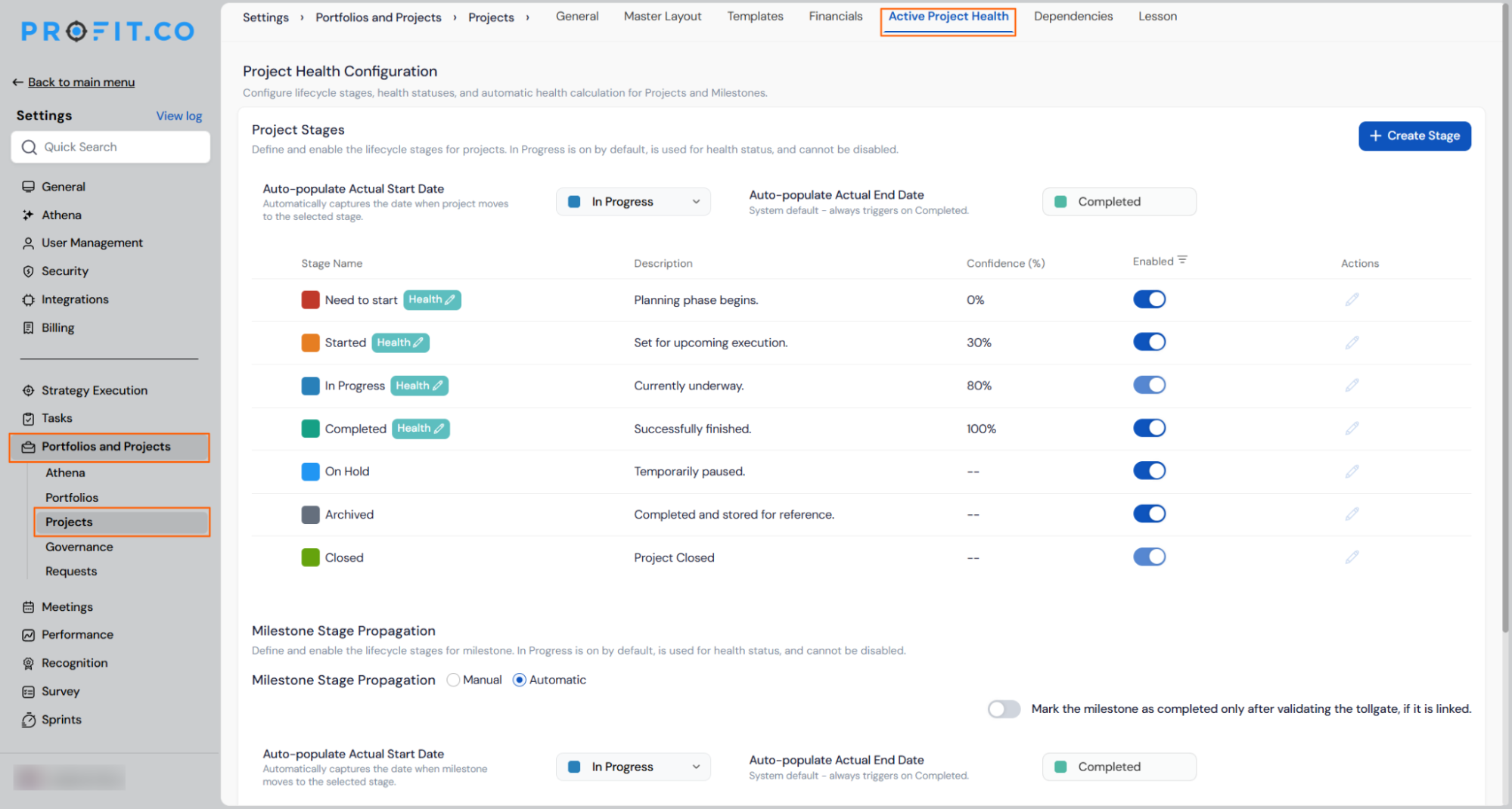
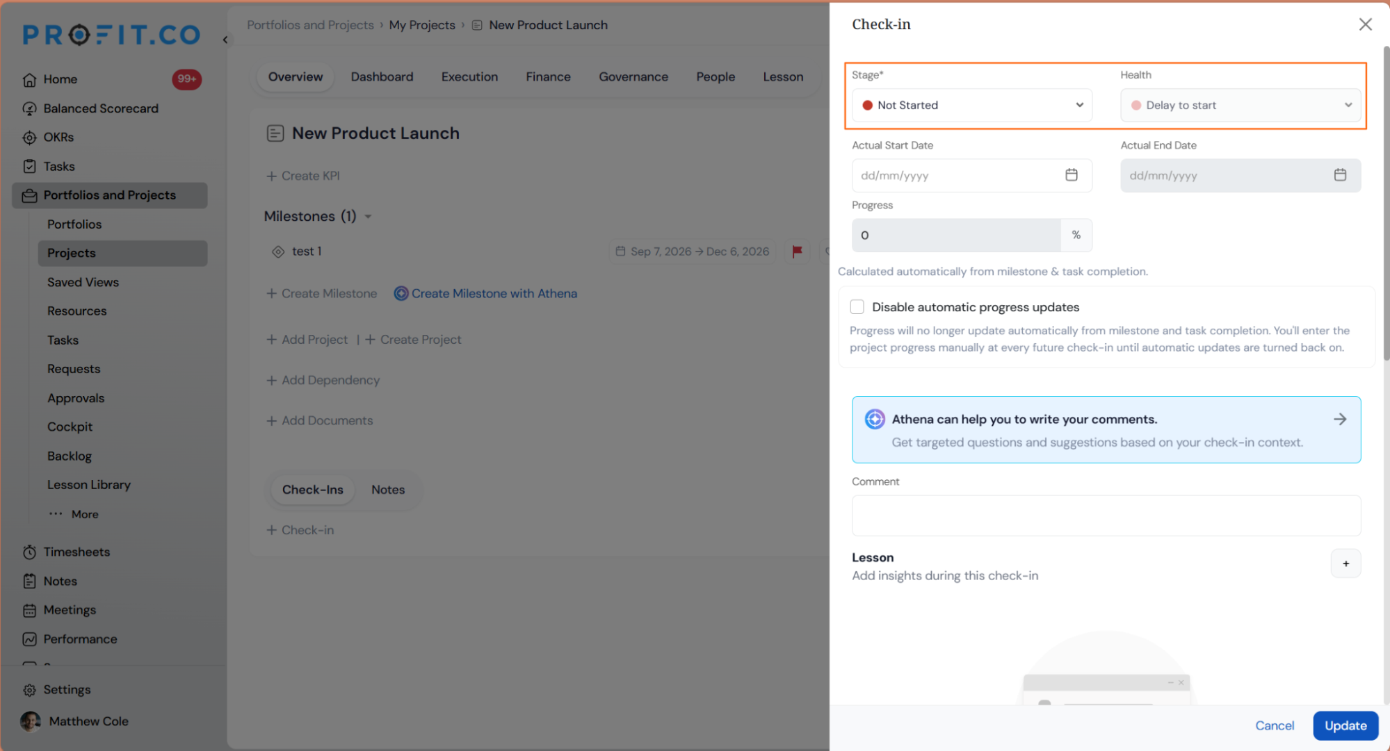
- Click the Health icon next to any built-in lifecycle stage to open its Health Status Configuration panel
- Each built-in stage uses its own health logic:
- Need to start — checks whether the planned start date aligns with the actual start date or today’s date; if the planned start has passed with no actual start recorded, health is Delay to start; if the planned start is still ahead, health is On time to start
- Started — compares expected progress (distributed evenly across the stage duration) against actual progress; if actual equals or exceeds planned, health is Scheduled On time; if actual falls below planned, health is Scheduled delay
- In Progress — calculates a velocity ratio (Actual Progress divided by Planned Progress); a ratio of 1.0 or above is On Time, below 1.0 is Delayed; uses either Progress-Based or EVM-Based (Schedule Performance Index and Cost Performance Index for projects with baseline and cost tracking); health statuses are mapped to configurable Velocity Bands with customisable percentage ranges (for example 0–40% = In Trouble, 41–80% = At Risk, 81–100% = On Track); additional bands can be added via + Create Band
- Completed — checks whether the actual completion date fell on or before the scheduled completion date; health is Completed On time or Completed delay
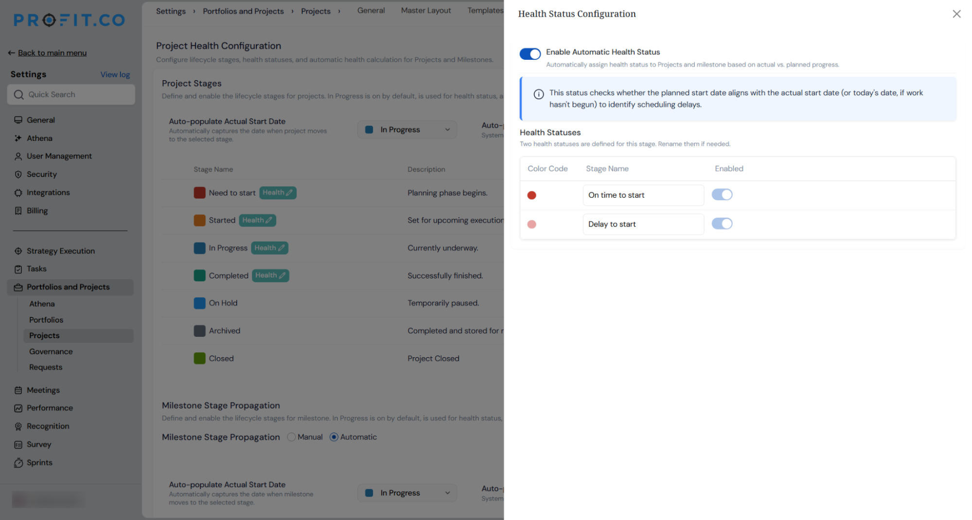
- Health cascades up the work hierarchy automatically: individual task health feeds into the parent milestone’s calculated health, which in turn feeds into the project-level health badge; no manual roll-up is required
- Health status labels within each stage can be renamed in the panel to match internal reporting terminology
- Health status configuration is available for built-in lifecycle stages only; custom stages do not currently support health assignment
Why It Matters
- Health logic matches the lifecycle stage: A project awaiting its start date is assessed on whether it is on track to begin; a project in execution is assessed on velocity against plan; a completed project is assessed on whether it finished on time, so the health badge is meaningful at every stage rather than applying the same formula regardless of context.
- Automatic roll-up from task to project: Because health cascades up from tasks through milestones to the project level, a project-level health badge always reflects what is actually happening in the work below it, with no manual aggregation needed.
- In-progress health supports both progress and EVM methods: Teams with mature cost tracking can switch to EVM-based health for the In Progress stage, giving finance-aware projects a more precise signal than a progress ratio alone.
10. Role-based widget access controls for portfolio and project dashboards
Overview
The Dashboard tab on Portfolio and Project pages previously showed the same set of widgets to every user with access, regardless of whether their role warranted visibility into financial, executive-level, or analytical content. Super users can now configure per-role widget access from the dashboard’s Access Control settings, defining which of 60 available widgets each role can see and add to their own dashboard view. Each user’s Customize panel shows only the widgets their role permits, keeping sensitive financial and executive data visible only to those who need it.
How It Works
- Click Settings → Access Control to see the list of configured dashboard roles, for example, Portfolio Owner, Portfolio Manager, Portfolio Finance Manager, and Portfolio User
- Click Edit on any role to open its permission panel, divided into two sections:
- Maintain Overview — controls project-level actions such as Manage Project, Manage Milestone, Export CSV, and Export PDF
- Maintain Dashboard — controls whether the role can view the dashboard and whether they can create custom widgets
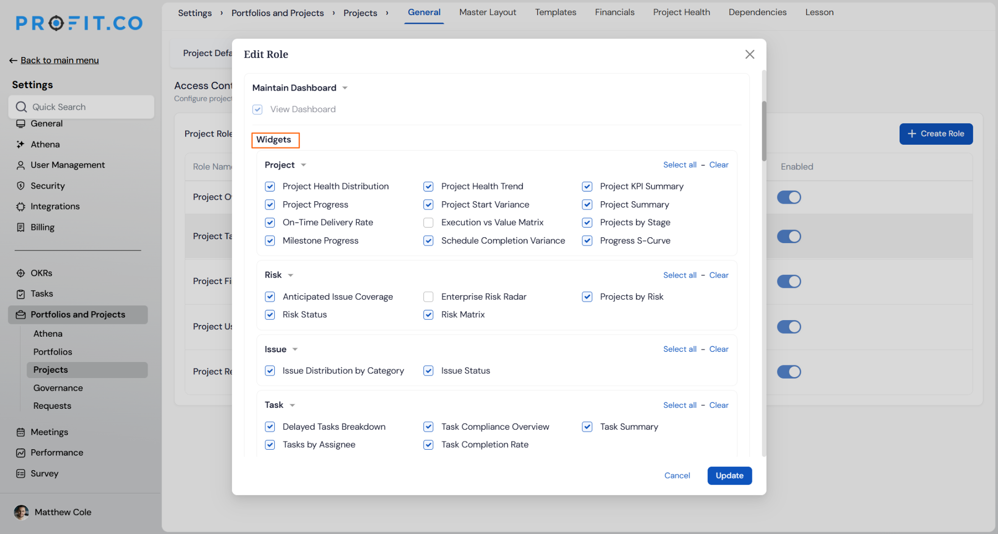
- Under Maintain Dashboard, expand the Widgets section to see all available widgets grouped by category: Project, Portfolio, Risk, Issue, Task, Resource Management, Lesson Learned, Strategic Alignment, Tollgate, Financial, and EVM
- Enable or disable individual widgets per role; use Select all or Clear per category for faster bulk configuration
- Widgets follow three access tiers:
- Core — available to all roles by default
- Analytical — available to managers and above
- Executive — available to senior roles only
- FIN — finance-gated; available only to roles with financial access permissions
- Once saved, each role’s Customize Widgets panel shows only the widgets enabled for that role; widgets not permitted are hidden entirely, not just greyed out

- An Enforce to all option pushes the current widget layout to all users sharing that role, standardising the default view across the team
Why It Matters
- The right data for each audience: Executives see strategic and financial widgets; project managers see operational and delivery widgets; finance roles see budget and EVM data, so each user’s dashboard reflects what their role actually needs without the noise of irrelevant panels.
- Finance and executive content stays protected: Financial and EVM widgets are gated behind specific role permissions, so sensitive budget, IRR, NPV, and variance data is visible only to roles explicitly granted access.
- Personalisation within defined limits: Users can still customise their own dashboard layout within the widget set their role permits, keeping the flexibility of a personal view without the risk of over-exposure.
11. Planned vs actual progress comparison in the project overview panel
Overview
The Project Information panel on the Overview tab displayed a Progress bar and a Health badge. Still, it showed only the actual progress percentage with no indication of what the planned progress was then. Reviewers and project managers could see the health judgement but not the underlying comparison that produced it, which required navigating away from the Overview tab to reconstruct the picture manually. The panel now shows both Actual and Planned progress side by side, with a plain-language variance label explaining the gap, so the health status is immediately self-explanatory.
How It Works
- Open any project and go to the Overview tab; the Project Information panel now shows a dual progress display beneath the existing progress bar
- The progress bar shows the actual progress fill as before; a vertical marker on the bar now indicates where planned progress sits at today’s date
- Below the bar, two labelled values appear side by side: Actual (the current progress percentage) and Planned (the expected progress based on the project plan and today’s date)
- A variance label beneath both values gives a plain-language reading of the gap in one of four states:
- X% ahead of plan — shown in green when actual exceeds planned
- X% behind plan — shown in red when actual is below planned
- Planned start date not yet reached — shown when the project has not yet started
- No due date set — shown when no planned end date is configured, making a plan line unavailable
- The planned progress value is calculated from the project’s milestone plan; it reflects the same planned progress figure used by the health engine to derive the Health badge, making the badge’s meaning fully transparent on the same panel
- No configuration is required; the dual display appears on all projects where planned dates are set

Why It Matters
- Health badge is now self-explanatory: The actual and planned values that determine the Health status are visible on the same panel as the badge, so reviewers can understand how the status was reached without leaving the Overview tab.
- Variance is readable at a glance: The plain-language label (“3% ahead of plan” or “8% behind plan”) communicates the project’s position in a format that is immediately usable in a review conversation without any calculation.
- Edge cases are clearly signalled: Projects that have not yet started or have no due date set show an explicit label rather than a blank or zero value, preventing misreads of incomplete data as actual project performance.
12. Date boundary enforcement across the project hierarchy
Overview
Milestone, task, and subtask dates could previously fall outside the boundaries of their parent, with no validation preventing the mismatch and no visible indicator once the inconsistency existed. A new Timeline Cascading settings section introduces configurable boundary enforcement across the full Project, Milestone, Task, and Subtask hierarchy. When enabled, child dates that fall outside their parent’s duration are blocked at the date picker before they can be saved, and any records already sitting outside their parent’s range show a permanent warning badge that is always visible regardless of the setting.
How It Works
- Navigate to Settings → Portfolios and Projects → Projects → General → Project Defaults and scroll to the new Timeline Cascading section, which contains three controls:
- Cascade date changes to children (on by default): when a parent’s dates are edited, a preview shows the proposed shifted dates for all child records; the user can review and apply or skip the cascade before saving
- Enable Approval Flow: when on, cascade adjustments that affect records owned by someone else require approval before they are applied
- Restrict dates within parent duration (new): when enabled, Milestone dates must stay within their Project’s duration, Task dates must stay within their Milestone’s duration, and Subtask dates must stay within their parent Task’s duration; out-of-range dates are disabled in the date picker and blocked on save

- When Restrict dates within parent duration is on, attempting to set a date that would fall outside the parent’s range disables that date in the picker and prevents saving, with a validation message
- For any Milestone or Task whose dates currently fall outside their parent’s range, the pop-up will appear.
- Switching the restriction toggle off restores the prior behaviour, allowing any date to be entered at any level; the warning badge continues to appear on any records that remain out of range
Why It Matters
- The full hierarchy is now protected: Boundary enforcement applies at every level from Project down to Subtask, closing the gap where Milestone dates could silently fall outside their Project’s range with no check and no warning.
- Out-of-range records are always visible: The permanent warning badge on the Overview page flags any record sitting outside its parent’s dates regardless of settings, so inconsistencies introduced before the restriction was enabled remain visible and actionable.
- Parent authority is restored: Children can no longer push parent dates outward, keeping the Project as the defining boundary for its Milestones rather than the other way around.
Enhancements:
13. Explicit format labels on all PPM export actions
Overview
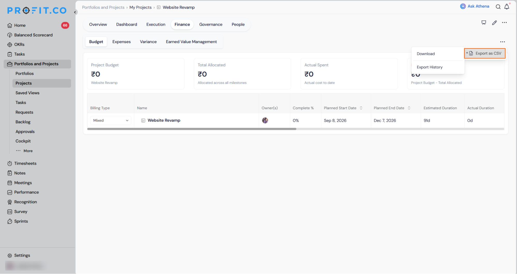
Export actions across the PPM module used inconsistent labels, with some showing “Export as CSV” and others showing only “Export” for the same action producing the same file. Users had to guess the output format before clicking. All export labels in Portfolio, Project, Task, and Request areas have been updated to state the file format explicitly, reading either “Export as CSV” or “Export as PDF” depending on what the action produces.
How It Works
- Access any export action across the following PPM areas and select the updated option:
- Portfolio and Projects (My Projects, All Projects): Export as CSV in the More options menu
- Project → Execution → Baseline: Export as CSV
- Project → Finance → Budget: Export as CSV
- Project → Governance → Risks & Issues (both Risk and Issue tabs): Export as CSV
- Project → Execution → Plan: Export as PDF
- Tasks: Export as CSV
- Requests (My Requests, All Requests): Export as CSV in the More options menu
- The file produced by each action is unchanged; only the label has been updated to reflect the actual format
- No bare “Export” label remains at any of these locations
Why It Matters
- No guesswork before clicking: The label now states the file format directly, so users know whether they are downloading a CSV or a PDF before the action runs.
- Consistent experience across PPM: All eleven export touchpoints across Portfolio, Project, Task, and Request now follow the same labelling pattern, removing the inconsistency that existed between different areas of the same module.
- Zero change to functionality: The fix is label-only; the file content, column structure, and download behaviour are identical to before.
PERFORMANCE (Performance, Goals, Development Plans, Recognition, Survey)
1. IDP summary cards and filters for HR administration
Overview
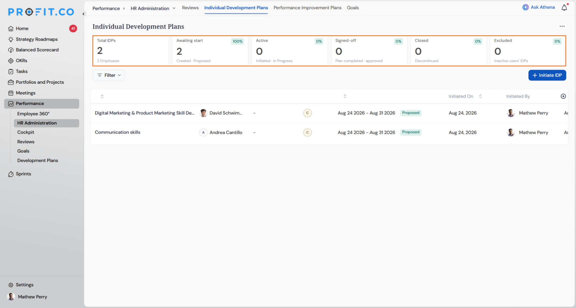
HR administrators managing organisation-wide Individual Development Plans previously had no way to assess programme health without opening each plan individually. The HR Administration view for Individual Development Plans now displays six summary cards at the top of the page showing plan counts by status, alongside a filter panel that lets administrators locate specific plans by employee, department, coach, progress, or status.
How It Works
- Navigate to Performance → HR Administration → Individual Development Plans
- Six summary cards appear at the top of the page on load, each showing a count and percentage of total active plans:
- Total IDPs — all active employee plans with the total employee count
- Awaiting Start — plans in Created, Proposed, Pending Acceptance, or Rejected status, with a breakdown of awaiting and rejected counts
- Active — plans currently Initiated or In Progress, with a breakdown of each
- Signed Off — plans where goals are achieved and the plan is approved
- Closed — plans ended without completion
- Excluded — plans belonging to inactive users, shown separately and not counted in the totals above
- Click any summary card to filter the IDP list below to matching records; an active filter chip appears and the selected card is highlighted
- Click the same card again or clear the chip to return to the full list
- Click Filter to open the condition builder and filter by Employee Name, Department, Coach, Progress (Not started, In progress, or Completed), or Status; multiple conditions can be combined and all must match
- Active filters are shown as chips next to the Filter button; click Clear All or the chip’s close button to reset the list
Why It Matters
- Programme health visible at a glance: The six summary cards replace manual plan-by-plan review, giving HR administrators an immediate view of how many plans are active, stalled, completed, or pending across the organisation.
- Faster location of specific plans: The filter panel lets administrators narrow the full IDP list by any combination of employee, department, coach, progress band, or status, removing the need to scroll through an unfiltered list to find relevant records.
- Excluded users tracked separately: Plans belonging to inactive employees are surfaced in their own card rather than hidden, so administrators can account for them without them inflating or distorting the active programme statistics.
2. Per-reviewer rating controls in review templates
Overview
The rating setting in review templates previously applied to all reviewer types at once, meaning disabling ratings turned them off for self-assessment, manager, peer, and secondary reviewer assessments simultaneously with no way to make exceptions. Super users can now enable or disable ratings independently for each reviewer type and for each assessment area, including Q&A, Competencies, Goals, OKRs, Tasks, and Overall Rating, giving review template administrators precise control over which reviewers submit scores and which provide commentary only.
How It Works
- Navigate to Settings → Performance → Reviews → Review Templates and open or create a review template
- Select any assessment step such as Self Assessment, Manager Assessment, or Peer Assessment to open its configuration panel
- Under Performance Review Assessment Includes, each assessment area (Q&A, Competencies, Goals, OKRs, Tasks, Overall Rating) displays separate toggles for Visibility, Ratings, and Comments
- Toggle Ratings on or off independently for each area within that reviewer step; turning off ratings for one reviewer type does not affect ratings configured for other reviewer steps
- Repeat the configuration for each reviewer step in the template to define the exact rating scope for each participant, for example enabling manager ratings while disabling self-ratings across all areas, or keeping ratings active for competencies while disabling them for goals
- The Who can view self-assessment section controls when each reviewer type can see the self-assessment results, independently of the ratings configuration
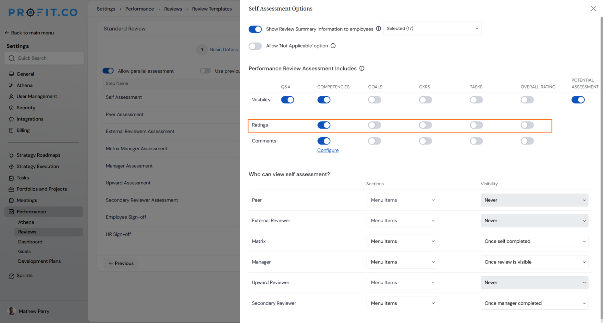
Why It Matters
- Ratings match the reviewer’s role: A reviewer type whose input is qualitative can be configured to provide comments only, while scoring reviewer types retain their rating fields, keeping the review process appropriate to each participant without a blanket on or off switch.
- No unintended impact across reviewer types: Changing the rating setting for one reviewer step leaves all other steps unaffected, so adjusting self-assessment behaviour does not alter what managers, peers, or secondary reviewers are asked to submit.
- Consistent control across all assessment areas: The same per-reviewer toggle applies across every content area in the review, including OKRs, goals, competencies, tasks, and overall rating, so the configuration is uniform regardless of which areas a template uses.
3. Historical review average in the final overall rating
Overview
The Final Overall Rating in a review template previously reflected only the ratings submitted within the current review cycle, giving no visibility into how an employee’s performance compared to prior periods. Super users can now enable a custom formula on the Final Overall Rating that averages ratings across a configurable number of historical review cycles, weighting each period’s contribution automatically based on how many reviews are available for that employee.
How It Works
- Navigate to Settings → Performance → Reviews → Review Templates, open a template, and go to the Review Process step
- Click the configuration icon on the Final Overall Rating field to open the View: Final Overall Rating panel
- Toggle on individual reviewer ratings to include in the final calculation: Self, Peer(s), Upward, External, Matrix Manager, Manager, Additional Manager(s), and Secondary Reviewer; toggle off any reviewer type whose rating should be excluded
- Enable the Enable Custom Formula toggle to activate the historical averaging configuration
- Under Formula Configuration, set # of Reviews to consider; this determines how many consecutive review cycles (including the current one) contribute to the average
- A preview matrix shows the weight automatically assigned to each review period based on how many cycles are available for the employee:
- An employee with only one review on record receives 100% weight on the current review
- An employee with two reviews receives 50% on each
- An employee with three or more reviews receives equal weight (for example 33.33% each) distributed across the configured number of cycles
- The formula adjusts automatically per employee, so employees with fewer reviews on record are not penalised with a lower-confidence average
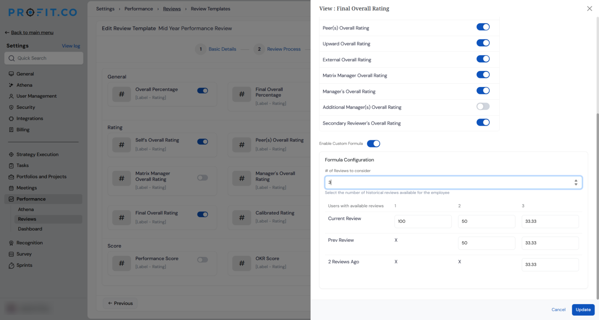
- The resulting weighted average populates the Final Overall Rating field visible in the review summary
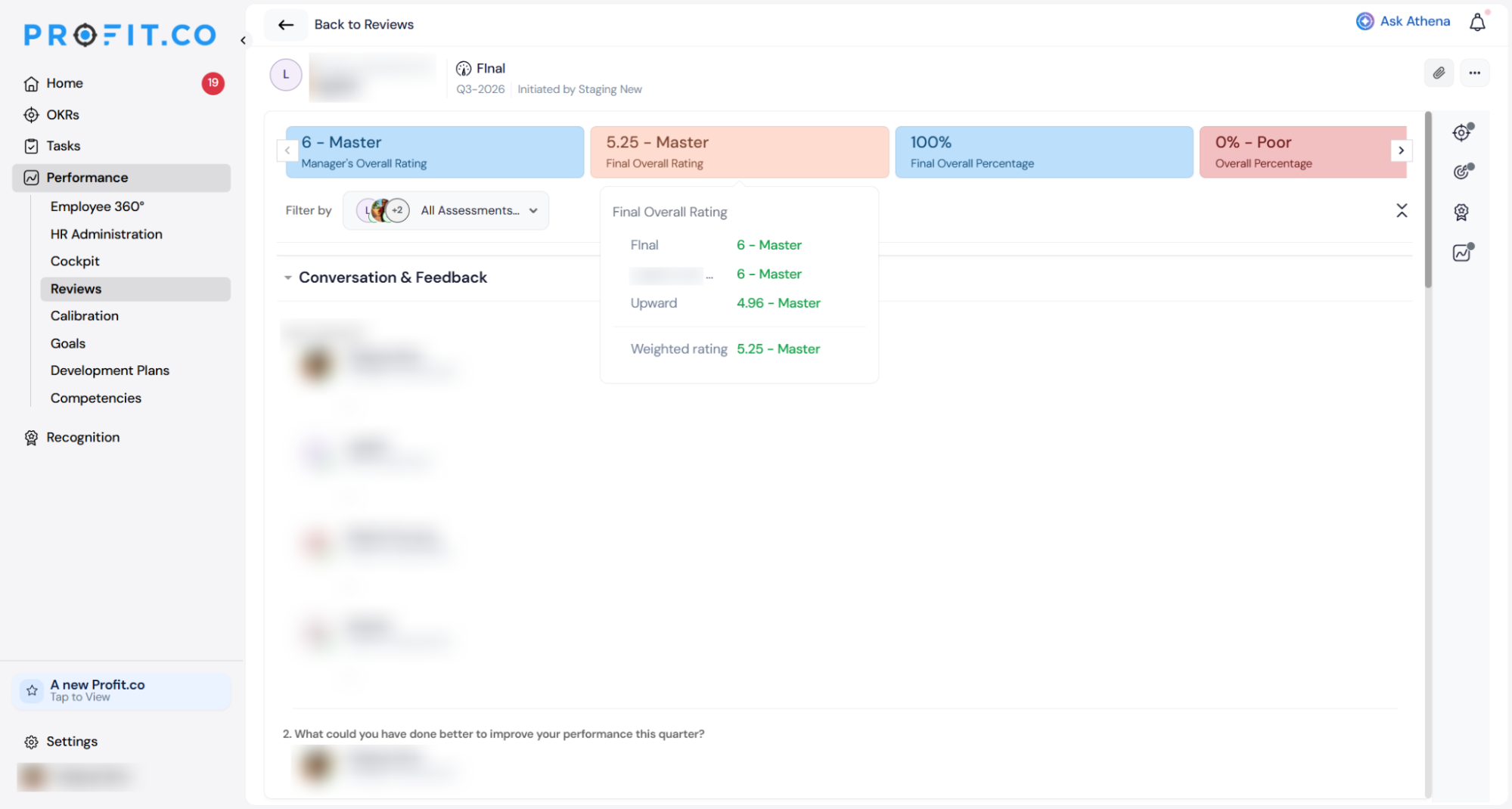
Why It Matters
- One rating reflects the full performance picture: The Final Overall Rating now surfaces a weighted view across multiple review cycles, giving managers and HR a more considered signal than a single cycle’s score in isolation.
- No manual calculation required: The weighting logic is applied automatically per employee based on available review history, removing the need for HR to calculate or maintain historical averages outside the platform.
- Configurable scope per template: The number of historical cycles to include is set per review template, so annual reviews can incorporate a longer lookback while mid-year reviews can use a shorter one, each calibrated to the review’s purpose.
4. Minimum and maximum peer count enforcement in peer assessment
Overview
Peer assessment stages previously had no way to enforce a minimum number of peer nominations before a review cycle could progress. HR super users can now set minimum and maximum peer counts per employee assessment directly in the Peer Assessment Options, and the platform prevents stage progression until the minimum is met, while displaying a clear notification when the limit is reached.
How It Works
- Navigate to Settings → Performance → Reviews → Review Templates, open a template, and select the Peer Assessment step to open Peer Assessment Options
- Enable Limit the number of peers for each employee assessment and set the Min and Max values; the minimum is the count required before the cycle can advance, and the maximum caps how many peer nominations can be added per employee
- The remaining Peer Feedback toggles control who can nominate peers (HR, HR BP, Manager, Employee) and whether nominations are auto-approved per role; configure these alongside the peer count limits to match the organisation’s nomination workflow
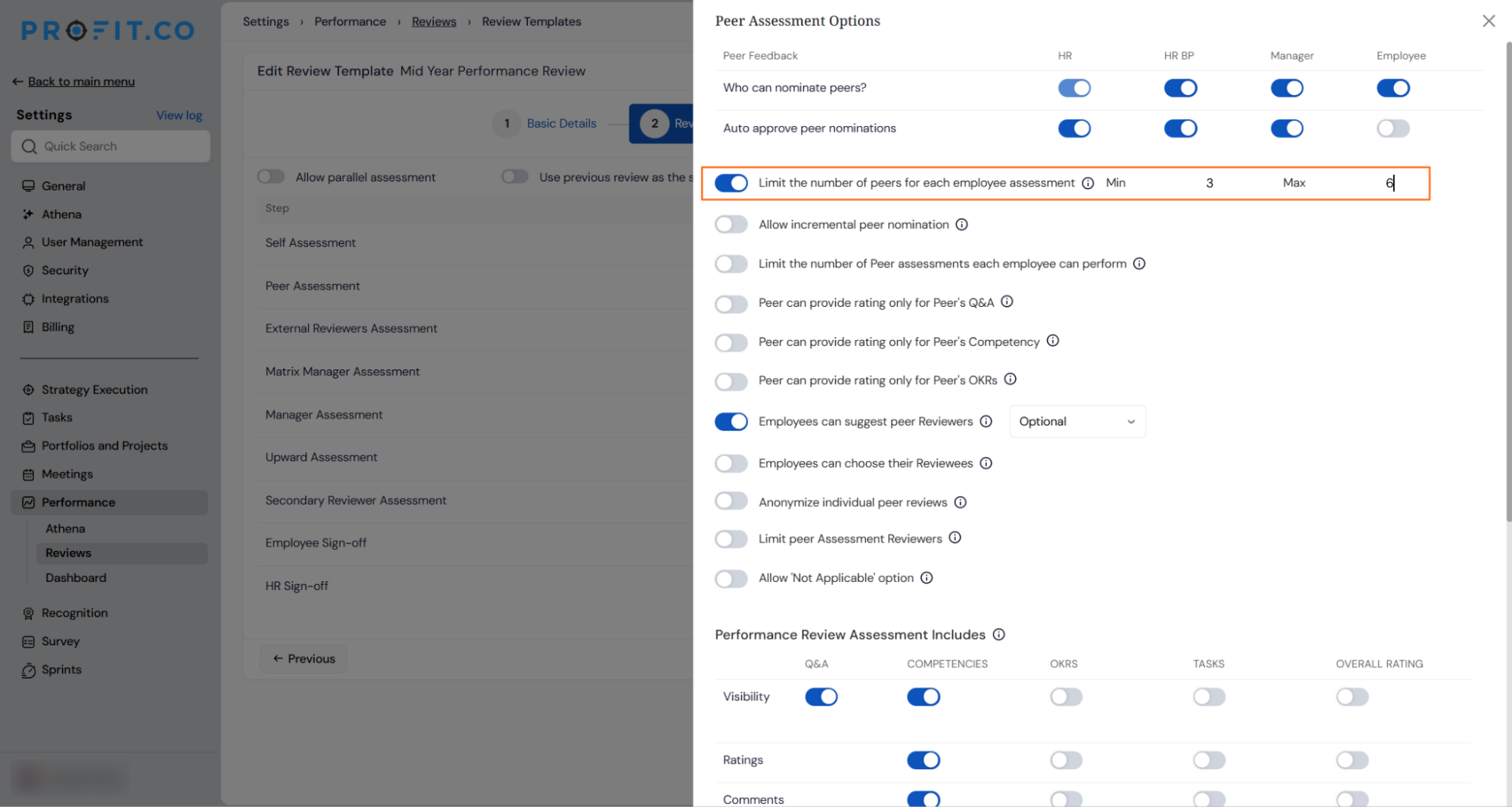
- During the review cycle, when the number of peer nominations for an employee reaches the configured minimum, the platform displays a notification confirming the minimum has been met and presenting two options: Close now to finalise nominations at the current count, or continue adding peers up to the configured maximum
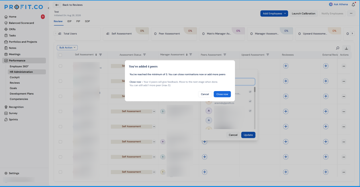
- If the minimum has not been reached when a super user or HR attempts to move the cycle to the next stage, the system blocks the progression and indicates which employees still require additional nominations
- The peer count limits apply per employee, not per reviewer, so different employees in the same cycle can have different numbers of peers within the configured range
Why It Matters
- Every employee gets a meaningful peer sample: The minimum count requirement prevents the cycle from advancing with too few peer inputs, ensuring the peer assessment carries statistical weight before it contributes to a final rating.
- Excess nominations are automatically capped: The maximum limit prevents any single employee from accumulating an unmanageable or unfair number of peer reviewers, keeping the process consistent across the organisation.
- Nomination completion is visible before stage progression: HR can see exactly which employees have not yet met the minimum before advancing the cycle, making it straightforward to follow up on outstanding nominations without reviewing each employee individually.
Enhancements:
5. Customisable IDP status labels and colours
Overview
Individual Development Plan statuses were previously fixed system labels that could not be changed, meaning organisations whose internal HR terminology differed from the platform defaults had to train employees around the mismatch. HR administrators can now rename, recolour, and add contextual descriptions to each IDP status from settings, so the labels employees see throughout the IDP workflow match the organisation’s own process language. The underlying system behaviour is unchanged; only the display names and colours are updated.
How It Works
- Navigate to Settings → Performance → Development Plan → Individual Development Plan and scroll to the Status section
- The status table lists all IDP statuses with their current name, description, colour, and an edit icon on each row
- Click the edit icon on any status to open the Update Status modal, pre-populated with the current values
- Update any combination of the following:
- Color — choose from a predefined colour palette; the status pill updates to match
- When this status occurs — contextual text that appears as a tooltip in the IDP workflow explaining when this status is triggered (up to 150 characters)
- Click Update to save; the new label and colour take effect immediately across all IDP views for every user in the organisation
- Disabling a status is blocked if active IDPs are currently in that status; the system shows the number of affected records and asks for them to be reassigned first
- Managers and employees see the customised labels throughout the IDP experience but cannot access the settings page
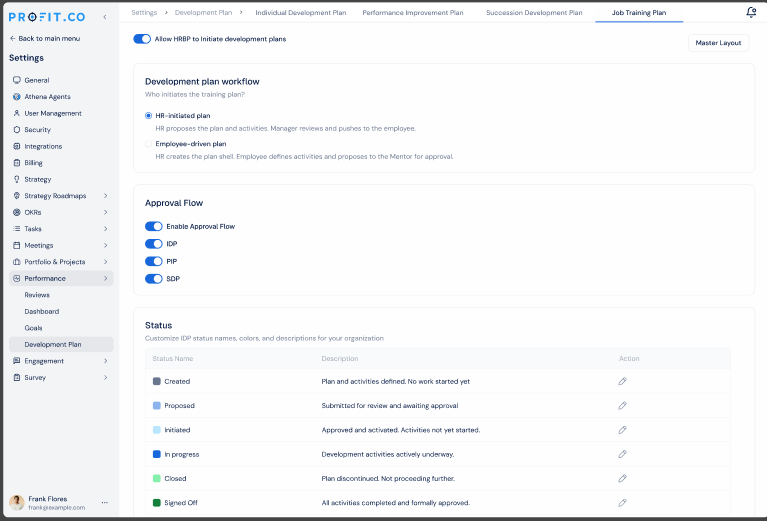
Why It Matters
- Process language stays consistent: Status names in the platform can reflect the organisation’s own HR terminology, removing the gap between what the tool shows and what employees are told to expect during the IDP process.
- No disruption to existing records or workflows: Renaming a status changes only the display label; all underlying IDP records, data, and system behaviour remain exactly as they were.
- Safe configuration with a disabled guard: Statuses with active plans cannot be disabled until those plans are moved, preventing orphaned records and ensuring administrators make deliberate, informed changes.
6. Independent rating level configuration per review object type
Overview
The Rating Controls page in review settings previously shared the same rating set across all object types, meaning changes to rating levels on one tab affected all other tabs, and the page did not reload correctly when switching between object types. Each tab now loads its own independent rating configuration, so super users can define a different number of rating levels for Competencies, Goals, OKRs, and Overall Rating separately.
How It Works
- Navigate to Settings → Performance → Reviews → Rating Controls
- Four tabs are available: Competency, Goals, OKRs, and Overall Rating; selecting any tab now loads the rating configuration specific to that object type
- Enable or disable individual rating levels on each tab independently; disabling a rating level on the OKRs tab does not affect the rating levels configured for Competencies, Goals, or Overall Rating
- Create new rating levels from any tab; a rating created on the OKRs tab appears only within OKR rating controls and is not added to other object types
- Each object type can therefore carry a completely different rating scale, for example a two-level scale (On Track, Off Track) for OKRs alongside a five-level scale (Outstanding, Commendable, Satisfactory, Needs Improvement, Unsatisfactory) for Competencies
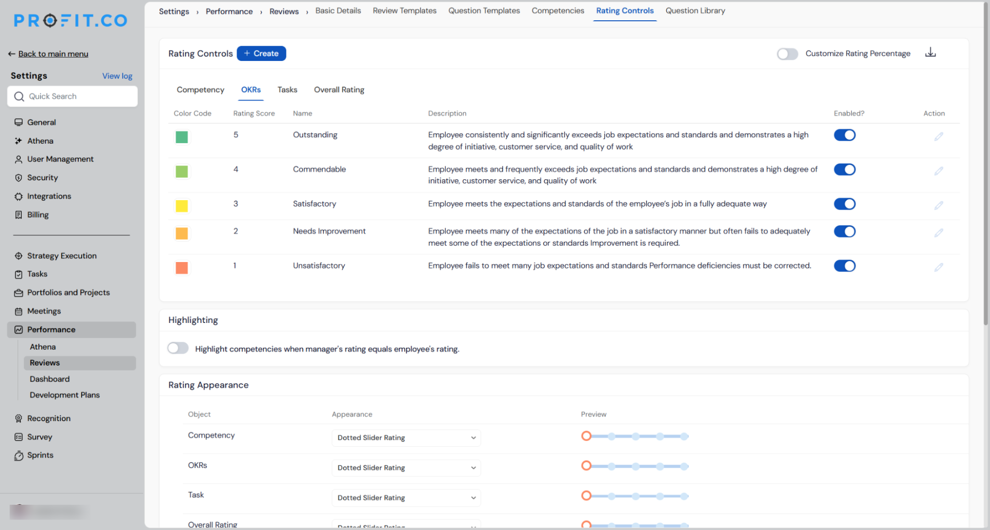
Why It Matters
- Rating scales match each assessment type: OKR ratings, competency ratings, and goal ratings often serve different purposes; each can now be configured with the number of levels and labels that fit the way that assessment is actually used.
- Changes stay contained: Disabling or adding a rating level on one tab no longer affects any other object type, removing the risk of unintended changes cascading across the review template.
- Accurate data on every tab: Switching between Competency, Goals, OKRs, and Overall Rating now reliably shows the configuration for the selected object type, so administrators can review and edit each one independently without confusion.
